

Categories
Artificial Intelligence Forex VantagePoint AI Market Outlook

Vantagepoint AI Market Outlook for November 24, 2025

Welcome to the Artificial Intelligence Outlook for Forex trading.

VIDEO TRANSCRIPT


US Dollar Index / USDU
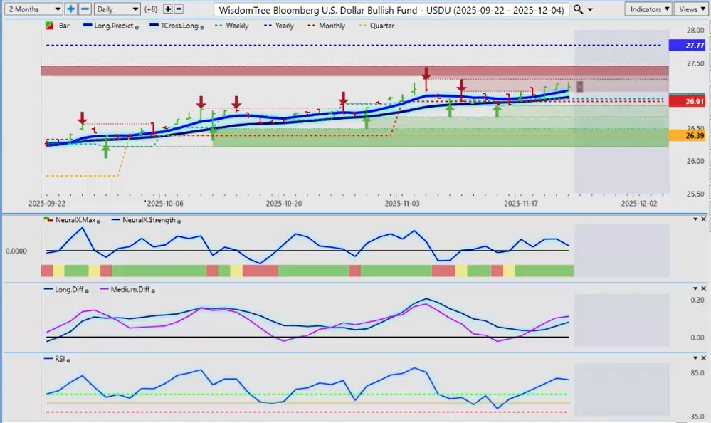
Okay, hello everyone, and welcome back. My name is Greg Ferman, and this is the VantagePoint A.I. Market Outlook for the week of November 24th, 2025. Now, to get started this week, we’ll begin where we always do with that very important Dollar Index, or in this particular case, we’re looking at the USDU (Bloomberg U.S. Dollar Bull Fund) to measure this dollar strength. We’ve been running along the T-Cross Long for basically about two weeks now, and we’re starting to rise higher. Bets are mixed on whether the Fed’s going to cut or whether he’s not going to cut, but quite frankly, guys, at this point, it’s really just a lot of noise in the market and a lot of confusion, and that’s coming from the Fed members.

For now, the Dollar Index is moving up, but as we can see, the VantagePoint indicators show the Neural Index is green, but Neural Index Strength is actually pointing down, indicating it’s losing momentum. Our MA Diff Cross has told us that we were going to rise, but we still remain negative on the calendar year. When we measure it from a hard anchor point to where we closed approximately on Friday, we can see that the dollar is still down 2.17%. This is probably something you’re not hearing very often because I’m not hearing it at all in the media or on CNBC, Bloomberg—these types of things. They’re simply talking about dollar strength when, in actual fact, it’s still negative on the year. Historically, the U.S. Dollar does very poorly around U.S. Thanksgiving and, more specifically, in the month of December. We could be nearing a corrective move on the dollar, but the key levels you want to watch going into next week are the Monthly Opening Price at 26.91 and, of course, that very important T-Cross Long at 26.98.

S&P 500 / SPY
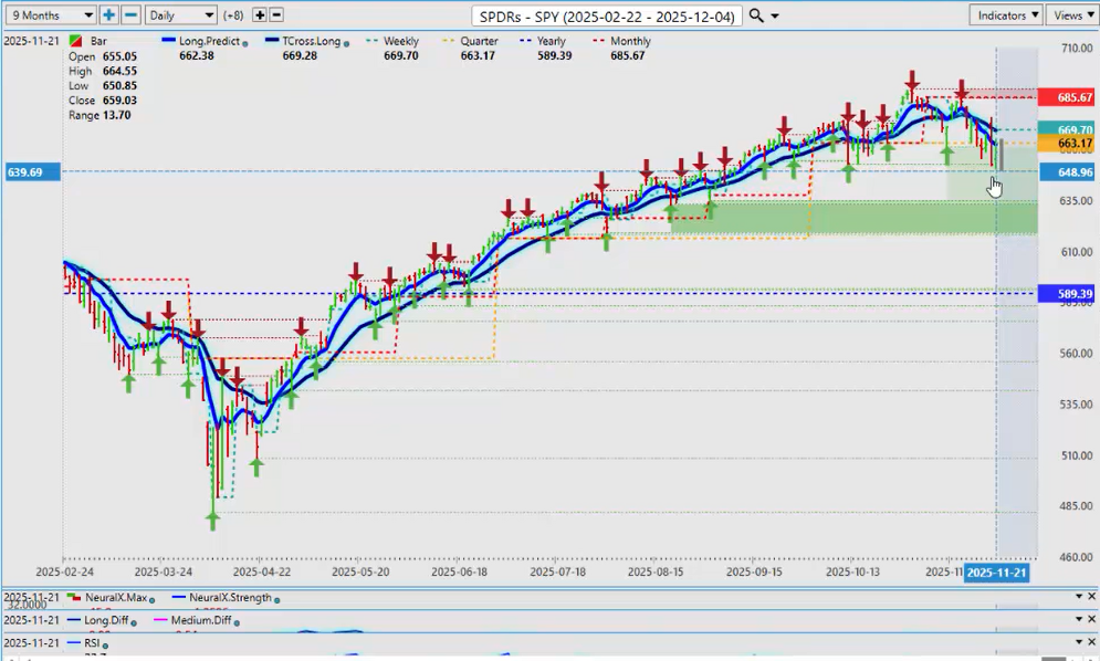
Now, taking a further look at the equity markets—because again, the media is really spinning things both ways here—let’s look at some true performance on the SPY, which mirrors the S&P 500. From the low point back in April, we’ve rallied a massive 43.15%. That’s from the lows they continue to cherry-pick. Now we’re going to delete that and instead say, “Okay, when we moved above the yearly opening price, how much did we rally from there?” We rallied another 16.88% from the yearly opening price back in May, which took us all the way up to the October 29th high at about 689.

When we look at true performance here, from the most recent low point in the market on Thursday, the market still fails to mention—and the media fails to mention—that we’re still up a whopping 10.4% on the SPY this calendar year. We had a massive rally on Friday on this particular ETF and on the S&P 500 futures. In my respectful opinion, historically speaking over the last five years, around the 6510 mark on the S&P 500—on a couple different indexes—there is very strong support down there. I misspoke earlier; what I meant was around 6510 being the historical lows on the S&P. We took a very strong bounce out of there on Friday based on seasonal patterns. In most cases, the S&P 500 has closed above its open price in the month of November. We’ve had a powerful rally on Friday.

A lot of confusion exists around the Fed. The Nvidia (NVDA) earnings were very good. The CEO of Nvidia said, “I don’t believe that there’s a tech bubble here or an A.I. bubble.” The market still pushed it lower, but anything around U.S. Thanksgiving often sees this kind of volatility, which I would’ve expected next week. The market is very jittery. Based on this, I’d be looking for some type of continuation into next week, provided the Fed stays in check. Looking closely at the chart, we see a big move down—a big bar down—and then a reversal. The Neural Index in my respectful opinion, and the Neural Index Strength, were already giving a warning sign that this market was not as structurally weak as it looked. What we want to see now is a move back above the quarterly opening price and ultimately above the T-Cross Long at 66.928.

DAX Futures
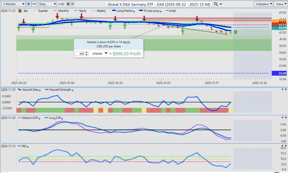
When we do a comparative analysis to the DAX, in the month of November we’ve dropped 4.53%. Automatically people think that the bears are in control, but the average drop in DAX futures in November over the last five years has been just over 2%. I double-checked the 13-year lows on the DAX on a percentage basis, and that came in at about 4.5% on the DAX futures. It’s very interesting that this is exactly where we bounced from. I warned everyone this week. I got a comment from my good friend from Germany: “Here come the bears.” My comment was, “Watch out for a bear trap,” and sure enough, that’s exactly what was sitting there.

Knowing these historical levels—what the DAX has done over a longer period of time in November—is very important. What often happens is we comingle weeks and months together and it causes distortion. If I look at the primary trend in 2025, I believe this is one of the best years the DAX has had, and it’s been a very good year for the Euro too, with the DAX currently up 27.3%, grossly outperforming the S&P 500. Yes, we could have more room to the downside, but that 4.53% drop is a very unique number. Over the last 13 years, using the same anchor point—the monthly opening price—the biggest November drop has been about 4.3% in the DAX futures. Very interesting stuff. Doesn’t mean it won’t crash next week, but the direction will be dictated by the U.S. equity markets.

Gold
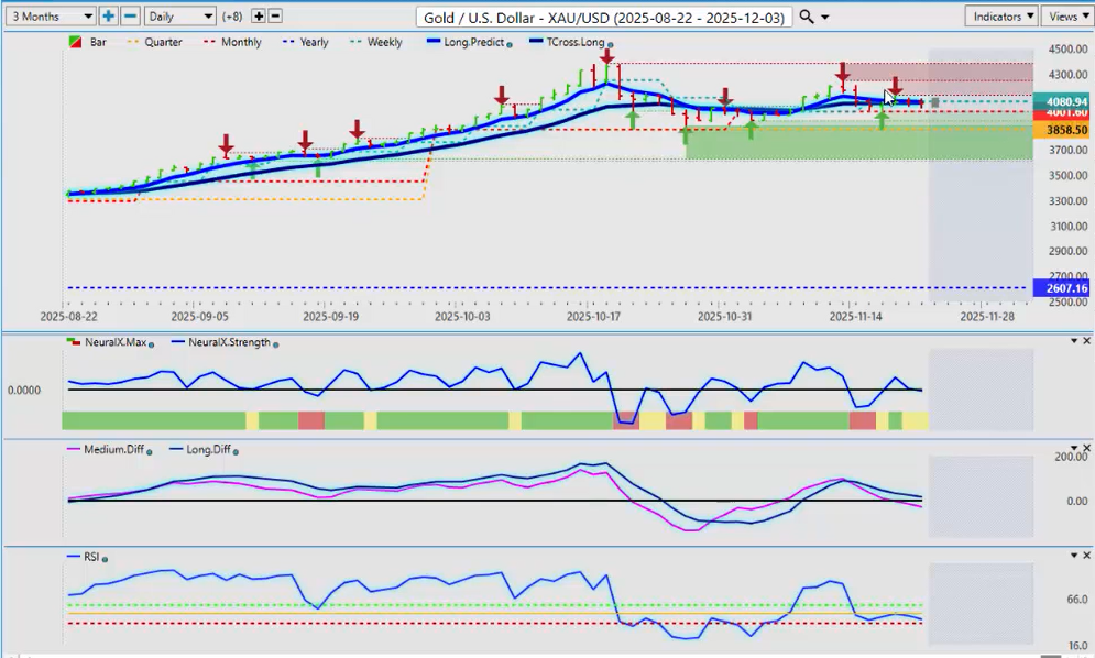
Looking at gold, we can see that gold is basically running flat this week. In most cases—not all, but most—gold and silver usually do quite well in December. We are holding above the very important Monthly Opening Price at 40160. I would argue that with gold, we should watch the VIX very closely, because if the VIX starts failing, that could potentially drag gold down with it.

Volatility Index ($VIX)
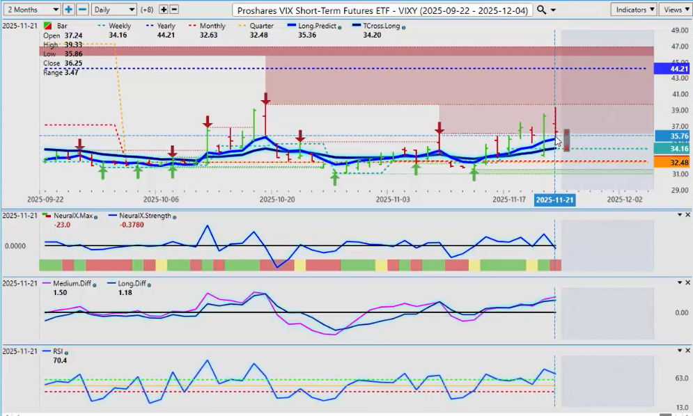
The VIX is holding above the quarterly opening price but is still negative on the year. This is being missed in the media because they are consumed by short-term trading. If we look at how the VIX finished Friday from the yearly opening price, it’s down 17.85%. I would need the VIX, at the very least, to stay above the Long Predicted and the T-Cross Long, but there are already cracks in the dam. Much will come down to what the Fed does. Over the last 5, 10, 15 years, whether the Fed hiked or cut, whether he was hawkish or dovish, equities have ultimately gone higher. The VIX is still grossly negative on the calendar year on this ETF, but it is something we need to keep an eye on. I believe the Fed is going to discuss rate cuts in 2026 and will likely cut, but the U.S. economy is moving along pretty well by the numbers despite tariffs and everything else.

Bitcoin
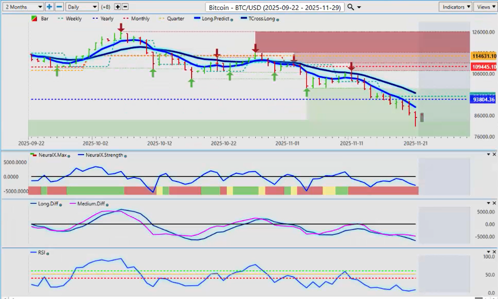
When we look at Bitcoin, Bitcoin is going to be fueled if equities turn higher—more specifically the QQQ, the NASDAQ. That will help Bitcoin turn around. My concern, as I’ve discussed for months, is that Bitcoin has a three-year cycle: three years up, one year down; three years up, one year down. We are in the third year of the three-year rally, which points to a pullback next year. That pullback remains to be seen because we have to first assess how we finish the calendar year of 2025. We’ll use the new yearly opening price to gauge whether Bitcoin will continue to follow this three-year cycle. Right now, it appears likely. But if equities turn around and we get a risk-on environment, then Bitcoin should climb higher. The indicators are still negative for now.

The key level to watch is 93,8004. Another way of playing this move is placing a buy stop just above that level. If Bitcoin turns around and gets back above the yearly opening price, we are going to rally higher. If we cannot, then it will confirm that we are going lower into year-end and likely lower into next year.

Crude Oil and Natural Gas
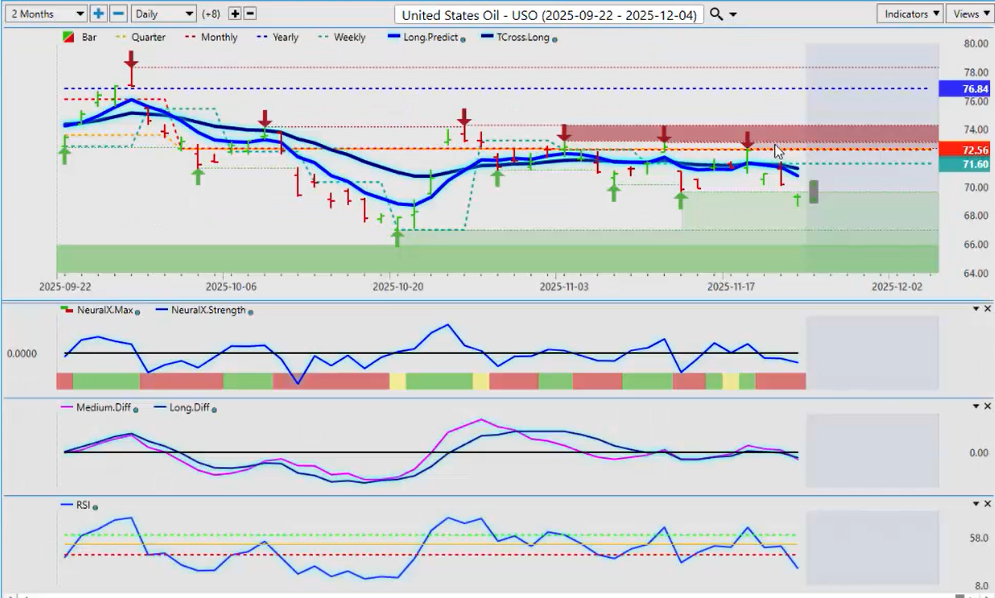
Looking at oil on the commodity side, I would’ve expected a little more of a bounce, but this is not really the time of year to be buying light sweet crude. Natural gas should remain firm for a few more weeks, but January nat gas starts to fall off, and then we start looking at oil again. For now, oil remains structurally weak below its yearly, quarterly, and monthly opening prices. Nothing at the moment is overly bullish for oil, though equities turning around could pull oil up a bit. I would be looking more toward January, February, and March for long oil trades.

Euro versus U.S. Dollar ($EUR/USD)
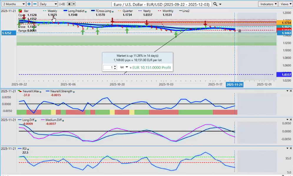
As we get into some of our main Forex pairs, we’re in for another very interesting week. All eyes will be on the Euro/U.S. Dollar (EUR/USD) pair. We’ve been running sideways in a channel for a couple of months—some upside, some downside. There is verified support down around 1.1465. Historically and seasonally speaking, the Euro doesn’t do too badly in December, but that’s due to U.S. Dollar weakness, not Euro strength. The Euro has had a very high intermarket positive correlation to gold, so if gold rebounds, that should help pull the Euro back up.

I am seeing a warning sign with Neural Index Strength starting to turn. The Neural Index is red, but inside that index it looks like it’s trying to turn around. Watch this area very closely around the Monthly Opening Price at 1.1531. If we can hold above that next week, then I believe you have a long trade here, and we’ll be watching this into December.

U.S. Dollar versus Swiss Franc ($USD/CHF)
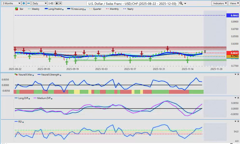
Now, the U.S. Dollar/Swiss Franc (USD/CHF) pair. The Swiss National Bank is talking again about promoting negative rates to weaken their currency. Historically, every time they’ve done this, it’s been a mess. The only one worse at this is the Bank of Japan. Both have created problems, but the Swiss are nowhere near as bad as Japan.

This is a make-or-break area for this pair. The Dollar Index, the USDU, they all have to move up if this pair is going to move higher. We are very negative on the calendar year. Even though the dollar has done well in the last two quarters, this pair remains heavily down. Having a solid anchor point helps us assess the real trend: this pair is down 11%. Currencies rarely go down this much in a calendar year. This is likely what’s making the Swiss National Bank nervous. When they start talking intervention, their track record speaks for itself. The Euro/Swiss Franc is a perfect example of how central bank intervention makes things worse.

If we can get above the Monthly Opening Price and hold above it, we may have a trade. Momentum to the upside is building, but I believe it would be short-term.

British Pound versus U.S. Dollar ($GBP/USD)
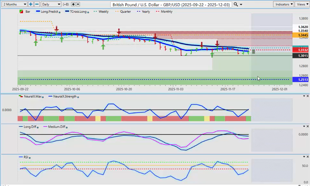
Now the British Pound/U.S. Dollar (GBP/USD). A lot of us want to get long on this pair—maybe December is our month—but we just cannot get through the very powerful VantagePoint Predicted Moving Average, the T-Cross Long, at 1.3190. The current T-Cross Long is 1.3160. If we can get above the Monthly Opening Price and break above the T-Cross Long, we’ve got a long trade. Another way to play this is placing a buy stop above 1.3160. If it breaks this level, we’ll be ready. If it can’t get through, pressure remains to the downside.

Neural Index Strength is pointing upward. We could see a long coming as early as next week. If the Fed chatter becomes more dovish, we could get the long trade—but it wouldn’t be on GBP strength; it would be on USD weakness. Always remember that.

U.S. Dollar versus Japanese Yen ($USD/JPY)
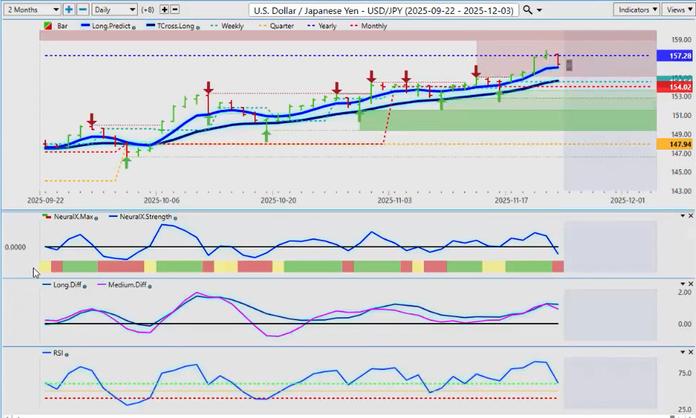
Now to the pair everyone loves to hate: the U.S. Dollar/Japanese Yen (USD/JPY). Full disclosure: I am dumbfounded that this has made it back up to the yearly opening price. But it’s a perfect opportunity to explain why this level is so important. We’ve been stalled here for three days in a row. The Bank of Japan is on the hunt. Be careful around the opening on Sunday night. This is an outlook, not a recap, and I suspect they’re going to try to make a move very soon to strengthen the yen. If we break through the yearly opening price of 157.28, they’re going to go into full panic mode. But remember, they caused this—not the Fed. The Fed hiked rates, yes, but the BOJ was verbally intervening in 2020 and has been crushed since.

Japan’s exports are doing well, but imports are costing a fortune with a yen this weak. VantagePoint is picking up on what I’m thinking: the MA Diff has crossed to the downside; the Neural Index is pointing down; the Predicted RSI is pointing down; and we are failing at the yearly opening price. If there is going to be intervention to strengthen the yen, we could be days away. If you’re not sure, stay away. It’s going to be volatile into the end of the calendar year. I’m getting the feeling that Japan is getting ready to make a move very soon. Be very careful.

U.S. Dollar versus Canadian Dollar ($USD/CAD)
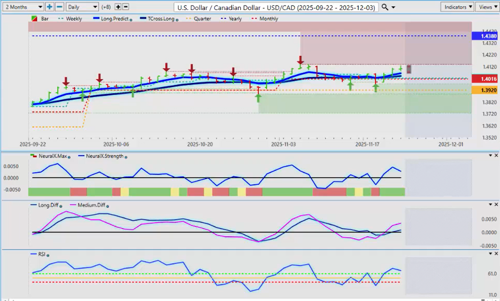
Now the U.S. Dollar/Canadian Dollar (USD/CAD) pair. It’s not about Canadian strength; it’s about U.S. Dollar strength or weakness. Canada has come through its first budget—probably one of the most disastrous budgets I’ve seen. The fiscal anchor has been removed. Not even Justin Trudeau removed that debt-to-GDP anchor. Carney’s budget removed it, and that basically means he’s going to spend, spend, spend, and fire up the printing presses. The very definition of a weakening currency is expanding the money supply.

This is not an elbows-up issue. This is dangerous. For now, the pressure is mounting to the upside on this pair. Even if the U.S. Dollar weakens, I don’t think that strengthens the Canadian Dollar much. I’ll give the new prime minister time, but we’re not off to a good start. They barely got the budget passed. The Parliamentary Budget Officer questioned why the media is not talking about the removal of the fiscal anchor. Central bankers love to gamble, and that’s what he’s doing with the Canadian economy.

Longs on the Canadian Dollar are not recommended until we see what happens with tariffs and this bizarre budget. Bias remains to the upside while above the T-Cross Long at 1.4041. Monthly and yearly opening prices show we’re still negative on the year but positive on the quarter and month. Critical support is at 1.3920. I would only short below that level.

Australian Dollar versus U.S. Dollar ($AUD/USD)
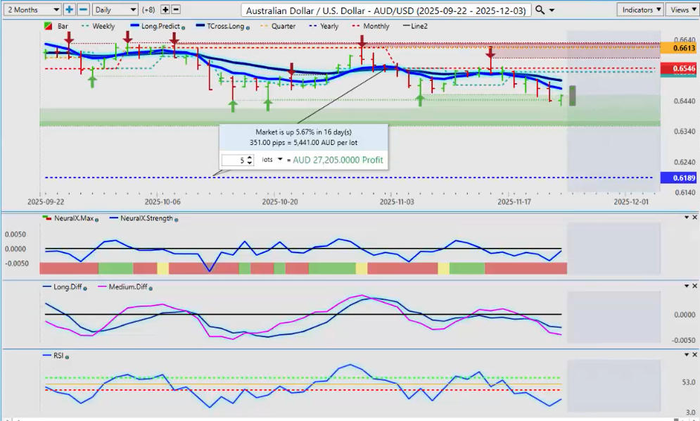
If equities move up next week, you definitely have long trades on the Aussie/U.S. Dollar (AUD/USD) and New Zealand/U.S. Dollar (NZD/USD) pairs, but heavily tipped toward the Aussie. We must look at the real trend: 0.6198 is the yearly opening price. The Aussie had a real good rally on Friday because the stock market did. When you trade the Aussie or the Kiwi, you are indirectly trading the S&P 500, in my respectful opinion, based on the highly correlated markets. The correlation between the Aussie and the S&P is about 90%. If equities go up next week, the Aussie will climb with them.

We are still below the T-Cross Long. I think a retracement, if nothing else, back to the T-Cross Long at 0.6506 is likely. There is very strong seasonal support around 0.6419. As long as you’re holding above 0.6419, longs are in play.

New Zealand Dollar versus U.S. Dollar ($NZD/USD)
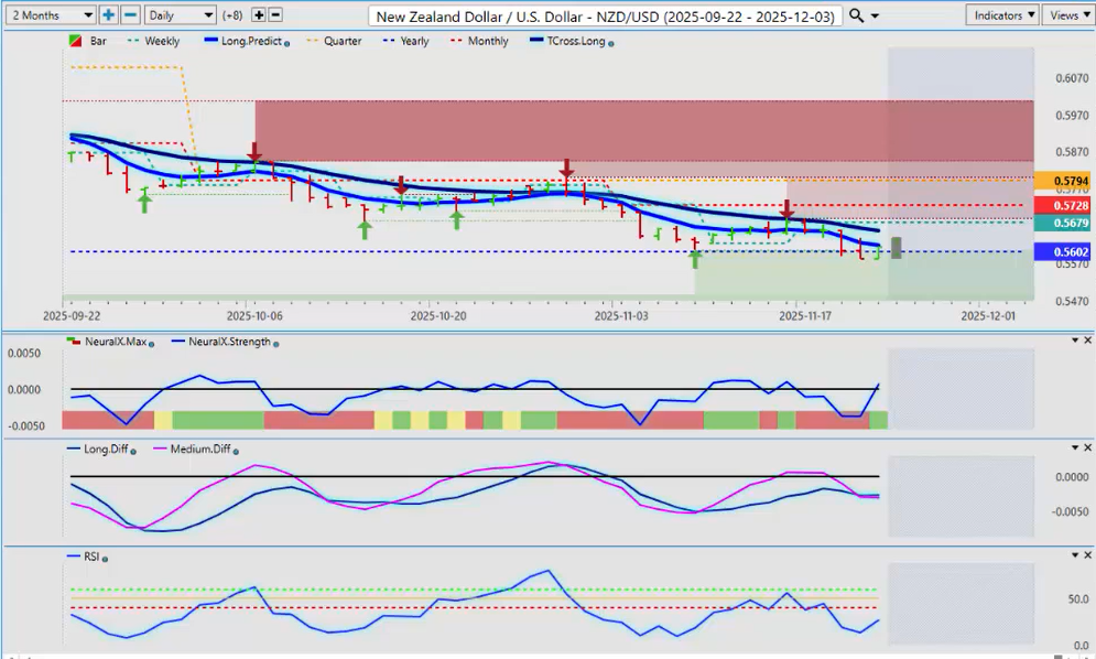
The same applies to the New Zealand Dollar. The market is obsessed with interest rates in New Zealand, and yes, we’re pressuring the yearly opening price. But given the correlation with the Aussie, the Kiwi may be better value. The Aussie could have room to fall; the Kiwi has more room to rise.

If we can hold above the yearly opening price at 0.5605, we have a long trade and potentially a very good one into 2026. My only concern is we already had one failure at this yearly opening price. Ninety to ninety-five percent of traders will never see how powerful that level is. It’s one of the strongest price-based tools you will ever have. If we can get above that and stay above it, then we will have a good long. I think a retracement back to the T-Cross Long at 0.5659 is likely next week. But what can undo several positions is a stock market that continues to crash. Another volatile week is coming.

Personally, I believe most of the volatility is out of it. I would have expected it Tuesday or Wednesday next week near U.S. Thanksgiving. But I think the media scared everyone with an A.I. bubble story. If you know your levels, trading is always easier than listening to the media.

This is the VantagePoint A.I. Market Outlook for the week of November 24th, 2025.


Categories
Stocks Weekly Stock Study

VantagePoint A.I. Stock of the Week Lumen Technologies ($LUMN)

This week’s ai stock spotlight is Lumen Technologies ($LUMN)

Lumen is that stubborn telecom zombie that just refuses to stay dead. It lurches forward, trailing decades of mergers, misfires, and misery, still clinging to one of the largest fiber networks on Earth like a washed-up rock band hanging onto its one real hit. And here’s the kicker: that network should make them rich. But instead, they’ve spent years proving that you can own a gold mine and still somehow starve in the gift shop. If management actually pulls off this turnaround, we’re looking at a Lazarus-level comeback trade. If not, well, keep this ticker next to your collection of expired lottery tickets and inspirational quotes.

Once upon a time, in the great age of dot-com dreams and dial-up whines, there existed a telephone company called CenturyLink, headquartered in Louisiana. Over the years they bought other telecom companies, merged networks, acquired broadband lines, and tried desperately to look like the cool kids in Silicon Valley. Then they changed their name to Lumen because nothing says “We’re hip!” like a word you’d find on a candle store gift card.

Lumen today employs about 30,000 people, all of whom presumably wake up every day hoping their company won’t be compared to a rusted dump truck full of unpaid invoices rolling downhill. The CEO, Kate Johnson, is trying to rebuild the business like a homeowner discovering the previous owner wallpapered over mold. She came in promising operational discipline, digital efficiency, and “strategic transformation.” Which are corporate phrases roughly translating to: “We will try to stop lighting money on fire.”

What Lumen does is provide telecommunications services — fiber infrastructure, enterprise networking, broadband, data transport, and business internet solutions. That means they own and operate a gigantic global fiber network. And I do mean gigantic. If fiber-optic acres were farmland, Lumen would be the Monsanto of light beams. Infrastructure nerds drool over their network map like middle-schoolers stare at sneaker drops.

The problem is: owning high-quality infrastructure isn’t the same as running a business that people want to buy things from. Telecom is brutally competitive, with margins

narrower than the attention span of a goldfish. Lumen sells connectivity in a world where everyone assumes the internet just magically appears — like Wi-Fi fairies fluttering around distributing TikTok memes and questionable medical advice.

Debt is the elephant in the room. And this elephant is not cute. It is large, old, cranky, and sitting directly on the coffee table where shareholders used to place their dreams.

What Could Actually Go Right?

The company is doing what any disciplined enterprise must do when faced with the realities of a changing marketplace — getting lean, focused, and forward-looking. It’s selling off non-core assets to pay down debt, a move that signals a return to financial prudence and balance sheet strength. At the same time, it’s doubling down on what drives profits: high-margin enterprise fiber, the backbone of modern digital communication. The leadership understands that efficiency isn’t just a buzzword; it’s a necessity. That’s why costs are being cut aggressively, because every wasted dollar is a dollar not working for shareholders. And make no mistake, they’re not trimming for survival, they’re positioning for growth. The targets are clear and compelling: artificial intelligence, cloud connectivity, and edge infrastructure. These are the growth engines of the modern economy, and by aligning capital with these sectors, the company isn’t just catching up, it’s getting ahead.

This is the zombie trade: the company has the right assets at the exact right time.

What Could Go Terribly Wrong?

The story here is one of mounting pressure and narrowing options, a familiar narrative on Wall Street when execution fails to match ambition. The company’s recurring challenge has been its inability to execute effectively, a theme that has haunted management through several strategic pivots and market cycles. That failure now intersects with growing debt refinancing pressure, as maturities approach in a higher-rate environment that leaves little room for error. Compounding the issue is customer churn, which continues to erode revenue stability and investor confidence alike. The result is a company caught in a tightening vise: rising costs of capital on one side, weakening customer loyalty on the other. Unless management can deliver a credible turnaround plan, the next chapter may involve shareholder dilution — or worse, a restructuring scenario that tests the very foundation of the business.

Lumen is the financial version of an old motel off the interstate. The sign flickers. The paint chips. The pool has been “closed for repairs” since the Obama administration. But the land underneath that motel? It’s right next to the express lane of the digital economy.

This is a speculative turnaround trade.

If the turnaround works → deep value resurrection, shorts panic, price re-rates. If it doesn’t → equity becomes emotional support wallpaper.

No one is buying Lumen because it’s great. They’re buying it because it’s terrible in a way that could become less terrible at exactly the right moment. Monitor revenue growth, enterprise segment momentum, and debt structure like your future depends on it — because in this trade, it does.

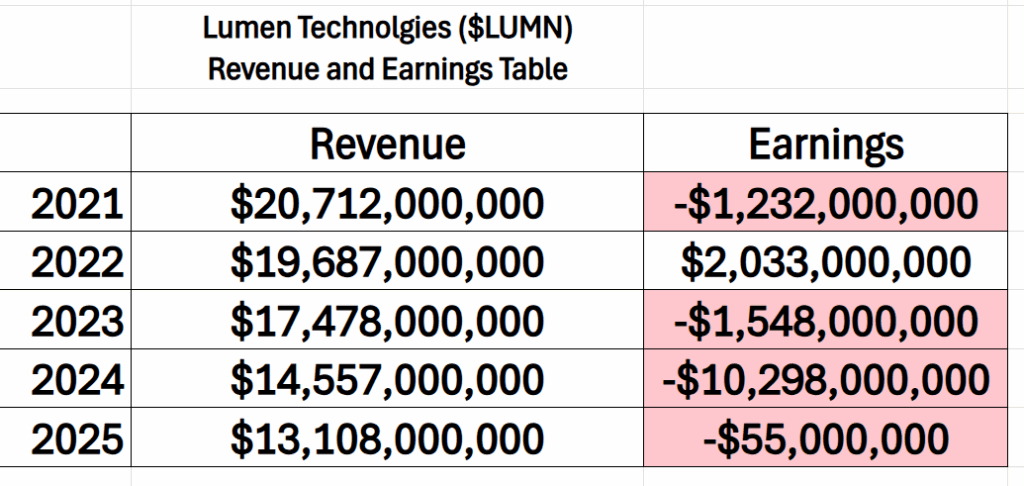
The Revenue and earnings table tells the story in black and white: Over the last 5 years revenue is down 37% and cumulatively over that same time frame $LUMN has lost $11.1 billion. Not exactly confidence inducing.

Lumen just reported its latest earnings, and the whole event felt like watching a very determined but slightly confused marathon runner: technically still moving forward, but everyone is wondering if they’re going to collapse before the finish line. Yes, Lumen beat the official expectations on revenue, and free cash flow. On paper, that looks like winning. But investors didn’t cheer. The stock went down anyway, which tells you the market has trust issues. Beating the numbers matters less when the crowd believes you’re jogging toward a cliff.

Revenue slipped again, down about four percent from last year. That means the company is still shrinking, just shrinking more politely than before. They made about $3.1 billion this quarter, which is a lot of money unless you’re a telecom company that used to make more. Adjusted EBITDA was around $787 million, which is business-speak for “we still make money once you ignore all the messy parts.” And yes, free cash flow improved. This is like discovering you do still have gas money, even after paying all the bills and accidentally driving your car into a mailbox. So that’s the good news.

The real story is that Lumen is trying to reinvent itself. Think of it like your dad deciding he’s going to get in shape and become a surfer now. The company is trying to stop being the old, slow, “we ran your grandma’s phone line” telecom barnacle and become a modern digital infrastructure company powering A.I., cloud computing, and things with names like “edge networking” that make tech people feel shiny inside. They’re selling new services, talking about partnerships, and promoting something called a “Connected Ecosystem,” which sounds like a nature documentary starring Wi-Fi.

But here’s the problem: the old part of the business is still dying. Those legacy services are shrinking faster than the new ones are growing. Lumen calls these segments “grow” and “harvest,” as though the company were a farm. Except right now the harvest field is going bald and the grow field is still being planted. Meanwhile, transforming the business isn’t free. It costs a fortune. And while all of this is happening, there is still a huge pile of debt looming in the background, like a giant elephant sitting in the living room wearing a tank top that says Refinance Me.

Investors didn’t celebrate because they’re not worried about today. They’re worried about the future. They want to know if the company actually can become what it says it’s trying to become, and whether it can do that before the debt gets too heavy, the customers lose patience, and the whole operation starts resembling a yard sale — except instead of selling bicycles and end tables, they’re selling fiber networks and office buildings.

The company insists that it can make the swap from Old Telecom to New Digital Vision Thing. They reaffirmed their guidance for the full year, predicting billions in adjusted earnings and strong free cash flow. This is the corporate equivalent of saying, “Please calm down, we swear we know what we’re doing.” Whether that’s true depends entirely on whether the “grow” businesses start growing faster and the losses stop widening.

So, what does this mean for traders? It means Lumen is not a sleepy investment. It is a proverbial wager. A roll of the dice with a politely worded press release. If you believe the company can finish this transformation, then this could be a comeback story. If not, then it’s more like a history lesson about debt, disappointment, and the dangers of trying to fix the plane while flying it.

In short: hope is still alive, but with $LUMN it’s wearing a helmet.

The indicators we’re using aren’t hunches, guesses, or gut feelings — they’re cold, hard data with a pulse. Every signal comes straight from observed market behavior, not some talking head’s opinion. They’re built on historical probabilities, battle-tested patterns that

repeat because human nature doesn’t change. And behind it all? Machine learning models tuned to spot the turn before it ever makes the headlines. By the time everyone else is reacting, we’ve already seen it coming.

· Wall Street Analysts Ratings and Forecasts

· 52 Week High and Low Boundaries

· Best-Case / Worst-Case Scenario Analysis

· VantagePoint A.I. Predictive Blue Line

· Neural Network Forecast (Machine Learning)

· VantagePoint A.I. Daily Range Forecast

· Intermarket Analysis

· Our Suggestion

Artificial intelligence gives us an anchor — no doubt about it — but it’s not a substitute for good, old-fashioned judgment. Before jumping on any signal, we go back to the basics: the company’s fundamentals, its competitive edge, and the risks that could shake its foundation.

And for $LUMN, that context couldn’t be more important — especially right now. This is a stock where the story behind the numbers matters as much as the numbers themselves.

It’s that deeper perspective that reveals not just what the models are saying, but why they’re saying it. It tells us whether the next move comes from real conviction — or if the market’s just gearing up for another bout of confusion. In a market this dynamic, separating strength from noise is everything, and $LUMN is right at the crossroads.

Wall Street Analysts Forecasts  

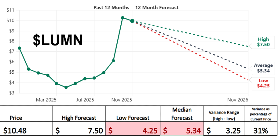
 There’s an old saying on Wall Street: “Nobody knows anything.” And looking at this chart, you can practically hear the analysts chanting it in unison, possibly while blindfolded and throwing darts at a pricing board. We’ve got Lumen sitting up here at $10.48, chest puffed out like a pigeon on a statue, and the highest analyst forecast they can muster is… $7.50. That’s almost three bucks lower. Imagine a weatherman predicting winter in July and calling it “reasonable guidance.”

But the real comedy act is in the spread. The optimistic crowd thinks the stock could cozy up just under eight bucks. The pessimists say it could belly-flop down to $4.25. That gap — $3.25 — represents 31% of the current price. If your GPS was off by 31%, you wouldn’t just miss your exit; you’d end up in another state explaining yourself to strangers.
In plain English: analysts are telling us the future of Lumen is anywhere between “respectable discount-bin comeback” and “please avert your eyes.” This isn’t analysis. It’s weather forecasting with a hangover.

The chart doesn’t predict the future. It simply warns: the range of outcomes here is extremely wide. If you’re in this stock, understand what game you’re playing. It’s not chess. It’s not checkers. It’s more like trying to ride a shopping cart down a hill — you might make it.

But you’d better be okay with how it ends.

52 Week High and Low Boundaries

Listen. Everyone says they want to be a smart trader — someone who “reads the market” with the keen eye of a hawk in a wind tunnel. But most traders just chase shiny things. They see a stock move and go, “Hey, that’s going up — lemme hop on!” like a dog spotting a squirrel.

Don’t be that trader.

You want to understand what you’re getting into. Not just the price. Not just the trend. The personality of the stock. The temperament. The way it moves when it gets punched in the face.

Which brings us to this 52-week range situation.

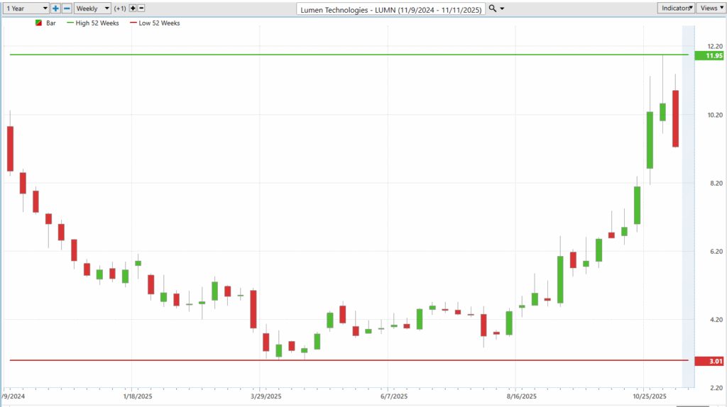
The stock is sitting at $10.48. Over the past year, the high was $11.95 and the low was $3.01.

The difference between high and low? $8.94. Which is 85% of the current price.

Think about that for a second:

If your car could swing 85% from lane to lane, they wouldn’t call you a driver. They’d call you a helicopter rescue incident. This number is your historical volatility.

It tells you: This stock doesn’t walk. It sprints, skids, spins, and sometimes trips over its own shoelaces.

Look at the past year of weekly bars.

For months, this thing looked like a screen door in a hurricane — flopping downward, sideways, wobbling, barely maintaining consciousness. Then suddenly — boom. Somebody plugged it into a light socket. Straight up, like it remembered it had somewhere important to be.

This is why we study the trajectory. Not to admire the shape of the curve like some chart-scented abstract art collector… but to understand how this beast reacts under stress, news, liquidity shifts, earnings cycles, and trader attention.

It was dead. It woke up. And it’s still twitching.

Earlier, we saw that the analyst forecast spread (high vs. low price targets) was $3.25, which was 31% of the current price.

Now we look at the historical volatility (85%).

If the analysts’ future expectations don’t match the actual historical personality of the stock, guess which one we believe?

The past behavior. Because it already happened.

Wall Street can fantasize about “stabilization” all day. But the stock has already shown you: It moves like a caffeinated badger.

Before you decide to trade this thing, ask yourself:

Are you built for an asset that can swing like this?

Because here’s the truth:

Profit comes from volatility. Pain also comes from volatility. The only difference is preparation.

If you size your position wrong? You get eaten alive.

If you size correctly, understand the range, and treat the volatility as the weapon instead of the enemy?

You get to be the one doing the victory lap.

Bottom line: trajectory matters because it reveals both direction and changes in character over time. Yet, while direction is important, historical volatility matters even more, it tells you how intense or unpredictable the ride can become. By comparing historical volatility to expected volatility, traders gain the critical perspective needed to manage risk and avoid becoming tomorrow’s cautionary tale.

Don’t just trade the ticker. Trade the volatility inside the ticker.

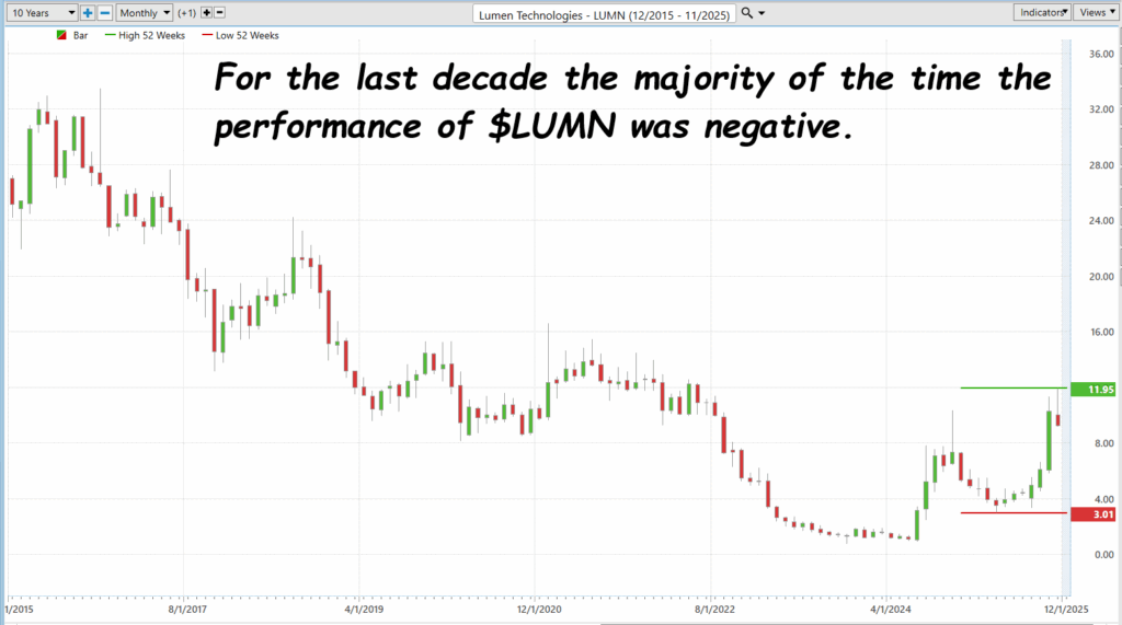
For ten long years, $LUMN has been like a ship taking on water — drifting lower, year after year, while investors prayed for a rescue that never came. Every rally turned out to be a mirage, every rebound another tease before the next slide. Now, though, the chart shows something different — a spark, a pulse, maybe even the start of a comeback story. But let’s be honest: Wall Street loves a good redemption arc, especially when it sells hope to the desperate. This could be the moment $LUMN finally turns the corner… or just another clever illusion dressed up as a turnaround.

Best-Case/Worst-Case Scenario Analysis

Volatility is one of those concepts that Wall Street loves to complicate — wrapping it in formulas, acronyms, and jargon until the meaning feels buried under a mountain of math. But at its core, volatility is simply about movement — how much an asset can rise or fall within a given time frame. The attached charts strip away the noise and bring the concept back to what really matters: the swings that define a trader’s reality.

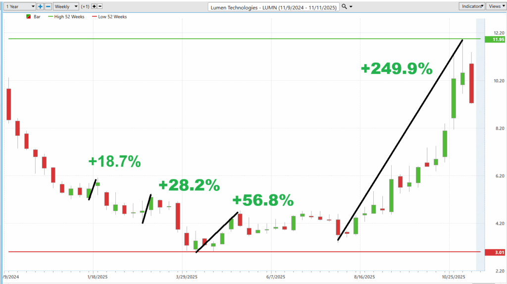
In the best case scenario we measure the largest rallies. We see Lumen Technologies (LUMN) at its most optimistic — rallies of +18.7%, +28.2%, +56.8%, and finally a staggering +249.9% surge. These aren’t just numbers; they represent bursts of momentum, driven by speculation, sentiment, and at times, sheer relief. The market doesn’t move in straight lines; it pulses, breathes, and reacts to new narratives. Each of those upswings tells a story of investors betting on a turnaround, seeing value where others see risk.

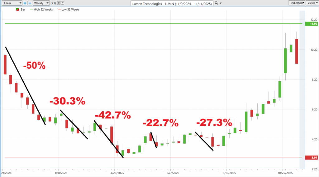
The second Worst-Case Scenario chart, though, reminds us that the ride works both ways. Declines of -50%, -30.3%, and -42.7% paint an equally vivid picture of the emotional and financial cost of volatility. When you put both images side by side, you get the essence of practical risk assessment: the best case and the worst case. Forget the academic definitions — this simple comparison reveals everything a trader or investor needs to know. It tells you how much pain you must endure for the chance of reward — and that, in the end, is what volatility is all about.

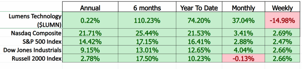
Here’s where the rubber meets the road. Once we’ve measured the swings, the emotional highs and the gut-punch lows — the next logical step is to stack $LUMN up against the broader market. And that’s exactly what this chart does. It’s not just a scoreboard; it’s perspective.

Look closely. Over the past six months, $LUMN has ripped 110.23% higher, outpacing the Nasdaq’s 25.44%, the S&P 500’s 17.15%, and even the Dow’s 13.01%. Year-to-date, the stock’s up 74.20%, while the big indexes are still jogging by comparison. Even on a monthly basis, $LUMN shows a solid 37.04%, leaving the rest of Wall Street looking like they’re standing still.

But here’s the kicker — look at that weekly column. Down -14.98%. That’s what volatility feels like in real time. You can’t have triple-digit gains without taking a few punches along the way. This snapshot reminds us that performance isn’t just about wins; it’s about surviving the pullbacks. In other words, if you’re going to dance with a fast mover like $LUMN, you better know the rhythm.

Vantagepoint A.I. Predictive Blue Line

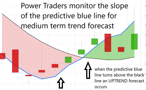
The VantagePoint A.I. Predictive Blue Line is not just another moving average, it’s a dynamic signal born from machine learning, designed to adapt as the market evolves. At its core, the Blue Line represents a forward-looking forecast of value, integrating intermarket data — currencies, commodities, interest rates, and correlated equities — to anticipate where price is likely to move next. It’s less about reflecting what has happened and more about predicting what comes next. That’s a subtle but powerful distinction — one that turns traditional technical analysis on its head.

When interpreting the Blue Line, the rulebook is refreshingly straightforward. If the predicted Blue Line crosses above the actual price, the trend is shifting higher. That’s the market’s way of whispering, “momentum is building.” Conversely, when the Blue Line dips below the actual price, it’s a warning shot — a signal that sentiment and probability are beginning to tilt lower. The key is consistency. Traders don’t chase every flicker of movement; they watch for sustained separations between the predicted and actual lines to confirm that a true directional shift is underway.

Trend identification, then, becomes a matter of discipline. The Blue Line isn’t about guessing tops or bottoms — it’s about aligning with the prevailing probability. When the predictive line rises steadily above price, the message is clear: stay with the uptrend until the data says otherwise. When it falls, step aside or consider the short side. In a world

where information overload often leads to indecision, the VantagePoint A.I. Predictive Blue Line cuts through the noise. It doesn’t promise perfection — but it does offer what every trader craves: a statistically grounded edge in a market built on uncertainty.

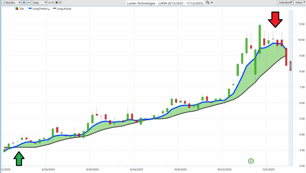
For short-term swing traders, the VantagePoint A.I. Predictive Blue Line provides a remarkably clear picture of where value is shifting before the market fully reacts. In this chart of Lumen Technologies ($LUMN), the blue line represents the predictive moving average—an adaptive signal generated from intermarket data. When the Blue Line rises above the actual price (highlighted by the green arrow), it marks the beginning of an upward shift in probability. Traders interpret this as a green light to align with the trend, not by chasing momentum, but by entering near points of value — when price retraces close to that blue predictive line. It’s less about guessing tops and bottoms, and more about participating in the middle of a move — where consistency lives.

As the chart progresses, the separation between the Blue Line and the actual price becomes a visual cue of strength — momentum accelerating as confidence builds. But near the red arrow, we see a clear inflection: the Blue Line flattens, and price begins to fall beneath it. For swing traders, that’s not panic — it’s information. The trend is losing steam, and what was once value may now be risk. This is where disciplined traders reassess: either take profits, tighten stops, or prepare for the next signal. In a world obsessed with noise and news, the Predictive Blue Line simplifies the task — it helps traders define value in real time and respond to change with data, not emotion.

VantagePoint A.I. Neural Index (Machine Learning)

Imagine, for a moment, a trading system that doesn’t just look at price, it thinks about it. That’s what a neural network does. It’s the market’s version of a brain — one that learns patterns, adapts to new information, and spots connections that human traders often miss. Each “neuron” in that network takes in data—price, volume, interest rates, even correlations with other markets—and passes it along to the next layer.

A neural network is basically a computer trying to think like a human — minus the bad habits, caffeine, and emotions. It’s built from layers of digital “neurons,” each one passing information to the next, like a chain of traders whispering hot tips — but these ones learn from their mistakes. Over time, the network starts to recognize patterns that no single person could ever keep straight — price behavior, momentum shifts, intermarket ripples — the whole noisy mess.

What makes it special is that it doesn’t follow rules; it finds them. A neural network teaches itself what matters by running the data over and over again until it can say, “Hey, this setup usually leads to a breakout,” or “That combination tends to end in a pullback.” It’s not magic, it’s math with intuition. And for traders, that’s the closest thing to having a co-pilot who’s been watching every chart on Wall Street, twenty-four hours a day, for decades straight.

Like the neurons firing in your head, each connection strengthens or weakens based on experience. Over time, the network becomes smarter, faster, and eerily good at spotting when momentum shifts before it’s obvious to everyone else.

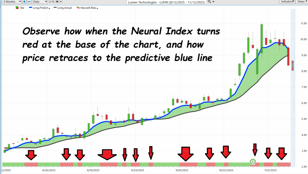
Now, look at this chart of Lumen Technologies ($LUMN). Those red and green bars at the bottom? That’s the neural index — its way of signaling short-term shifts in market momentum. When it flips from red to green, it’s like the network tapping you on the shoulder and saying, “Hey, the odds just changed.” And that’s the magic: it’s not predicting the future — it’s adjusting probabilities based on how thousands of interlocking variables interact. The goal isn’t to eliminate risk; it’s to make better decisions, faster. Think of it as having a second set of eyes on the market — ones that never blink, never sleep, and are always recalculating what comes next. For traders with short attention spans and shorter time horizons, that kind of edge is gold.

VantagePoint A.I. Daily Range Forecast

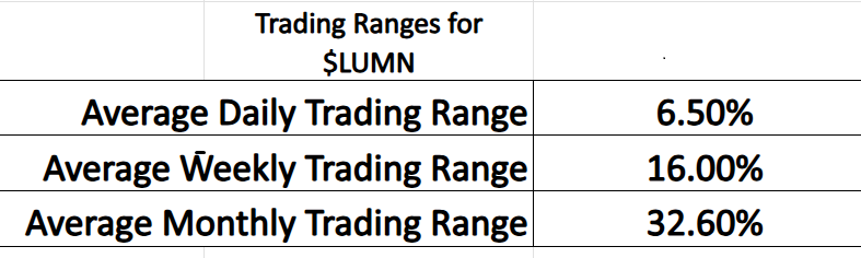
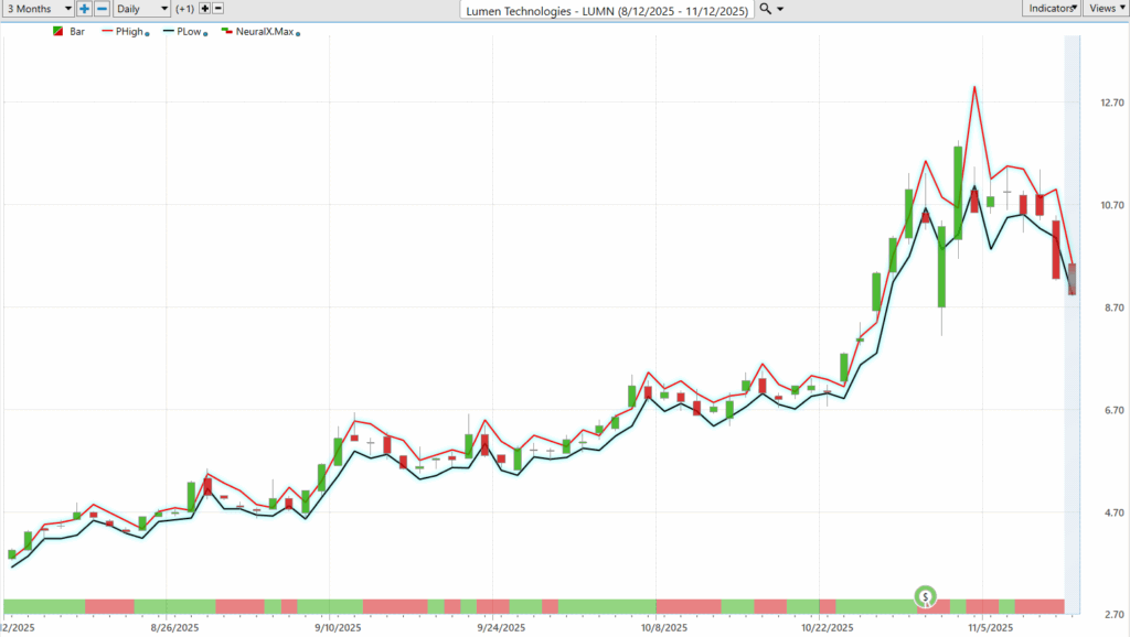
When $LUMN decides to move, it doesn’t ease into it like a polite guest at a cocktail party; it kicks down the door and makes an entrance. The data doesn’t lie — a 6.5% average daily trading range, 16% weekly, and a staggering 32.6% monthly. That’s velocity. It means traders can wake up rich or wrecked depending on whether they respected the range. Look at the chart — those tight red and black lines show the VantagePoint A.I. Daily Range Forecast, wrapping around each candle like guardrails on a mountain road. Step outside them without a plan, and you’re not trading — you’re gambling.

Here’s what separates pros from tourists: process. Every trader wants the same thing — a repeatable system that defines risk and opportunity before the chaos hits. That’s

exactly what this forecast can deliver. It doesn’t just predict where price might go; it draws the battlefield for you — the likely high, the probable low, and the danger zone in between. That’s not theory; it’s practical, actionable intel. Because in a market like $LUMN, if you don’t know your limits before the bell rings, the market will define them for you — in red ink.

The market doesn’t care about your expectations, it only rewards your awareness of reality. Great trading isn’t about predicting the future or clinging to hope; it’s about reading the room, taking what the market gives you, and leaving before the music stops. Every trend, every setup, every signal has a shelf life, and the traders who thrive are the ones who know when enough is enough. In the end, the market isn’t generous or cruel; it’s simply honest. It tells you what’s possible every day — you just have to be wise enough to listen and disciplined enough to take it.

Intermarket Analysis

Intermarket analysis, in plain English, is how smart traders connect the dots. It’s like watching how a thunderstorm over one town can change the wind in another. In the markets, everything is connected — stocks, bonds, commodities, and currencies all move in their own rhythm, but they influence each other constantly. When interest rates rise, money gets more expensive. When oil jumps, shipping costs soar. When the dollar climbs, exports slow. So, a good trader doesn’t just stare at one chart, they zoom out and see the bigger picture. That’s what intermarket analysis is: understanding how one part of the

economy pushes or pulls on another so you can be one step ahead when the storm changes direction.

Now let’s put that into practice with Lumen Technologies ($LUMN). The stock’s been on a wild ride — up big when the A.I. buzz hit, now back near $9 after a Citi downgrade. Here’s what’s driving it: when bond yields go up, $LUMN usually goes down. Why? Because the company’s carrying $18 billion in debt, and higher rates make that mountain more expensive to manage. When the Fed pauses or cuts rates, traders cheer, and the stock can bounce hard. On the flip side, tech stocks are its best friends — when companies like NVIDIA or Amazon rally, LUMN often gets an even bigger boost since it sells the fiber that powers their data centers. Oil prices matter too — higher energy costs can hurt profits — but stable copper prices actually help, since copper is used to build the networks. Finally, the U.S. dollar doesn’t move the needle much for now, since most of LUMN’s business is in the States.

For traders, the setup is simple: buy when yields drop and A.I. demand heats up, especially near $9. If rates rise again, don’t hang around — get out before the market tells you to. That’s the way to think about intermarket analysis, connect the forces, respect the trends, and never forget that every price move has a reason written somewhere else in the economy.

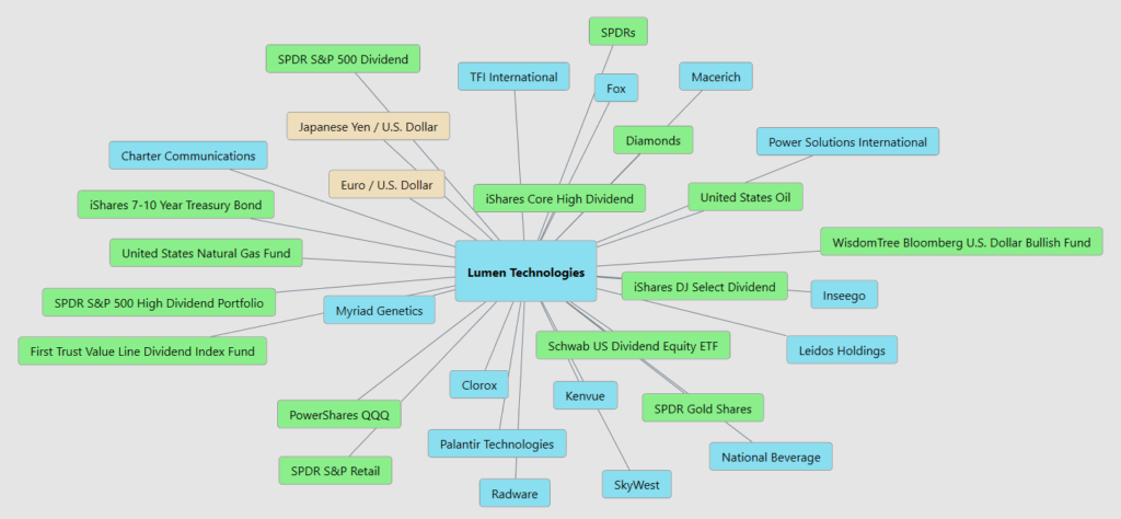
Here are the 31 key drivers of price for $LUMN.

What you’re looking at here is the bigger picture behind Lumen Technologies ($LUMN), the web of forces that quietly push and pull on its price every single day. This is the heartbeat of intermarket relationships. When bond yields move through the iShares 7–10 Year Treasury Bond, it ripples straight into Lumen’s debt load. When oil and natural

gas spike, it pressures costs. The U.S. dollar, reflected here through ETFs like the WisdomTree Bloomberg U.S. Dollar Bullish Fund, shapes competitiveness and investor appetite. Then you’ve got the equity side — the SPDR S&P 500 Dividend, Schwab US Dividend ETF, and even tech names like Palantir — all swimming in the same current of risk-on or risk-off sentiment. What this chart tells you, plain and simple, is that Lumen doesn’t move alone. It’s part of a living ecosystem of assets and signals. Understand those connections, and you stop trading in the dark — you start trading with the market’s rhythm.

Our Suggestion

Lumen Technologies’ last two earnings calls revealed a company deep in reconstruction mode. Under CEO Kate Johnson, the mission is clear: tear out the rot, modernize the foundation, and stop lighting money on fire.

The Q2 results showed just how much work remains, revenue slipped to $3.09 billion, losses widened to $915 million, and cash flow turned negative as legacy telecom services continued to erode. Yet there were early steps toward triage: the planned $5.75 billion sale of its fiber-to-home business to AT&T, ongoing cost-cutting, and refinancing moves to push debt maturities further out. By Q3, Johnson’s message shifted from survival to progress. Lumen reported a modest improvement and a surprising $1.6 billion in free cash flow, aided by strong enterprise fiber demand and over $1 billion in new private connectivity deals.

Still, this is less a turnaround than a renovation. The company’s “strategic transformation” is an admission that it inherited a structure built on outdated services, bloated costs, and more than $18 billion in debt. Johnson’s talk of “operational discipline” and “digital efficiency” translates into a simple reality: fix the leaks before chasing growth. Refinancing efforts have trimmed interest expenses by about $135 million annually, but profitability remains elusive, and the balance sheet continues to creak under leverage. Each quarter is a balancing act between funding new opportunities in A.I.-driven enterprise networking and managing the slow bleed of its legacy business lines.

The challenge now is endurance. Lumen’s future depends on whether it can stay solvent long enough for the transformation to bear fruit. Free cash flow improvements and new contracts are encouraging, but the debt clock is still ticking, and investor patience has limits. Johnson has exposed the mold and started the rebuild; what remains to be seen is whether the repairs can make the house livable again — or whether the structure gives way first. In the end, Lumen’s story hinges on one simple test: can this company become profitable and restructure its debt before time runs out?

Place $LUMN on your trading radar. It will create numerous trading opportunities in the months ahead. Use the VantagePoint A.I. Daily Range Forecast for short-term trading opportunity analysis.

Practice great money management on all your trades.

Let’s Be Careful Out There.

Disclaimer: THERE IS A HIGH DEGREE OF RISK INVOLVED IN TRADING. IT IS NOT PRUDENT OR ADVISABLE TO MAKE TRADING DECISIONS THAT ARE BEYOND YOUR FINANCIAL MEANS OR INVOLVE TRADING CAPITAL THAT YOU ARE NOT WILLING AND CAPABLE OF LOSING.

VANTAGEPOINT’S MARKETING CAMPAIGNS, OF ANY KIND, DO NOT CONSTITUTE TRADING ADVICE OR AN ENDORSEMENT OR RECOMMENDATION BY VANTAGEPOINT AI OR ANY ASSOCIATED AFFILIATES OF ANY TRADING METHODS, PROGRAMS, SYSTEMS OR ROUTINES. VANTAGEPOINT’S PERSONNEL ARE NOT LICENSED BROKERS OR ADVISORS AND DO NOT OFFER TRADING ADVICE.

Categories
Stocks Weekly Stock Study

VantagePoint A.I. Stock of the Week Hecla Mining ($HL)

This week’s ai stock spotlight is Hecla Mining ($HL)

Hecla Mining is not just another name in the precious metals space. It is, in fact, the largest primary silver miner in North America. That distinction carries enormous weight in today’s markets. Over the past two decades, countless mining companies operating in developing countries have faced a recurring problem: governments demanding a bigger slice of the pie. In some cases, that has meant giving away strategic metals at below-market prices. In others, it has meant strict export controls or outright nationalization — policies designed to keep silver, gold, copper, and other resources inside national borders rather than allowing them to flow freely to global markets. 

By contrast, Hecla’s portfolio is anchored in the United States and Canada. Its mines — Greens Creek in Alaska, Lucky Friday in Idaho, Casa Berardi in Québec, and Keno Hill in the Yukon — are all located in jurisdictions with stable legal frameworks, reliable infrastructure, and a rule of law that protects both shareholders and long-term investments. That means traders don’t have to discount Hecla’s silver for political risk, nor worry about sudden government edicts siphoning away value. 

For precious metals traders, this is a super big deal. Hecla offers direct exposure to silver prices without the geopolitical haircut. It is silver that is mined, sold, and priced in transparent markets — an essential feature at a time when resource nationalism is on the rise globally. In a world where stability is becoming as valuable as the metals themselves, Hecla’s North American footprint is not just a geographic detail. It is one of the company’s most strategic advantages. 

Hecla Mining has been around since 1891, founded in the rough mining camps of Idaho, and it’s still standing tall more than 130 years later. Headquarters in Coeur d’Alene, Idaho. About 1,830 employees. And four profit centers that actually produce. That’s not a story stock — that’s real ore coming out of the ground every single day. 

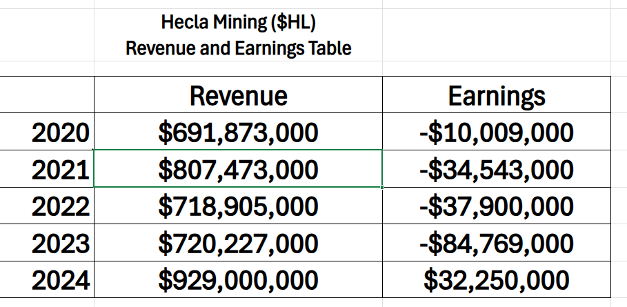
The revenue and earnings graphic lays out a clear turnaround story for Hecla Mining ($HL). From 2020 through 2023, the company struggled, piling up nearly $135 million in cumulative losses despite steady revenue. But 2024 marked a decisive shift: revenue surged to $929 million and earnings swung positive to $32.25 million. That strong performance, coupled with record results in the most recent quarter, has forced Wall Street to re-evaluate the company. Where once investors saw a chronic underperformer, many now see a miner finally hitting its stride — and believe that much brighter days may lie ahead for $HL. 

Now here’s the kicker: this year, Hecla didn’t just tread water. It exploded. In Q2 2025 they dropped record revenue of $304 million, $58 million in net income, and $133 million in adjusted EBITDA. Lucky Friday hit a new milling record. Greens Creek reaffirmed guidance with costs under control. Keno Hill finally posted its first profitable quarter. Management got on the earnings call and didn’t need hype, they just laid out the numbers, reaffirmed guidance, and let the scoreboard do the talking. Traders love that. 

So, why’s the stock ripping higher, more than doubling in 2025? Simple. Silver’s been on a tear this year, and Hecla is the largest silver producer in the U.S. and Canada. They’re the liquid, North American proxy for silver. Funds need exposure? They buy $HL. Add in proof of execution — Lucky Friday and Greens Creek humming, Keno Hill finally delivering — and you get a runaway rally. Throw in momentum funds and retail traders piling on once the breakout started, and you’ve got liftoff. 

But don’t kid yourself. This isn’t a free lunch. You’ve got to know the fine print. Hecla’s strength is in its capital structure — net leverage below 1x, balance sheet cleaned up, cash flowing. You’ve got the jurisdictional advantage — all mines in the U.S. or Canada, not some unstable regime halfway around the world. And you’ve got an exploration pipeline feeding the future. All good. But Casa Berardi has a looming production gap after 2027, and Keno Hill’s full ramp depends on permits and infrastructure that don’t come overnight. Those are the cards on the table. 

Here’s the real trader’s edge: $HL trades like a leveraged bet on silver. When silver jumps 10%, Hecla can move 20–30%. Same on the downside. That’s why pros love it. It’s volatile, it’s liquid, and it’s tightly wired into the metal itself. Catalysts are clear: the next Keno Hill milestone, Casa Berardi’s long-term plan, and ETF flows into silver. Layer in the macro story — Fed policy, real yields, currency debasement — and you’ve got a stock at the intersection of execution and a monster commodity cycle. 

Bottom line: Hecla isn’t just another mining stock. It’s the silver barometer for North America. Traders who get that — who know the company’s history, its profit centers, its balance sheet, and the risks — are the ones who won’t just chase the chart. They’ll trade it with conviction, backed by both fundamentals and the technicals that scream momentum. Winners keep winning. $HL has proven it this year. The question now is whether you’re sharp enough to ride it, or just another bystander watching history pass you by. 

In this stock study, we’ll analyze the key indicators and metrics that guide our decisions on whether to buy, sell, or stand aside on a particular stock. These inputs serve as both our framework and behavioral compass, rooted in data and powered by predictive intelligence.  

  • Wall Street Analysts Ratings and Forecasts 
  • 52-Week High and Low Boundaries 
  • Best Case/Worst-Case Analysis 
  • VantagePoint A.I. Predictive Blue Line  
  • Neural Network Forecast (Machine Learning) 
  • VantagePoint A.I. Daily Range Forecast 
  • Intermarket Analysis 
  • Our Suggestion 

While our decisions are ultimately anchored in artificial intelligence forecasts, we briefly review the company’s fundamentals to better understand the financial environment it operates in. For $HL this context helps us assess the quality of the A.I. signal within a broader economic and industry backdrop. 

Wall Street Analysts Forecasts

Wall Street’s forecasts for Hecla Mining ($HL) over the next 12 months tell a fascinating story. Analysts see a high target of $12.50, a low of $6.50, and a median of $8.18, with the stock currently trading near $10.18. That’s a spread of $6.00, or about 59% variance relative to today’s price. Now, here’s the secret: that variance is not just guesswork. It’s the market whispering to us about what’s already “baked in.” Analysts aren’t simply tossing darts at a board — they’re modeling future volatility, and that wide gulf between bullish and bearish tells us $HL will not be a sleepy ride. 

This is what we always advise traders to watch like hawks: the variance range. Forget obsessing over whether the median forecast is right or wrong. What matters most is the distance between the most optimistic and the most pessimistic projections. That spread is the market’s early-warning system. It represents the volatility moving forward, the expected turbulence you can harness — or be crushed by. For disciplined traders, that’s not something to fear. It’s something to embrace. Volatility is opportunity, if you respect it. 

So, when you see a 59% baked-in variance on $HL, understand what’s at stake. This isn’t a company Wall Street thinks will meander sideways. It’s a name that traders believe will test conviction — on both the upside and the downside. The winners will be those who prepare, manage risk, and ride the swings with eyes wide open. 

52 Week High and Low Boundaries

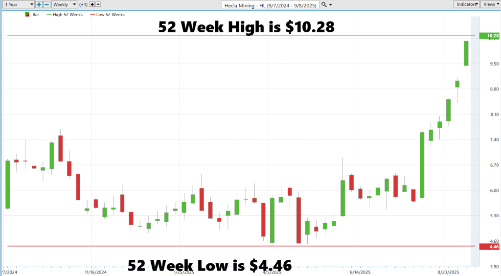
The attached graphic highlights a central truth about Hecla Mining ($HL): volatility has defined its past year. The spread between the 52-week high of $10.28 and the 52-week low of $4.46 is a staggering $5.82, equal to roughly 57% of the current share price. That variance is more than just a number — it is the stock’s historical volatility, the lived experience of traders and investors who have watched the stock swing almost six dollars from trough to peak in just 12 months. It underscores why silver miners, and Hecla in particular, are considered leveraged bets not just on commodities, but on the sentiment surrounding them. 

Traders pay close attention to these 52-week boundaries because they serve as both psychological markers and technical guardrails. The low becomes a test of resilience: if broken, confidence falters. The high becomes a ceiling: if surpassed, it signals strength and triggers momentum buying. In Hecla’s case, the fact that the stock is currently trading within 98.3% of its 52-week high suggests something significant — investors are not just cautiously optimistic, they are leaning heavily into the bull case, forcing the stock to challenge and potentially redefine its upper boundaries. 

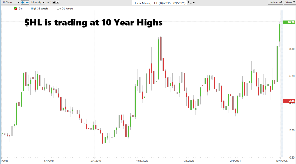
What makes this moment for $HL so potentially explosive is not simply that it is pressing on a 52-week high. It is that the stock is simultaneously breaking into 10-year highs, a rarity that traders interpret as a signal of structural strength rather than a short-term rally. When a stock overcomes both near-term and long-term barriers, it communicates something profound: management is delivering, the market is rewarding, and the path forward is being rewritten in real time. For Hecla, a company with over a century of history, this breakout carries a symbolic weight — it is a reminder that even old warhorses can enter new phases of growth when the conditions align. And for traders, it’s a moment to pay attention, because history suggests that when highs fall, momentum often builds into something much larger. 

We also advise zooming out and studying the 10-year chart to better understand the long term trajectory that the stock has had. 

Best-Case/Worst-Case Scenario Analysis

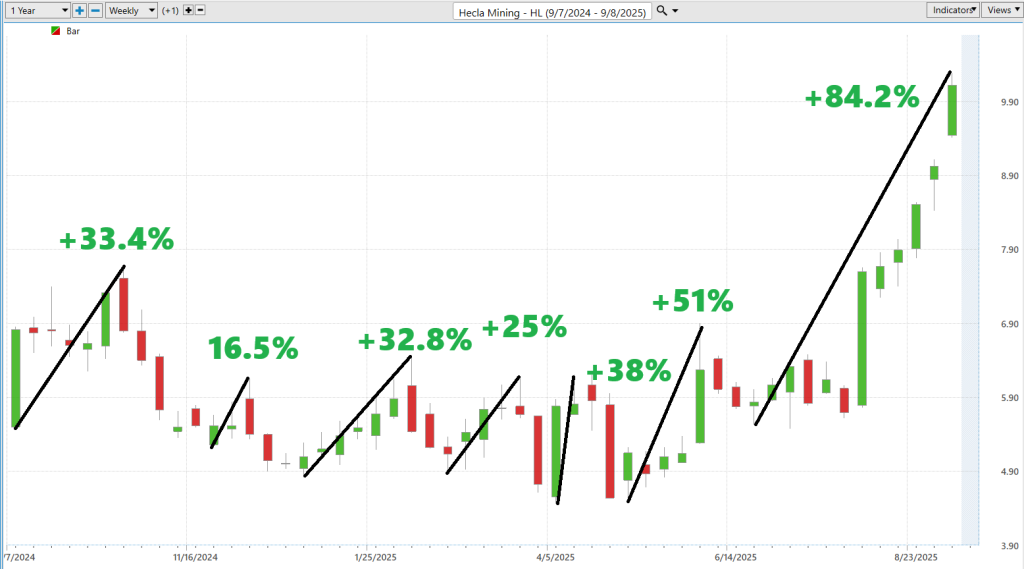
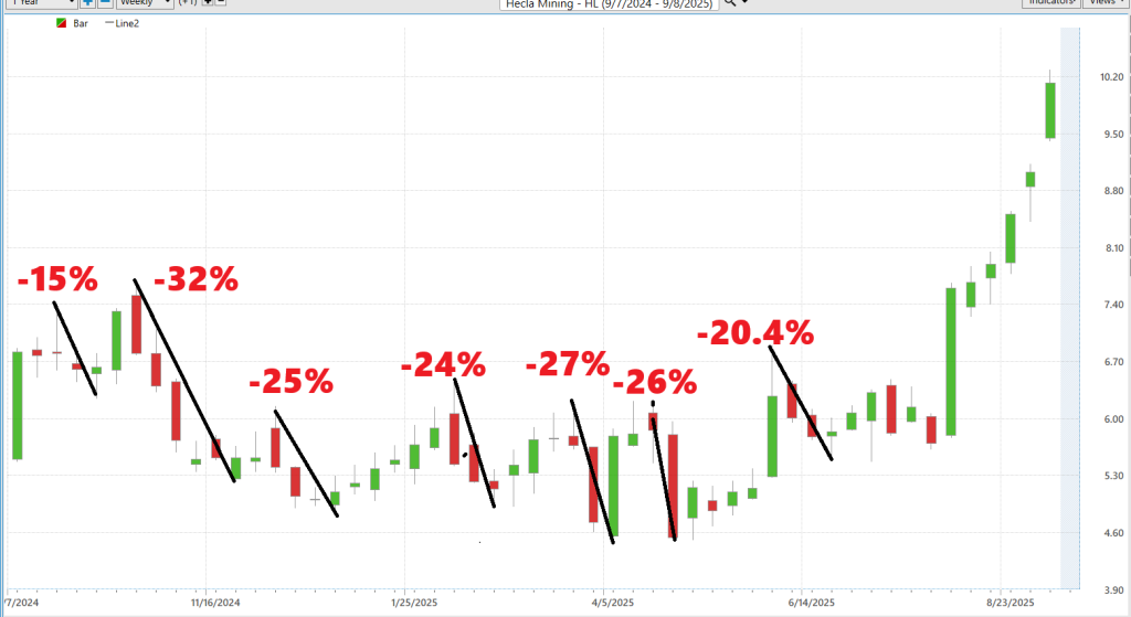
What these two charts reveal about Hecla Mining ($HL) is the kind of truth most traders ignore until it’s too late. Over the past year, this stock has staged six separate rallies, ranging from +16% to a jaw-dropping +84%. That is raw, undeniable evidence of upside potential. Not theory. Not prediction. Proof. And yet, alongside every one of those surges, the charts also record the punishment: sharp, uninterrupted declines of -20%, -25%, -32% or more. These swings are not noise — they’re the rhythm of the stock. The heartbeat of volatility. 

Here’s why this matters: every trader wants opportunity, but few respect the cost of admission. $HL delivers both in abundance. Its rallies show you the power of catching the right wave. Its declines show you the consequence of mistiming the tide. Together, they paint a brutally honest picture of what’s at stake. You can’t erase the risk — but you can harness it. That’s the secret. The biggest winners aren’t the ones who avoid volatility; they’re the ones who prepare for it, plan for it, and profit from it. 

We start by measuring the magnitude of the rallies. 

Then we compare to the magnitude of the declines:

So, take these charts for what they are: your unvarnished guide to trading $HL. They kill delusion, strip away hype, and hand you the truth on a platter. This stock can soar 80%+ in a single stretch. It can also crater 30% without blinking. That’s the real-world range of motion. That’s the baked-in volatility. And for traders who want both excitement and opportunity, $HL isn’t just another silver miner. It’s a proving ground. Respect the swing, and it can reward you handsomely. Ignore it, and it will humble you just as fast. 

Next, we compare $HL to the broader stock market averages: 

The beauty of a chart like this is that it cuts through the noise. No theories. No hype. Just the raw scoreboard. And what the scoreboard says is undeniable: Hecla Mining ($HL) is massively outperforming every major index. Over the past year, while the S&P 500 gained 18.5% and the Nasdaq climbed 28.5%, $HL surged nearly 79%. Stretch that to six months, and Hecla delivered a breathtaking 97.7%, compared to just 25% for the Nasdaq. Even week by week, the stock is clocking gains that leave the Dow, S&P, and Russell in the dust. 

That’s what I call proof. Proof that something extraordinary is happening here. Traders don’t need to guess. The evidence is in black and white. When a stock beats the market averages by a factor of three, four, or even seven, it’s not luck — it’s momentum, fundamentals, and money flows converging into one irresistible force. That’s why the pros pay attention to relative strength. Because winners like this tend to keep winning, and you either ride them… or you watch others do it without you. 

So, if this graphic does its job, it should trigger one response in you: curiosity. Curiosity about why $HL is crushing the Nasdaq, the S&P, and the Dow so decisively. Curiosity that leads you to put this stock on your radar. Because in trading, the numbers don’t lie — they persuade. And the numbers here are screaming that Hecla Mining isn’t just another miner. It’s a market leader in motion. 

Vantagepoint A.I. Predictive Blue Line 

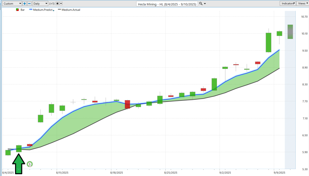
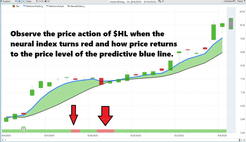
What you’re looking at here is one of the most remarkable stretches in Hecla Mining’s ($HL) recent history. In just five and a half weeks, the stock rocketed from $6.14 to $10.18 — a gain of nearly 66%. That’s not the kind of move you stumble into by accident. It’s the kind of run that can make or break a trading quarter. 

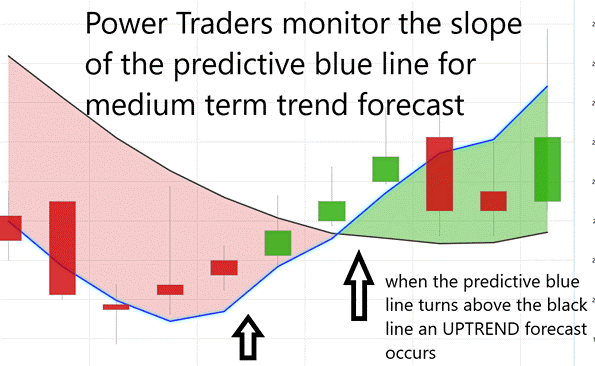
The golden rule of trading with the VantagePoint Predictive Blue Line is simple: when the blue line crosses above the black line (the actual moving average), it signals a shift to an uptrend — that’s your entry or confirmation to go long. When the blue line crosses below the black line, it indicates a likely downtrend, warning you to exit longs or consider shorts. The key is discipline: you don’t second-guess the signal, you align with it. Stay in trades as long as the predictive blue line holds its position relative to the black line, and let it guide you through short-term noise so you can ride the larger trend with confidence.

Now, here’s the critical part: the A.I. didn’t just participate in this move — it caught the entire thing. Look closely at the chart. The green arrow marks the moment when the predictive blue line crossed above the actual line, signaling the start of a bullish shift. From that point on, the blue line consistently guided traders upward, keeping them in the trade as the stock climbed week after week. Even during minor red days, the predictive signal held, reinforcing conviction when it was easiest to second-guess. 

By the time $HL hit $10.18, the AI had captured the entire rally from the ground floor to the peak. That’s not hindsight, that’s foresight. For traders, this chart isn’t just evidence of a great stock run — it’s proof of what happens when advanced forecasting tools meet disciplined execution. The result? A front-row seat to one of the most powerful rallies in the silver sector this year. 

Neural Network Forecast (Machine Learning)

A neural network in trading is, at its core, an attempt to replicate how the human brain processes information — only with infinitely more data, and without fatigue or bias. It’s constructed with layers of interconnected “neurons” that take in vast amounts of market data – price histories, intermarket relationships, technical indicators, even global correlations — and pass them forward, adjusting the weight of each input until the system can recognize patterns invisible to the human eye. The result isn’t a crystal ball, but rather a probability-driven forecast: a signal designed to help traders cut through noise and improve decision-making by focusing on where the odds are stacked. 

The graphic below illustrates this point vividly. The neural index, a short-term forecasting tool derived from such a network, turned red — a warning that weakness was likely to develop over the next 48 to 72 hours. And that’s exactly what played out. Price softened, trading below the predictive blue line, which itself acts as a dynamic forecast of trend direction. In other words, the neural network flagged the coming shift before it showed up in price action. For traders, that’s not just a technical curiosity; it’s actionable intelligence. It allows them to adjust expectations, tighten risk, and be ready for near-term turbulence even while the broader trend remains intact. 

What we’re seeing here is the fusion of technology and trading discipline. By highlighting the moments when momentum falters — well before it becomes obvious on the chart — the neural index gives traders the ability to anticipate instead of react. And in markets like silver miners, where volatility is both opportunity and risk, that anticipatory edge can mean the difference between catching the wave and being crushed by it. 

VantagePoint A.I. Daily Range Forecast

What all traders want — without exception — is a clear method of knowing where the risk and where the opportunity exists every day. Without that knowledge, trading becomes guesswork; with it, trading becomes strategy. 

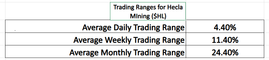
Folks, let’s be clear: the graphic above lays out the undeniable truth about Hecla Mining ($HL) — this is a stock that moves, and it moves big. On average, $HL swings 4.4% in a single day, 11.4% in a week, and an astonishing 24.4% in a month. That is volatility supercharged compared to the broader market. And here’s the point — those ranges aren’t just numbers; they represent both the risk and the remarkable opportunity in trading this stock. Traders must understand it’s precisely this kind of movement that demands discipline, proper position sizing, and respect for risk. 

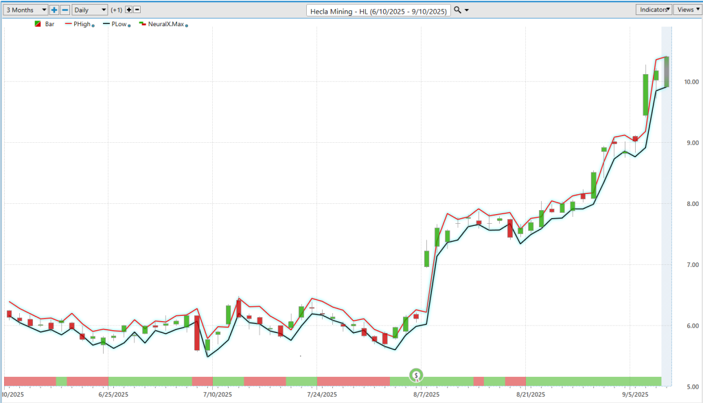
Now, the second chart drives it home. The VantagePoint Daily Range Forecast shows traders the expected highs and lows for each trading day. And what do we see? Accuracy — day after day, the price action of $HL falls neatly inside that forecasted range. That kind of precision is a tremendous advantage. Instead of guessing where the market might turn, traders have a roadmap: buy near the forecasted lows, take profits or protect capital near the highs, and manage stops with confidence. 

Put together, these two visuals tell a powerful story. Yes, $HL is volatile. But that volatility is measurable, and with the right tools, it’s tradable. The average ranges prove the magnitude of opportunity, while the daily forecast shows you exactly how to navigate it. For traders, this isn’t chaos — it’s clarity, and it’s the difference between being tossed around by the market and using volatility to your advantage. 

Intermarket Analysis

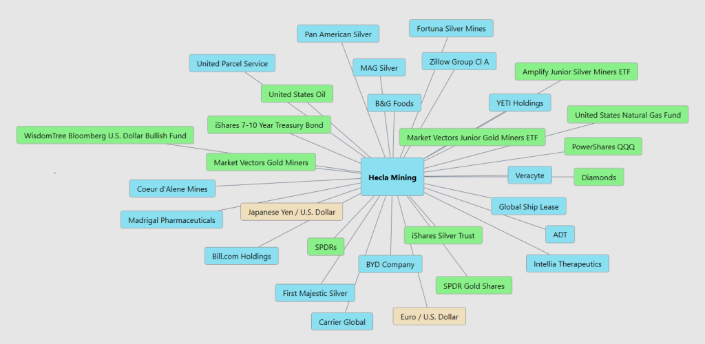
What drives Hecla Mining isn’t just about silver pulled from the ground. It’s about the big forces moving the entire marketplace.

You’ve got the obvious ones: the price of precious metals, investor appetite for gold and silver, and the relentless tug-of-war between the U.S. dollar and global currencies. When the dollar strengthens, it squeezes commodities; when it weakens, metals often shine. Then there are energy costs—oil and natural gas—critical inputs that can make or break mining margins.

Beyond that, the story is shaped by broader markets—Wall Street indexes, exchange-traded funds, and the performance of peers across the mining sector. Add in global demand trends, interest rates, and bond markets, and you have the financial crosscurrents that push this company’s stock higher or drag it lower.

And finally, let’s not overlook the intangibles: investor sentiment, speculation, and the hunger for safe havens when uncertainty strikes. Together, these events, cycles, and capital flows form the real price drivers for Hecla Mining.

Here are the 31 key drivers of $HL price action:

 Our Suggestion

Hecla’s inclusion in the S&P SmallCap 600 is no accident — it’s the market’s recognition that America’s largest silver producer has leveled up. They’ve earned it with operational strength, consistent execution, and a balance sheet that’s positioned to ride the next big wave. Index funds and institutions are about to pile in, bringing more liquidity and credibility with them. That’s a powerful tailwind for a stock that’s already outpacing every major benchmark this year. 

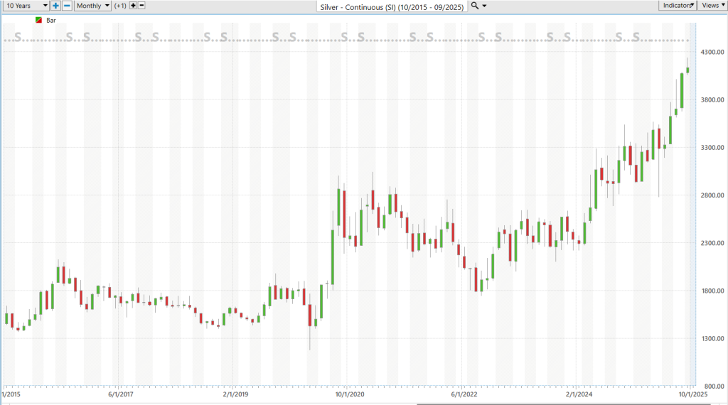
Study the chart of Silver ($SI) over the last decade.  When I study it, I remain very bullish. 

And here’s the bigger picture: silver is the only precious metal that still hasn’t broken through its 1980 high of $50 an ounce. Gold, platinum, palladium — all of them have already rewritten their records. Silver traders see that gap not as weakness, but as the ultimate setup. Industrial demand keeps growing, monetary demand is heating up, and sentiment is shifting. Silver isn’t just undervalued — it’s coiled like a spring, ready to explode higher. 

Put those two forces together — Hecla’s rising prominence and silver’s historic undervaluation — and you have a story that every serious trader should be watching. But let me leave you with this: opportunity means nothing without discipline. Volatility cuts both ways, and silver stocks like $HL can hand you massive gains or gut-wrenching losses depending on how you manage them. So, practice good money management on every trade. Respect the swing, size your positions wisely, and you’ll give yourself the chance to not just ride history — but profit from it. 

Let’s be careful out there. 

It’s not magic. 

Disclaimer: THERE IS A HIGH DEGREE OF RISK INVOLVED IN TRADING. IT IS NOT PRUDENT OR ADVISABLE TO MAKE TRADING DECISIONS THAT ARE BEYOND YOUR FINANCIAL MEANS OR INVOLVE TRADING CAPITAL THAT YOU ARE NOT WILLING AND CAPABLE OF LOSING.

VANTAGEPOINT’S MARKETING CAMPAIGNS, OF ANY KIND, DO NOT CONSTITUTE TRADING ADVICE OR AN ENDORSEMENT OR RECOMMENDATION BY VANTAGEPOINT AI OR ANY ASSOCIATED AFFILIATES OF ANY TRADING METHODS, PROGRAMS, SYSTEMS OR ROUTINES. VANTAGEPOINT’S PERSONNEL ARE NOT LICENSED BROKERS OR ADVISORS AND DO NOT OFFER TRADING ADVICE.

Categories
Stocks Trading Strategy

How Reliable is Government Data? Trading Strategies for the New Cost of Living Economy 

The headlines tell one story. Your wallet tells another.  

“Inflation is cooling,” the reports declare, but your grocery bill, rent, and utilities haven’t gotten the memo. If anything, the numbers on the receipt seem bolder every month. For traders, that gap between the official narrative and the lived experience isn’t just frustrating, it’s dangerous. 

The problem is that the most-watched measures of the economy — CPI, PPI, and jobs data — aren’t neutral scorekeepers. They’re built on methodologies that can shift with political winds, subject to revisions that sometimes erase hundreds of thousands of jobs from the record, and almost always lag the reality on the ground. That means by the time you see the number, the market may have already moved — leaving you trading on a picture that’s not just incomplete, but potentially misleading. 

In a market where speed, accuracy, and context are everything, traders can’t afford to take government data at face value. The disconnect between “official” inflation and actual inflation isn’t just a talking point — it’s a source of risk and opportunity. The question is whether you’re positioned for one or blindsided by the other. 

The Consumer Price Index is designed to track the cost of living, but the methodology often underplays the pressure consumers feel. Substitution allows cheaper goods to replace more expensive ones in the basket. Weighting assigns less influence to certain high-cost categories. And hedonic adjustments — factoring in “quality improvements” — can reduce the reported price of an item even when the sticker price climbs. 

Employment figures carry their own caveats. This year, the National Bureau of Economic Research quietly removed hundreds of thousands of jobs from earlier reports. Those revisions ripple through other data sets, distorting income, spending, and productivity readings. 

Gross Domestic Product and productivity measures aren’t immune either. They depend on inputs like trade flows, inventory levels, and corporate investment data — each with its own margin for error. 

And then there’s the timing problem. By the time CPI, jobs, or GDP reports are released, markets have often already moved on leaked expectations or private forecasts. For traders, that lag means the official number is rarely the first — or most accurate — signal. 

The real issue with government data isn’t math. It’s human nature. 

In a perfect universe — somewhere far, far away from Washington — numbers would be pure. Facts would be objective. “Two plus two” would never need a press conference to explain why it’s suddenly five. But here on Earth, objectivity is a rare bird… and in politics, it’s on the endangered species list. 

In politics, everything is either a popularity contest or a quest for more power. Often both. And when you hand the people in charge of winning those contests control over the nation’s official “weights and measures,” you might as well give a fox the key to the henhouse. Not only will the numbers change, they’ll change fast, dramatically, and always in whatever direction makes the fox look good. 

Nobody trusts government data anymore. Not really. They may nod at the headlines, but deep down, they know the game. The Bureau of Labor Statistics doesn’t exist to make you a better-informed citizen — it exists to make politicians look like they’re steering the ship straight. 

What’s the fix? Rip the ruler out of the government’s hands. Let the private sector measure and report the numbers. Yes, it sounds radical. But if it happened, the grandstanding would vanish faster than a senator at a budget meeting. Without control over the scoreboard, government officials would have to focus on actual results instead of manipulating the perception of them. 

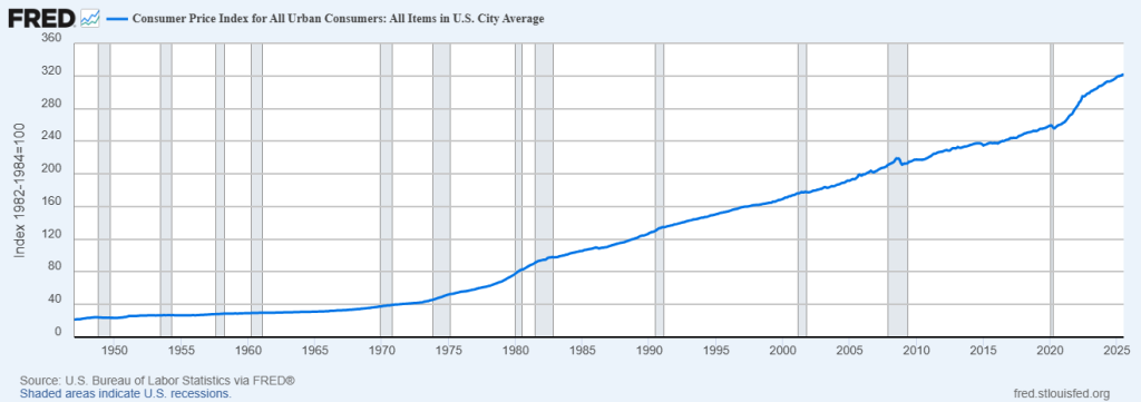
Right now, we’ve got a bureaucratic class whose primary job is to keep their political bosses looking sharp, not to keep the data clean. Case in point: the latest CPI number 2.7% inflation. Everyone’s thrilled. Cue the victory laps on cable news. 

But here’s the thing — when I look at my own expenses, the ones hammering my savings — insurance, food, utilities, property taxes — they’re up way more than 2.7%. And of course they are. Because the government doesn’t track the full scope of what’s killing your wallet. If it did, that number wouldn’t fit the narrative. 

The truth is, they’re not measuring your inflation. They’re measuring the version of inflation that makes them look good. 

Allowing the government to “accurately” report on its own economic progress is like letting a kid who hates school grade his own report card — and hand out the honor roll certificates while he’s at it. Suddenly, math isn’t a C-minus, it’s “Advanced Quantitative Problem-Solving Excellence.” Science isn’t a D — it’s “Innovative Independent Inquiry.” And gym? “Presidential Physical Fitness Award,” of course. 

That’s exactly how it works with economic data. The scoreboard isn’t there to measure reality, it’s there to make the player look good. Numbers get “adjusted,” definitions get “updated,” and anything inconvenient gets shoved into the “seasonal adjustment” closet until nobody’s looking. 

And just like that kid, the government learns quickly: if you control the grading, you control the story. Inflation suddenly “isn’t that bad,” unemployment “is holding steady,” GDP “is stronger than expected.” But the fridge is still empty, the rent’s still higher, and the bills keep coming. 

The fix? You don’t let the kid grade his own papers. You hand the red pen to someone who isn’t invested in the outcome, someone who doesn’t care if the grade stings. Same with the economy: take the ruler away from the people being measured. Put it in the hands of independent, private-sector watchdogs with no skin in the political game. 

Until then, we’re all just parents at a conference listening to little Johnny explain why the dog ate his math homework… and wondering why our grocery bill feels like an F when the government swears it’s an A+. 

The reason this is important is because on August 1, 2025, President Trump fired BLS Commissioner Erika McEntarfer within hours of the release of a weak July jobs report and significant downward revisions to earlier months. He accused her — without evidence — of manipulating data to undermine him politically. The move prompted widespread alarm from current and former BLS staff, economists, and data objectivity advocates, who warned it threatens the independence and credibility of a traditionally apolitical, scientifically grounded agency 

Alright, let’s talk about government data — that wondrous cascade of “facts” issued daily from the Ministry of Mathematical Confusion. Our elected officials, economists, and bureaucrats would have you believe they’re handing us the unvarnished truth, when in reality it’s closer to one of those cereal-box riddles — except the prize inside is more obfuscation, not a decoder ring. 

Let’s start with the jobs report, the government’s monthly exercise in mass delusion. The Bureau of Labor Statistics will solemnly announce we “added” 200,000 jobs but forget to mention they also quietly subtracted 150,000 jobs from last month’s total because, whoops, turns out those weren’t real. That’s not a “revision,” that’s retroactive gaslighting. Imagine your bank telling you last month’s deposit wasn’t actually there — and could you please stop asking about it? 

Then we have inflation data, otherwise known as the Consumer Price Index (CPI), which somehow manages to track the cost of living while leaving out the things that actually determine the cost of living — like food, housing, and energy. It’s like saying the Titanic didn’t really sink because the deck chairs stayed afloat. And just when you think you’ve got the number, they’ll seasonally adjust it, which is Washington’s way of saying “we don’t like how this looks, so we gave it a haircut and a spray tan.” 

There’s GDP growth, which sounds important until you learn it can go from “robust expansion” to “mild contraction” in the time it takes for the Commerce Department to finish lunch and issue its third revision. By the time they’re done, the original number has been sliced, diced, and rebranded like a corporate merger no one asked for. And good luck figuring out if it actually means the economy grew or just inflated like a parade balloon. 

Don’t forget unemployment rates. Officially, they hover in the single digits, making you think joblessness is rare and minor. In reality, that number is calculated by the elegant method of pretending millions of jobless people simply don’t exist if they haven’t applied for work in a while. This is like measuring obesity rates by excluding anyone who’s stopped stepping on the scale. 

And then there’s the trade deficit, housing starts, retail sales, and every other “leading indicator” they trot out — each one an amalgam of raw numbers, questionable assumptions, and heroic guesswork. By the time the data is “adjusted” to fit the narrative, it has the accuracy of a weather forecast written by a psychic with a head cold. 

The moral of the story? Government economic reports are a bit like modern art: you can stare at them all day, read the official description, and still have no earthly idea what you’re looking at. But unlike modern art, you can’t just walk away. They’re using this data to decide how much of your money to take, how much to print, and how to tell you everything is “just fine.” 

Here’s the truth: this isn’t about giving you clarity. It’s about massaging the numbers until they purr, making sure you feel calm enough not to question who’s really writing the script. It’s political convenience wrapped in a statistical show tune, designed to keep you humming along while the ushers quietly pick your pockets. 

Let me explain. 

The recent CPI report came in at 2.7%. 

Study the chart below which shows the price of U.S. Postage Stamps since 1958. 

Here’s the thing nobody in Washington wants you to do: long-term math. 

In 1958 a U.S Postage stamp cost 4 cents. Today that same stamp cost 78 cents. That is a 1,850% increase in price over 67 years. 

Since 1958, the postage stamp, the simplest, most boring product in America — has gone up at a 4.9% compound annual growth rate every year. That’s not my opinion, that’s just raw, government-published price history. 

Now, compare that to the “official” CPI they’ve been spoon-feeding you all these years. They brag about 2.7% average inflation over the long haul, as if they’re doing you a favor. But do the math — 4.9% is 81% higher than 2.7%. That’s not a rounding error. That’s like telling you it’s a gentle summer drizzle while you’re standing in a hurricane. 

Why does this matter? Because stamps are a government-controlled product. No greedy CEO to blame, no shady supply chain excuse. If they’re hiking prices at nearly double the “official” inflation rate for decades… what do you think is happening to everything else you buy that they don’t control? 

This is the inflation sleight-of-hand trick. They keep your eyes on their CPI “average” so you don’t notice your real-world costs ballooning like a Macy’s parade float. The result? Your paycheck buys less, your savings erode faster, and you’re left wondering why your budget never stretches as far as the “experts” say it should. 

It’s not complicated. It’s just math. And the math says 4.9% beats 2.7% — by a lot.  

In January 2024, the price of a U.S. first-class postage stamp was 68 cents. That’s the last officially published rate before the recent hikes. 

Even since then, it’s gone up another 10 cents — landing at 78 cents today. On the surface, that’s a 14.7% increase in just over a year. But the real story shows up when you run it through the compound annual growth rate formula: it’s a 9.05% CAGR

Now here’s where it gets ugly. The CPI — the government’s headline inflation number — currently reports 2.7%. That means the actual price growth in something as basic and government-controlled as a postage stamp is running at 235% higher than the official inflation figure. 

And stamps aren’t cherry-picked exotic goods. They’re a standardized product, sold by the same provider, nationwide, with decades of pricing history. When even the most tightly managed prices are rising more than twice as fast as “official” inflation, it’s fair to question what the CPI is really measuring… and what it’s deliberately leaving out. 

At its core, the critique of the Consumer Price Index is that it’s built on a shell game. Whenever a product’s price spikes too dramatically, it’s quietly removed from the “basket” and replaced with a cheaper, often lower-quality substitute. This isn’t inflation measurement — it’s inflation avoidance by spreadsheet. Instead of tracking the real, lived cost of maintaining the same standard of living, the CPI redefines that standard downward. Over time, the index stops reflecting the actual experience of consumers and starts reflecting the creativity of statistical bureaucrats in keeping the headline number politically palatable. 

This approach may make for nice press releases, but it’s useless to anyone who actually needs to budget in the real world. The CPI doesn’t capture how much more we’re paying to live the same way we did a year ago; it measures the government’s skill at swapping in less expensive goods so it can claim progress in the “fight” against inflation. The result is a figure that tells citizens the economy is healthier than it feels — and in doing so, undermines both trust in the data and the policies built on it. 

Recently I walked into what used to be a dollar store. Before the pandemic, every item in the place was — you guessed it — one dollar. Then came the “adjustment” to $1.25. Today, that same aisle of greeting cards, paper towels, and off-brand cookies will run you $1.50 each. That’s a compounded annual growth rate of roughly 10% — a pace that would make hedge fund managers blush. And yet, according to the official CPI, inflation is under control. Sure it is. 

If you think this is just retail sticker shock, try this thought experiment: compare the price increase of a postage stamp to the performance of the S&P 500. Spoiler alert: when postage stamps increase more than the price of a stock portfolio you might need to reconsider how you are going to pay for your retirement.   

The evidence is everywhere that the government isn’t telling us the truth about inflation. You don’t need a Ph.D. in economics to figure it out, you just need a grocery cart, a gas tank, and a faint memory of what things cost last year. The numbers don’t match the official story because the official story is written by the same people who would be out of a job if they admitted the truth. 

Why? Because the government only has one true ambition — acquire more power for itself. And in the history of the world, no power has ever been greater than controlling a nation’s money supply. That’s the magic wand that turns bad ideas into “policy,” failures into “investments,” and political friends into billionaires. They won’t give up an ounce of that control, because once you give the public a ruler they can trust, they might start measuring what the government can and cannot do. And that, in Washington, is the one number they never want calculated. 

Let’s quit pretending.  Government data can’t be trusted. 

Every government policy aimed at “fixing” the debt problem does the same thing — pours more debt onto the fire and slaps a slogan on it: “We can grow our way out of it!” Sure, we can. And I can eat my way into a smaller pants size. 

The U.S. debt spiral isn’t just a problem — it’s an accelerating crisis chewing through our status as the top dog in the world. Deficits are surging, we’ve got massive rollovers from the Everest-sized debt pile we already owe, and the interest payments alone are about to crush the budget. Which means the Fed will soon have to step in as a permanent buyer of Treasuries — the buyer of first and last resort — just to keep the wheels from coming off. 

Want some perspective? Back in 2000, the gross national debt was under $6 trillion. Now, in mid-2025, it’s blown past $37 trillion — a 520% increase in just 25 years. And our debt is now 740% of federal revenue. You don’t need a Ph.D. to see that’s a straight line to insolvency unless something changes yesterday

It won’t. Because Washington’s plan is to add another $30 trillion in just the next decade — taking us to $67 trillion by 2035. It took America 250 years to rack up the first $37 trillion. We’ll add the next $30 trillion in one-third the time. That’s the fastest debt binge in modern history. 

Deficits? Already at $1.36 trillion this fiscal year, up 14% over last year with months still to go. Annual deficits now eat up 6.4% of GDP, and the CBO says they’ll hit 9% — $2.7 trillion — by 2035. Oh, and we’ve got $9.2 trillion in debt maturing next year — almost a third of GDP. Even if we froze federal spending tomorrow, we’d still have to refinance that mountain at today’s higher rates. That’s not “managing debt.” That’s a death spiral in real time. 

Interest payments have already overtaken defense spending — $1.11 trillion a year just to service what we owe, more than the $1.10 trillion we spend on national defense. CATO says it’ll hit $2 trillion a year in a decade. The private sector should be screaming. Rates should be spiking. But they’re not — because the Fed is in the corner, printing like mad and stuffing Treasuries into its own balance sheet while the rest of the world loses interest in financing our habit. 

This isn’t fiscal discipline. It’s banana republic behavior with better suits and bigger microphones. And the punchline? The same people who drove us here keep telling you, “We can grow our way out of it.”  

If inflation is really 2.7%, then parking money in Treasury bonds paying 4% makes sense—you’re locking in a safe, positive return. But here’s the catch: if inflation is actually higher than those yields—and your grocery bill says it is—you’re losing purchasing power every single year. That’s not investing, it’s slowly bleeding out while the government pats you on the head and tells you it’s fine.

Why the smoke and mirrors? Because in the next four months, the U.S. has to roll over $9 trillion worth of debt. That’s nearly a third of the economy’s output—refinanced at today’s higher rates. Admit inflation’s real number and you risk spooking the bond market, sending yields higher, and making that rollover an even bigger nightmare. This isn’t just a headline—it’s the story of our time: a government gaming the scoreboard because it is too financially threatened to play by honest rules.

Year-to-date, Gold is up 27%. Bitcoin? Also, up 27%. Meanwhile, the S&P 500 — propped up like a drunk uncle at a wedding by the “Magnificent 7”—is crawling along at just 10.17%. 

Why are gold and Bitcoin both massively outperforming the stock market? You better have an answer to that question, because this isn’t a cute market quirk — it’s been the macro theme for the last 18 months. 

Gold doesn’t rip like this unless the smart money smells smoke in the financial house. Bitcoin doesn’t run this far unless people are sprinting for the exits on fiat currencies. And when both are rising together? That’s a red siren over the entire monetary system — one asset is 5,000 years old, the other barely out of its teens, and they’re both screaming the same thing: “We don’t trust the paper!” 

Meanwhile, the S&P’s gains are mostly thanks to a handful of tech behemoths holding up the tent while the rest of the circus quietly folds up. This isn’t a rising tide lifting all boats, it’s a rising tide lifting seven yachts while the other 493 ships take on water. 

Ignore the message here, and you’re not just behind the trade, you’re behind the story. And the story right now is simple: the market is already voting on what it trusts with its money… and the answer isn’t the U.S. dollar. 

Ask yourself — are you riding the biggest waves in the market with the sharpest boards… or still paddling around with gut feelings, CNBC noise, and a prayer? 

Here’s the thing the pros know, and the guessers don’t: there’s a moment in every serious trader’s life when you stop chasing the market like a dog after a UPS truck… and you start making it come to you. That moment isn’t luck. It’s not some cousin’s “can’t-miss” stock tip. It’s the day you find a better way — scientific, disciplined, unblinking. 

For thousands of traders, that day began when they told their emotions to take a hike… and let VantagePoint’s artificial intelligence run the show. 

Yeah, skepticism’s healthy. If you aren’t skeptical, you shouldn’t be trading. But here’s my challenge: what if you had a trading partner that doesn’t get tired, doesn’t panic, and doesn’t suddenly decide “maybe this time will be different” right before it blows up your account? 

This thing scans hundreds of global indicators, chews through millions of data points, and hands you a crystal-clear picture of where the market is most likely headed — before it gets there. That’s not science fiction. That’s happening right now, live, with real trades and real money. 

And you can see it for yourself in a FREE live trading masterclass. No rah-rah hype. No filler. Just a blunt, behind-the-curtain look at how pros are using machine learning to see the trade before it happens, stay in it longer, and get out before it turns into a horror show. 

Here’s the simple truth: machines are beating humans everywhere — chess, poker, war games, Jeopardy — and yes, in the markets. They’re not just playing better. They’re rewriting the rules. 

So, if A.I. can humiliate the best human players in games of timing and probability… what chance do you think the average headline-chasing, emotionally driven trader has? 

Trading is probability, timing, and pattern recognition. That’s what VantagePoint’s A.I. is built for. It spots patterns the human eye misses, calls reversals before the herd even smells a change, and keeps you riding the right trend while everyone else is bailing water. 

I’m not asking for trust. I’m offering proof. Come watch it work. See the calls. Watch it dissect the market like a surgeon. Walk away with clarity, confidence, and an edge you can use immediately. 

You can keep doing it the old way — guessing, chasing, hoping. Or you can step into a sharper, smarter, more strategic future. 

Reserve your seat. 

It’s not magic. 

It’s machine learning. 

THERE IS A SUBSTANTIAL RISK OF LOSS ASSOCIATED WITH TRADING. ONLY RISK CAPITAL SHOULD BE USED TO TRADE. TRADING STOCKS, FUTURES, OPTIONS, FOREX, AND ETFs IS NOT SUITABLE FOR EVERYONE.IMPORTANT NOTICE!

DISCLAIMER: STOCKS, FUTURES, OPTIONS, ETFs AND CURRENCY TRADING ALL HAVE LARGE POTENTIAL REWARDS, BUT THEY ALSO HAVE LARGE POTENTIAL RISK. YOU MUST BE AWARE OF THE RISKS AND BE WILLING TO ACCEPT THEM IN ORDER TO INVEST IN THESE MARKETS. DON’T TRADE WITH MONEY YOU CAN’T AFFORD TO LOSE. THIS ARTICLE AND WEBSITE IS NEITHER A SOLICITATION NOR AN OFFER TO BUY/SELL FUTURES, OPTIONS, STOCKS, OR CURRENCIES. NO REPRESENTATION IS BEING MADE THAT ANY ACCOUNT WILL OR IS LIKELY TO ACHIEVE PROFITS OR LOSSES SIMILAR TO THOSE DISCUSSED ON THIS ARTICLE OR WEBSITE. THE PAST PERFORMANCE OF ANY TRADING SYSTEM OR METHODOLOGY IS NOT NECESSARILY INDICATIVE OF FUTURE RESULTS. CFTC RULE 4.41 – HYPOTHETICAL OR SIMULATED PERFORMANCE RESULTS HAVE CERTAIN LIMITATIONS. UNLIKE AN ACTUAL PERFORMANCE RECORD, SIMULATED RESULTS DO NOT REPRESENT ACTUAL TRADING. ALSO, SINCE THE TRADES HAVE NOT BEEN EXECUTED, THE RESULTS MAY HAVE UNDER-OR-OVER COMPENSATED FOR THE IMPACT, IF ANY, OF CERTAIN MARKET FACTORS, SUCH AS LACK OF LIQUIDITY. SIMULATED TRADING PROGRAMS IN GENERAL ARE ALSO SUBJECT TO THE FACT THAT THEY ARE DESIGNED WITH THE BENEFIT OF HINDSIGHT. NO REPRESENTATION IS BEING MADE THAT ANY ACCOUNT WILL OR IS LIKELY TO ACHIEVE PROFIT OR LOSSES SIMILAR TO THOSE SHOWN.

Buffet Investment Checklist