



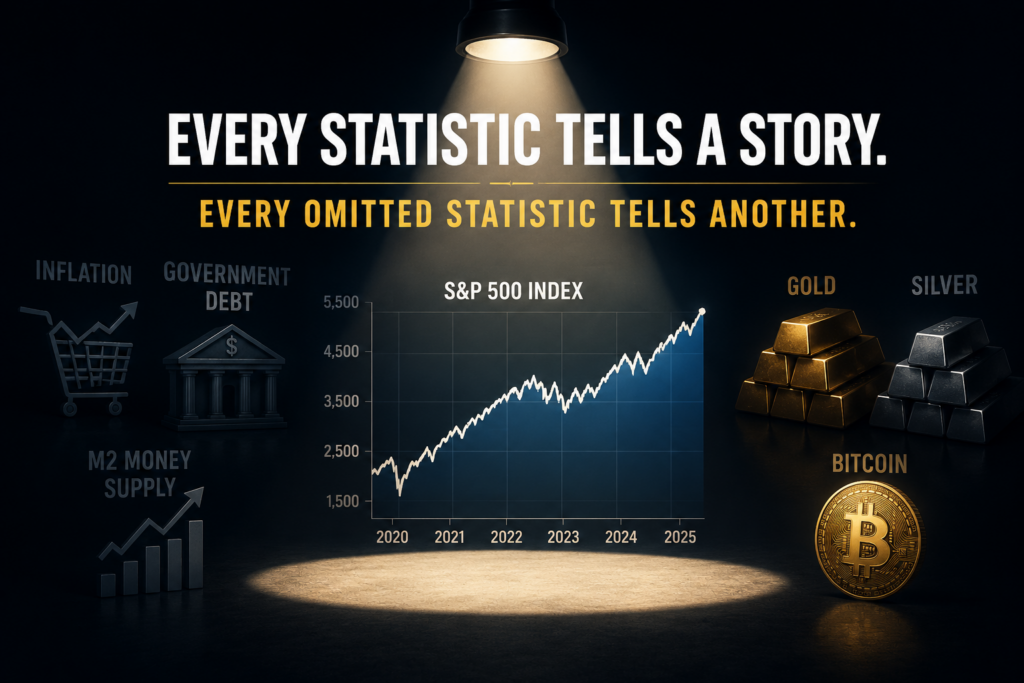




Every statistic tells a story.
Every omitted statistic tells another.
This past Tuesday the Bureau of Labor Statistics released the Consumer Price Index. The headline was encouraging: CPI fell 0.4% for the month, while the 12-month inflation rate slowed sharply to 3.5%, down from 4.2% in May. Core CPI, which excludes food and energy, rose 2.6% year over year, down from 2.9% previously. The big picture is that the rate of inflation is slowing, but prices are not returning to where they were before the inflationary surge.
As I was contemplating this latest release, I immediately began seeing huge contrasting opinions emerging. The stock market bulls point to the gains since January 2020. The bears point to numerous other metrics. If you’ve watched financial television for more than fifteen minutes, you’ve probably noticed an amazing phenomenon. The economy is either the greatest success in modern history or teetering on the edge of collapse. It all depends on which chart happens to be standing in front of the camera.
One day you’re told the stock market is making new highs, unemployment is low, and the American economy is the envy of the world. The next day someone points to grocery prices, housing costs, insurance premiums, and the national debt, then wonders whether anyone outside Wall Street received the memo.
Here’s the funny part.
Neither side has to lie.
They simply have to choose the right benchmark.
Imagine trying to convince your doctor you’re in fantastic shape because your blood pressure is excellent. Never mind the cholesterol. Ignore the blood sugar. Let’s not dwell on those X-rays. You found one number that makes you look like an Olympic athlete, and by golly, you’re sticking with it.
Economic debates often work the same way.
The first rule is simple.
Choose the statistic that supports your conclusion.
The second rule is even more important.
Never mention the benchmark that might complicate the story.
Since January 2020, the S&P 500 has gained more than 130%. That’s an extraordinary accomplishment and an entirely accurate statement.
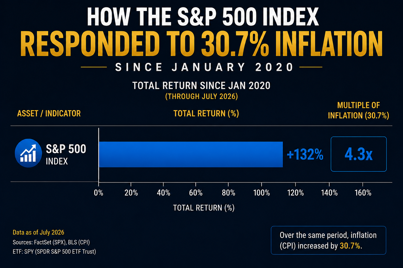
It’s also only one chapter of the book.
Government debt has exploded. The Federal Reserve’s balance sheet remains dramatically larger than it was before the pandemic. The money supply surged. Consumer prices climbed more than 30%. Gold, silver, and Bitcoin delivered returns that make “normal” investments look positively restrained.
None of those facts contradict one another.
They simply refuse to fit inside the same television segment.
That’s the problem with modern economic storytelling. The facts are usually accurate.
It’s the missing chapters that deserve your attention.
If you wanted to convince the world that America’s economic policies have been an overwhelming success, you wouldn’t have to invent a single statistic. You could simply point to the S&P 500, which has climbed more than 130% since January 2020. Add a few charts showing unemployment near historic lows and inflation retreating from its peak, and you’ve built a compelling story. The audience walks away believing prosperity has returned and that the difficult years are safely behind us.
Every financial newsroom understands the power of a benchmark. The S&P 500 is more than an index, it’s a scoreboard. When the scoreboard keeps making new highs, optimism almost writes itself. Investors feel wealthier, retirement accounts grow, and television anchors smile a little wider because green arrows make better television than red ones.
There is nothing dishonest about celebrating a market that has produced extraordinary returns. The facts are accurate, and they deserve to be reported. If stocks are the benchmark, then the conclusion is obvious. The economy weathered a pandemic, survived inflation, absorbed higher interest rates, and still delivered one of the strongest bull markets in modern history.
But every benchmark shines a spotlight in one direction while leaving the rest of the stage in shadow. The stock market tells us what happened to publicly traded companies. It doesn’t tell us what happened to purchasing power, government debt, the money supply, or the millions of Americans who don’t own enough stocks to materially change their financial lives. Those stories exist too. They simply require a different measuring stick.
Now here’s where things get interesting. We’re not going to change a single statistic from the last section. The S&P 500 is still up more than 130%. Every chart, every headline, and every celebration is still completely accurate. The only thing we’re going to change is what we place next to it.
Instead of looking at stocks in isolation, let’s widen the camera lens. Government debt has increased roughly 70%. The Federal Reserve’s balance sheet has expanded more than 60% from where it stood before the pandemic. The money supply is nearly 50% larger, and cumulative inflation has climbed more than 30%. None of these numbers erase the stock market’s gains, but they certainly change how you interpret them.
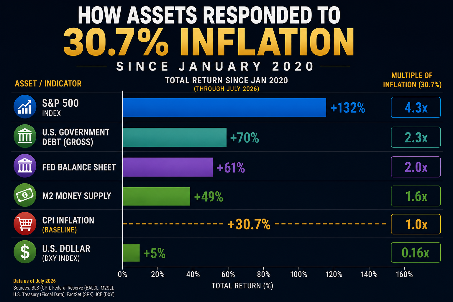
Here’s a simple question every trader should ask. If the measuring stick itself changed, how do you measure success? If more dollars are circulating through the financial system, should asset prices be expected to rise? More importantly, did stocks become dramatically more valuable, or did the denominator used to measure them become less valuable?
This is where the conversation usually ends on television because there’s no time left in the segment. It’s much easier to flash a chart of record highs than it is to explain how debt, liquidity, inflation, and monetary policy interact over several years. Yet those relationships are exactly where traders find opportunity.
Now let’s introduce three more facts that rarely appear in the same conversation. Since January 2020, gold has climbed roughly 163%. Silver has gained more than 220%. Bitcoin has appreciated nearly 800%. Those aren’t obscure markets quietly drifting higher. They’re among the best-performing assets of the post-pandemic era, yet they often receive only passing attention compared to the daily discussion surrounding equities.
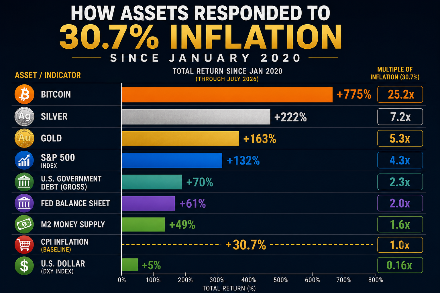
Viewed individually, each asset has its own explanation. Gold is a monetary metal and a traditional store of value. Silver sits at the intersection of monetary demand and industrial consumption. Bitcoin occupies an entirely different category, attracting investors who see it as a digitally scarce asset in a world where currencies can be created far more easily than bitcoin can. Different assets, different drivers, different investor bases.
Taken together, however, they raise a question that’s difficult to ignore. Why did three very different scarce assets dramatically outperform consumer inflation over the same period? Perhaps it’s a coincidence. Perhaps each rally can be explained independently. Or perhaps markets were responding to a broader reality that extends beyond any single headline, policy announcement, or quarterly earnings report.
This isn’t an argument that everyone should own gold, silver, or Bitcoin. It’s an argument for asking better questions. When multiple asset classes begin sending the same message, experienced traders pay attention because markets often reveal important shifts long before economists, politicians, or television commentators reach a consensus. Sometimes the most valuable information isn’t found in the statistic everyone is discussing. It’s found in the statistics that rarely appear together.
There are roughly 163 million working Americans in the United States. According to Gallup, roughly 38% do not own any stocks. That means that roughly 61.8 million American experience the 30% cumulative inflation and did not experience the 130% increase in the stock market. If we are talking about economic policy shouldn’t we at least discuss how the have-nots have fared since January 2020? This is one reason why statements like “the stock market is benefiting all Americans” is wildly misleading. These have-nots are probably not making 30% more than they were in 2020, so what this segment of the population experience is a massive loss of purchasing power.
Wall Street has always understood a simple truth. Markets don’t speak. People interpret them. The interpretation often depends less on the data itself than on which data is chosen to frame the discussion. That’s why two respected economists can examine the same economy, cite entirely different statistics, and arrive at conclusions that appear mutually exclusive, even though neither has distorted the underlying facts.
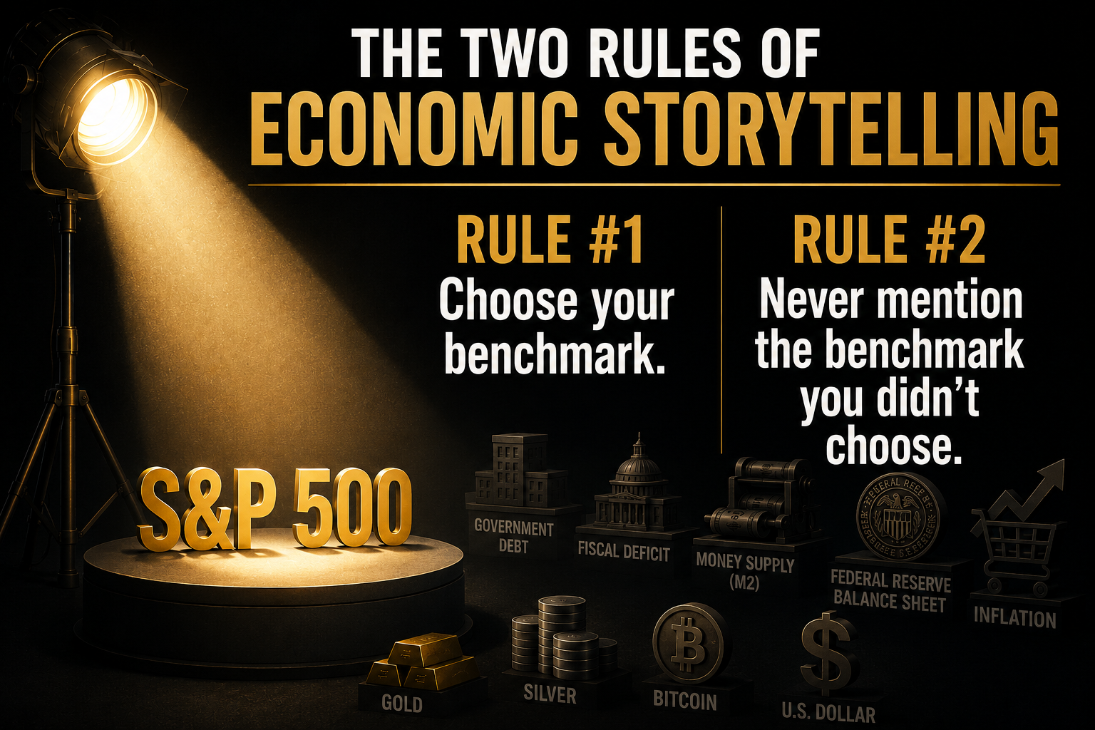
The first rule of economic storytelling is straightforward. Choose your benchmark. If your benchmark is the S&P 500, the past six years look remarkably successful. If your benchmark is purchasing power, the conversation changes immediately. If your benchmark is government debt, money supply growth, or the performance of scarce assets like gold and Bitcoin, the narrative changes again. The numbers remain exactly the same, but the conclusions begin to diverge.
The second rule is even more powerful. Never mention the benchmark you didn’t choose. That isn’t necessarily deception. Every article, television segment, research note, and policy speech has limited time and space. Decisions must be made about what stays in the story and what gets left on the cutting room floor. Those editorial decisions shape public understanding far more than most people realize.
This is why traders should resist the temptation to fall in love with any single narrative. Markets are rarely driven by isolated statistics. They are driven by the relationship between statistics. The opportunity often emerges not from the number everyone is talking about, but from the benchmark almost nobody bothered to compare it against. That’s where context becomes an analytical advantage instead of simply another opinion.
Here’s where the Austrian economist politely raises a hand and asks the one question capable of bringing an entire cocktail party of economists to an uncomfortable silence.
“Compared to what?”
It’s an irritating question because it refuses to let anyone celebrate without first checking the bill. Yes, stocks went up. Compared to what? Yes, home prices soared. Compared to what? Yes, wages increased. Compared to what? If the measuring stick itself changed, then measuring success becomes a little more complicated than pointing at a line on a chart that’s heading north.
The Austrian perspective isn’t obsessed with whether prices rise. Prices have always risen and fallen. The real concern is whether money itself is changing in ways that make every other price more difficult to interpret. Increase the money supply, expand government debt, and inject trillions of dollars into the financial system, and it’s perfectly reasonable to ask whether assets became more valuable or whether dollars became less scarce. Those are two very different explanations that can produce the exact same chart.
Imagine entering a pie-eating contest where the judges quietly switch from measuring slices with a ruler to measuring them with a rubber band. Congratulations, everyone appears to be eating larger pieces. The applause is genuine. The trophies are real. But before declaring a new world record, you might want to examine the ruler. Austrian economists have been making that uncomfortable suggestion for more than a century, usually while everyone else is busy admiring the trophies.
Whether you ultimately agree with that perspective isn’t really the point. The value lies in asking the question before accepting the conclusion. Traders who make a habit of questioning the measuring stick often discover opportunities that remain invisible to people arguing over the measurements themselves. Markets have a funny way of rewarding curiosity long before they reward certainty.
At first glance, this may sound like an interesting academic debate reserved for economists and central bankers. It isn’t. Every trading decision you make is built on context. Professional traders don’t simply ask whether a stock is going up. They ask whether it’s outperforming the S&P 500, its sector, its competitors, inflation, Treasury yields, or another opportunity competing for their capital. The comparison is often more valuable than the price itself.
That’s why the best traders spend far less time predicting the future than measuring the present. Markets are constantly ranking assets against one another, rewarding leadership and punishing weakness. A stock that gains 12% sounds impressive until you discover its sector gained 20%. Likewise, a market making new highs feels exciting until you realize several other asset classes have quietly outperformed it by a wide margin over the same period.
This is one of the reasons benchmarks matter so much. They don’t simply measure performance. They shape decision-making. When traders compare stocks to inflation, gold to the dollar, or Bitcoin to money supply growth, they begin asking different questions than investors who focus exclusively on price. Those comparisons often reveal trends that remain hidden when viewed through a single lens.
Successful trading has never been about collecting the most information. It’s about organizing the right information in the right order. Markets generate an endless stream of headlines, opinions, forecasts, and statistics every day. The traders who consistently outperform are usually the ones who step back, compare the competing benchmarks, and recognize that the biggest opportunity often appears where two seemingly unrelated charts begin telling the same story.
Now let’s talk about the person who rarely gets interviewed on financial television. He isn’t managing a hedge fund. He doesn’t have a Bloomberg terminal glowing on his desk. He isn’t refreshing his brokerage account every five minutes. He’s simply trying to pay the mortgage, fill the gas tank, keep food on the table, and save a little money for retirement.
When the evening news announces that the stock market has doubled since 2020, he shrugs. That’s nice, but it doesn’t describe his life. Maybe he owns a small 401(k). Maybe he doesn’t. What he notices every week is the grocery bill, the insurance premium, the electric bill, property taxes, healthcare costs, and just about everything else that seems to require a little more money than it did a few years ago. His benchmark isn’t the S&P 500. It’s his monthly budget.
That doesn’t mean the market’s gains aren’t real. They absolutely are. It simply means they’re not everyone’s reality. A household with substantial investments experienced the last six years very differently from a household living paycheck to paycheck. Both families occupied the same economy. Both watched the same news. Yet they walked away with completely different conclusions because they experienced completely different outcomes.
This is why context matters so much. One chart can tell you what happened to financial assets. Another can tell you what happened to purchasing power. Neither chart is wrong. The mistake is assuming that one chart tells the entire story. The economy isn’t experienced through an index. It’s experienced one paycheck, one grocery receipt, and one monthly bill at a time.
It is easy to criticize the financial media. It is much harder to acknowledge the challenge they face every day. Complex economic systems must be distilled into a three-minute television segment, a two-minute podcast interview, or an 800-word article. Decisions have to be made. Which chart deserves airtime? Which statistic belongs in the headline? Which data point is essential, and which one is left on the editing room floor? Those choices inevitably shape the narrative.
Most omissions are not the result of bad intentions. They are the consequence of limited time and limited attention. Viewers want simple explanations, but markets rarely offer them. A headline declaring that the S&P 500 reached another record high is easy to understand. Explaining how that performance relates to money supply growth, fiscal deficits, inflation, government borrowing, and the appreciation of scarce assets requires far more time than most broadcasts can reasonably devote to a single topic.
That reality places an even greater responsibility on traders. Television is designed to inform a broad audience. Trading requires a much narrower focus and a much deeper level of analysis. Professional investors understand that every chart raises another question, every statistic invites another comparison, and every conclusion should be tested against alternative benchmarks before capital is committed.
Perhaps the most valuable habit a trader can develop is learning to notice what isn’t being discussed. Not because the missing information proves the prevailing narrative is wrong, but because it may reveal dimensions of the market that have yet to be fully appreciated. Markets rarely reward investors for knowing what everyone else already knows. More often, they reward those willing to examine the evidence that sits just outside the camera’s frame.
Every great magician knows the audience isn’t watching the trick. They’re watching where the magician wants them to look. Wave one hand dramatically enough and nobody notices what the other hand is doing. It’s not deception. It’s choreography. Attention, after all, is a limited resource.
Economic storytelling works much the same way. Watch the left hand celebrate record highs in the stock market. Watch the right hand quietly accumulate another sixteen trillion dollars of government debt. Watch one chart applaud a booming economy while another shows a money supply that expanded by nearly fifty percent, a Federal Reserve balance sheet dramatically larger than it was before the pandemic, and consumer prices more than thirty percent higher than they were just a few years ago. None of those charts are fake. They’re simply performing in different parts of the theater.
The clever part is that almost everyone leaves believing they saw the whole show. They didn’t. They saw the act that fit inside the allotted time. The audience applauds because the finale looked impressive, never realizing several important scenes were edited out before the curtain ever went up. That’s not a conspiracy. It’s the inevitable result of trying to explain a $30 trillion economy between commercial breaks.
Professional traders eventually learn to distrust performances, including the ones they want to believe. When everyone is staring at the left hand, they instinctively glance toward the right. That’s where surprises usually live. Not because someone is hiding the truth, but because the most important part of the story is often the part nobody thought to include in the first place.
The financial markets have a remarkable way of rewarding perspective over certainty. Every day, investors are inundated with economic reports, earnings releases, policy announcements, and a steady stream of expert opinions, each claiming to explain what happens next. Yet the most successful traders often distinguish themselves not by possessing more information, but by asking better questions about the information everyone else already has.
One of those questions is deceptively simple. Compared to what? It is the question that transforms isolated statistics into meaningful analysis. A stock’s return becomes more informative when measured against its sector. Inflation becomes more revealing when viewed alongside money supply growth. Government debt takes on greater significance when considered next to economic output. Context doesn’t diminish the importance of the numbers. It determines their meaning.
This is why markets so often surprise the consensus. By the time a single narrative becomes universally accepted, professional investors are already searching for the variables that narrative leaves unexplored. They understand that markets are complex systems where relationships matter more than headlines. The next opportunity rarely emerges from repeating what everyone already knows. It comes from recognizing connections that have yet to become obvious.
Perhaps that’s the most enduring lesson of the past several years. Every statistic tells a story. Every omitted statistic tells another. The trader’s responsibility is not to choose between competing narratives, but to understand why each one exists, what it explains well, and where it falls short. In the end, context isn’t a footnote to the story. It is the story.
Here’s the lesson worth remembering. Take one six-year period, hand the exact same economic data to eight different newspaper editors, and you can wake up tomorrow morning to eight completely different versions of reality. One screams, “STOCKS HIT RECORD HIGHS.” Another warns, “GOVERNMENT DEBT SURGES 70%.” A third celebrates gold. A fourth marvels at Bitcoin. Nobody has to lie.
The trick is deciding where to point the camera. Focus on the S&P 500 and America looks like a wealth-creation machine. Focus on inflation and the conversation becomes purchasing power. Focus on M2 or the Fed’s balance sheet and suddenly you’re talking about monetary expansion. Focus on gold and Bitcoin and you may start wondering why scarce assets have been running like somebody yelled “Fire!” in a crowded theater.
Same six years. Same economy. Same facts. Different headlines, different benchmarks, different conclusions. And every editor can go home believing he told you the truth.
That’s why the most dangerous question in finance may be, “Is this statistic true?” A better question is, “What statistic did they leave out?” Because the number sitting in front of you may be perfectly accurate while the number missing from the conversation completely changes its meaning. The headline tells you where everyone is looking, but the omitted statistic may tell you where the opportunity is hiding.
That’s the trader’s job. Don’t merely read the headline. Don’t blindly accept the story someone else assembled for you. Look at the numbers they showed you, then go hunting for the numbers they didn’t. Because every statistic tells a story, every omitted statistic tells another, and the trader who learns to see both sides of the picture has something the crowd rarely possesses: context
For most people, this article will simply be an interesting way to think about economics. For traders, it should be something far more important. It should be a reminder that markets don’t reward the people who know the most headlines. They reward the people who recognize the most meaningful relationships. Every chart you’ve seen, every statistic we’ve discussed, and every comparison we’ve made points to one inescapable conclusion. The biggest opportunities almost always belong to those who see the broader picture before everyone else does.
That is precisely why professional traders measure everything. They don’t become emotionally attached to a single narrative. They compare sectors against the S&P 500. They compare stocks against their peers. They compare gold against inflation, the dollar against money supply, and institutional money flow against public opinion. While the crowd argues about yesterday’s headlines, experienced traders are quietly asking a much more profitable question. What is the market trying to tell me next?
Imagine what your trading could look like if you no longer had to rely on television personalities, sensational headlines, or endless economic debates to make your decisions. Imagine having a tool to forecast leadership as it develops, predict institutional rotation before it becomes obvious, and scan markets through objective measurements instead of opinions. That is the difference between reacting to the market and anticipating it. One approach follows the crowd. The other follows the evidence. The answer is VantagePoint.
Your goal is to be on the right side of the right market at the right time. While everyone else is arguing about inflation, interest rates, money supply, and government policy, your job is simpler: find where the strongest trends are developing and position yourself accordingly. That is precisely what VantagePoint AI specializes in; analyzing global intermarket relationships and using predictive technology to help traders forecast market direction before the opportunity becomes obvious to the crowd.
Our predictive technology was built to do what human beings struggle to do consistently: analyze enormous amounts of intermarket data, forecast emerging relationships across global markets, and predict probable price direction before those relationships become obvious to others. VantagePoint helps you recognize the best opportunities by measuring what the market is already revealing beneath the surface. When you learn to see those relationships, you stop chasing stories and start following probabilities.
If this article challenged the way you think about markets, you’ve only scratched the surface. Join us for a FREE VantagePoint AI Live Online Masterclass and discover how professional traders use predictive intelligence to identify emerging trends, track institutional money flow, and uncover opportunities that most investors never see until the move is already underway.
The market is always communicating. The question is whether you’re listening to the headlines, or learning to read the signals hidden beneath them.
It’s not magic.
It’s machine learning.
THERE IS A SUBSTANTIAL RISK OF LOSS ASSOCIATED WITH TRADING. ONLY RISK CAPITAL SHOULD BE USED TO TRADE. TRADING STOCKS, FUTURES, OPTIONS, FOREX, AND ETFs IS NOT SUITABLE FOR EVERYONE.IMPORTANT NOTICE!
DISCLAIMER: STOCKS, FUTURES, OPTIONS, ETFs AND CURRENCY TRADING ALL HAVE LARGE POTENTIAL REWARDS, BUT THEY ALSO HAVE LARGE POTENTIAL RISK. YOU MUST BE AWARE OF THE RISKS AND BE WILLING TO ACCEPT THEM IN ORDER TO INVEST IN THESE MARKETS. DON’T TRADE WITH MONEY YOU CAN’T AFFORD TO LOSE. THIS ARTICLE AND WEBSITE IS NEITHER A SOLICITATION NOR AN OFFER TO BUY/SELL FUTURES, OPTIONS, STOCKS, OR CURRENCIES. NO REPRESENTATION IS BEING MADE THAT ANY ACCOUNT WILL OR IS LIKELY TO ACHIEVE PROFITS OR LOSSES SIMILAR TO THOSE DISCUSSED ON THIS ARTICLE OR WEBSITE. THE PAST PERFORMANCE OF ANY TRADING SYSTEM OR METHODOLOGY IS NOT NECESSARILY INDICATIVE OF FUTURE RESULTS. CFTC RULE 4.41 – HYPOTHETICAL OR SIMULATED PERFORMANCE RESULTS HAVE CERTAIN LIMITATIONS. UNLIKE AN ACTUAL PERFORMANCE RECORD, SIMULATED RESULTS DO NOT REPRESENT ACTUAL TRADING. ALSO, SINCE THE TRADES HAVE NOT BEEN EXECUTED, THE RESULTS MAY HAVE UNDER-OR-OVER COMPENSATED FOR THE IMPACT, IF ANY, OF CERTAIN MARKET FACTORS, SUCH AS LACK OF LIQUIDITY. SIMULATED TRADING PROGRAMS IN GENERAL ARE ALSO SUBJECT TO THE FACT THAT THEY ARE DESIGNED WITH THE BENEFIT OF HINDSIGHT. NO REPRESENTATION IS BEING MADE THAT ANY ACCOUNT WILL OR IS LIKELY TO ACHIEVE PROFIT OR LOSSES SIMILAR TO THOSE SHOWN.