As the president of a family owned and operated company, it’s not all business for me.
I like sharing product news and market updates. I also like sharing things of a more personal nature, and that’s what this post is. If you’d rather watch than read, the video below tells the story better than I can in print.
Some of you have met my dad in person. Some of you have been with us for decades as VantagePoint Family Members. And some of you are still considering whether to join us, which is exactly why this story matters.
We Don’t Call You Customers
As you may have just noticed, we call the people who use our software VantagePoint Family Members. That’s not a marketing line. It’s a reflection of how long we plan to be here and how seriously we take the commitment we make to the people who trust us.
Here’s where that mindset comes from.
It Started in a Checkout Line
On August 29th, my parents celebrated their 50th wedding anniversary.
A weekday evening in late 1975, my dad (and Founder of Vantagepoint AI) stopped into the Stop & Shop in Brookline, Massachusetts to pick up groceries. He was 27. My mom, was 22 and standing in that same line. They walked out at the same time, he struck up a conversation in the parking lot, and he’ll tell you it was love at first sight. A few months of dating later they were engaged. They married the following summer.
Fifty years, three sons, and five grandchildren later, Stop & Shop heard the story. They put out a press release about it. They’re hosting a celebration at that same Brookline store, handing out cookies to shoppers who might just strike up a conversation of their own. And in my parents’ honor, they made a $5,000 donation to the Hope High School endowed scholarship fund at the Rhode Island Foundation. My dad went to Hope High as a teenager. That money now goes to students in the city where he grew up.
“Make Sure You Wear Something Special”
This past weekend we had a small family celebration here in Florida. No big production, just the people closest to them, all of it there to celebrate the love of two people: my mom and my dad.
In the weeks leading up to it, my mom kept reminding me to dress up. “Make sure you wear something special.” She said it more than once.
So I did.
I showed up in a suit, which was appropriate for the occasion. Then partway through the evening I slipped into another room, changed into a full Elvis costume, and walked back out to give my parents a toast in my best Elvis voice.
I opened the toast by looking right at my mom and saying, “You told me to dress up. Is this what you had in mind?”
She loved it. My dad was laughing. The whole room was cracking up. I was a little nervous going in, but I knew it would be something they’d remember, and the rest of what I said to them that night came straight from the heart.
The Same Principles Built This Company
Fifty years of a happy marriage doesn’t happen by accident. It takes long term commitment, integrity, respect, and two people willing to keep showing up for each other.
Those are the same words we use to describe how we run this company, and that is not a coincidence. My dad founded VantagePoint in 1979, three years after he married my mom, and he built it on exactly the same principles that built their marriage.
In 2029, VantagePoint turns 50. Same family. Same values. Same commitment to the people who trust us with their money and their time.
What You’re Joining
If you’re already part of the VantagePoint family, you know how we treat you, because we treat you like family. We care deeply about every one of you, all over the world, and we care about your continued success in the markets so that you can build the legacy you want to leave.
If you’re thinking about joining us, that’s what you’re joining.
Pfizer began in 1849 when Charles Pfizer and Charles Erhart, two German immigrants, opened a fine-chemicals shop in Brooklyn with a product that seems almost quaintly on-brand: an almond-flavored antiparasite medicine called santonin. From that modest beginning, Pfizer grew into one of the world’s largest pharmaceutical companies, surviving wars, depressions, patent cliffs, and the kind of corporate reinvention that would have killed lesser enterprises. The company’s modern era was defined by two events of opposite character. First, the COVID-19 pandemic turned Pfizer into the world’s largest pharmaceutical company by revenue, with Comirnaty and Paxlovid generating tens of billions in annual revenue during 2021 and 2022. Second, the post-pandemic decline of those same COVID-19 revenues created a revenue cliff that the company is still climbing out from under. Today Pfizer matters to traders because it sits at the intersection of a powerful turnaround story and a looming patent cliff, and Wall Street is now debating whether the pipeline can replace the revenue being lost faster than the market expected. All market data in this report is as of the market close on September 1, 2026.
Pfizer discovers, develops, manufactures, and distributes medicines and vaccines across four primary therapeutic areas: oncology, internal medicine, vaccines, and inflammation and immunology. Its product portfolio includes some of the most commercially significant drugs in pharmaceutical history. Eliquis, a blood thinner co-marketed with Bristol Myers Squibb, generated approximately $12 billion in 2024 sales and remains one of the most prescribed anticoagulants in the world. Padcev, a bladder cancer therapy acquired through the $43 billion Seagen acquisition in 2023, is expanding into earlier treatment lines. Vyndaqel treats a rare but devastating cardiac condition. Ibrance is a breast cancer therapy. Xtandi addresses prostate cancer. Nurtec, acquired through the Biohaven deal, is a fast-growing migraine treatment. And Comirnaty and Paxlovid, the COVID-19 vaccine and antiviral that defined Pfizer’s pandemic peak, are now in managed decline.
The company is headquartered at the Spiral, 66 Hudson Yards, New York, NY, and is led by Chairman and CEO Albert Bourla, who took the role in January 2019. Pfizer employs approximately 75,000 people globally. Bourla, a Greek-born veterinarian with a Ph.D. in the biotechnology of reproduction, joined Pfizer in 1993 and rose through positions in animal health, vaccines, and oncology before becoming CEO. Under his leadership, Pfizer divested non-science-based businesses, increased R&D investment, restructured into four end-to-end therapeutic units, and completed two transformative acquisitions: Seagen for $43 billion in 2023 and Metsera for up to $10 billion in 2025. Competitors include Merck, Eli Lilly, Johnson & Johnson, Bristol Myers Squibb, AbbVie, Roche, and Novartis. Pfizer’s distinction is its sheer scale and pipeline breadth, combined with a dividend yield that makes it one of the highest-yielding stocks in the S&P 500. While Eli Lilly and Novo Nordisk have captured the obesity market narrative, Pfizer is building a differentiated obesity pipeline through Metsera’s berobenatide, an ultra-long-acting GLP-1 receptor agonist designed for monthly dosing rather than weekly injections.
The financial history explains why Wall Street’s relationship with Pfizer has become complicated. Revenue has traveled an extraordinary arc — from $41.65 billion in 2020 to a peak of $100.33 billion in 2022, then collapsing to $59.55 billion in 2023 as COVID-19 revenues evaporated, before partially recovering to $63.63 billion in 2024 and settling at $62.58 billion in 2025. Net income followed an even more violent path: $9.16 billion in 2020, surging to $31.37 billion in 2022, then plummeting to $2.12 billion in 2023. The distinction matters. Pfizer’s revenue story is really two stories: a COVID-19 story that went from zero to $56 billion to declining, and an underlying business that has been growing steadily underneath the pandemic noise. Excluding COVID-19 products, revenues grew 6% operationally in 2025. The question is whether the underlying business is growing fast enough to replace what the pandemic took away and what the patent cliff will take next.
The numbers tell a story of a company in transition rather than decline. Revenue declined 2% operationally in 2025, but adjusted diluted EPS actually rose to $3.22 from $3.11 in 2024, suggesting that cost-cutting and portfolio optimization are protecting profitability even as top-line revenue compresses. Pfizer has achieved $4.5 billion in savings by the end of 2025, with a path toward $7.7 billion in net savings by 2027. The company also announced an additional $2.5 billion in cost-cutting during its Q2 2026 earnings, targeting $9.7 billion in total net savings through 2029. That is not merely cost-trimming. That is a structural reshaping of the operating model.
Traders are really asking two questions now. First, can Pfizer’s pipeline , particularly in oncology, obesity, and immunology, generate enough new revenue to offset the patent cliff that threatens Eliquis, Ibrance, and Xtandi between 2026 and 2028? Second, is the market undervaluing a company with a forward P/E of approximately 9.5 to 10.2 (midpoint ~9.8) and a 6% dividend yield, or are those metrics a value trap signaling that Wall Street expects growth to remain anemic? Those are considerably more useful questions than asking whether Pfizer will ever return to its pandemic-era revenue levels.
The evidence supporting the bulls has been accumulating. First-quarter 2026 revenues reached $14.5 billion, up 5% year-over-year, with launched and acquired products growing 22% operationally. Second-quarter 2026 revenues came in at $15.03 billion, up 3% reported and 1% operationally, with non-COVID products growing 5% and launched and acquired products growing 18%. Adjusted diluted EPS of $0.77 beat the consensus estimate of $0.68 by nine cents. Eliquis sales rose 21% to $2.43 billion in Q2, well above analyst estimates of $1.93 billion. Padcev sales rose 23% to $667 million. Management consequently raised the midpoint of full-year 2026 revenue guidance by $500 million to a range of $60.5 billion to $62.5 billion, while reaffirming adjusted diluted EPS guidance of $2.80 to $3.00. That is not merely a good quarter for a pharmaceutical company in transition. That is evidence that the post-COVID reconstruction is ahead of schedule.
The most important news of the last 30 days has been less about a single press release and more about a convergence of signals. On August 4, Pfizer reported Q2 results that topped estimates on both revenue and adjusted earnings. On August 27, Pfizer and BioNTech received FDA approval for their XFG-adapted COVID-19 vaccine for the 2026-2027 season. The Metsera obesity pipeline is advancing rapidly, with ten pivotal studies expected to progress in 2026 for berobenatide, which demonstrated 12.0% to 12.3% placebo-corrected weight loss at week 28 in Phase 2b comparing favorably to digitized estimates for weekly semaglutide (~9.0%) and tirzepatide (~12.5%). The Innovent Biologics deal, worth up to $10.5 billion, expanded Pfizer’s oncology pipeline with 12 early-stage cancer drug candidates. And the MEVPRO-1 Phase 3 trial for mevrometostat in prostate cancer is fully enrolled with a readout expected in Q4 2026.
Some of this optimism is obviously reflected in the stock price. Through September 1, PFE had gained approximately 20.6% year-to-date on a total-return basis and approximately 23.4% over the trailing year. The S&P 500 returned approximately 18.1% over the same trailing-year period. PFE is not merely participating in a market rally. It is outperforming the benchmark it was widely expected to trail. The Health Care Select Sector SPDR ETF, XLV, has lagged the broader market, making Pfizer’s relative strength even more notable against its sector headwinds.
Why? Earnings beats, raised guidance, pipeline execution, cost-cutting momentum, a 6% dividend yield, and the growing belief that Pfizer’s transformation from a COVID-dependent company back to a diversified biopharmaceutical leader is real. The obesity pipeline from Metsera, the oncology portfolio from Seagen, and the immunology expansion from the Biohaven and Innovent deals are giving investors something they have not had in years: a reason to believe in future growth rather than merely managing decline.
That is also where Wall Street could be wrong. Pfizer carries an enormous overhang: the patent cliff. Eliquis, which generated over $12 billion in 2024 revenue, faces European patent expiry already underway and U.S. generic entry expected in April 2028. Ibrance, Xtandi, and other key products face patent expirations in 2027. Analysts estimate that Pfizer could lose $17 to $20 billion in annual revenue to generic competition between 2026 and 2030. At a forward P/E of approximately 9.5 to 10.2, the market is pricing in significant concern about this cliff. The question is whether the market is pricing in too much concern or not enough.
The upside opportunity is substantial but contingent. If the pipeline delivers, berobenatide in obesity, mevrometostat in prostate cancer, the Innovent oncology programs, continued Padcev and Eliquis strength before generic entry, Pfizer could generate high single-digit revenue CAGR from 2028 through 2033, as management has targeted. A monthly GLP-1 in a market projected to reach $150 billion would be transformative. A successful mevrometostat readout in Q4 2026 would add a major oncology franchise. And the 6% dividend yield provides a substantial cushion while waiting for the pipeline to deliver. The biggest upside surprise would be evidence that berobenatide can compete meaningfully against Eli Lilly and Novo Nordisk in obesity. That would fundamentally re-rate the stock.
The biggest risk is exactly the patent cliff wearing a convincing disguise. Eliquis generic entry in Europe is already underway. U.S. generic entry in April 2028 is less than 20 months away. If pipeline readouts disappoint, cost-cutting reaches its natural limits, or COVID-19 revenues decline faster than expected, investors may suddenly remember that they are holding a stock whose growth depends on products that have not yet been approved. The 6% dividend yield, while attractive, also reflects a payout ratio that exceeds 100% of GAAP earnings, meaning the dividend is being funded partly by adjusted earnings and cost savings rather than reported net income. That is sustainable for now, but it is not permanent.
The catalyst calendar is unusually dense. The MEVPRO-1 Phase 3 readout for mevrometostat in prostate cancer is expected in Q4 2026, a major binary event. The talazoparib plus enzalutamide combination is advancing through regulatory review with a target action date expected in Q4 2026. Ten pivotal studies for berobenatide are progressing throughout 2026. Third-quarter 2026 earnings are expected in early November. The next dividend payment was made on September 1, 2026. And the ongoing Eliquis European patent expiry will create quarterly revenue headwinds that investors need to monitor. Earnings and pipeline readouts matter most because traders will discover whether the post-COVID reconstruction is accelerating or stalling.
The company is performing better than the market expected. The stock has noticed. That means the risk is no longer whether Pfizer can stabilize. The risk is whether the pipeline can grow fast enough to replace the revenue the patent cliff will take away. At a forward P/E of approximately 9.5 to 10.2 and a 6% dividend yield, the market is pricing in significant pessimism. That creates opportunity for patient investors, but it also raises the burden of proof. Pipeline execution, not cost-cutting, will determine whether Pfizer re-rates higher or remains stuck in value-stock purgatory.
PFE therefore looks best suited to value and income investors comfortable with pipeline risk, not growth-chasers expecting a return to pandemic-era revenue levels. The trend can continue if non-COVID revenue grows, the pipeline delivers on its catalysts, and the dividend remains sustainable. The turnaround is real. Whether it is enough depends on what the next 18 months of data reveal.
The early warning sign is simple: watch non-COVID revenue growth and pipeline readouts before listening to the cost-cutting story. If those weaken together, especially alongside disappointing clinical results, respect the message. Pharmaceutical pipelines are binary. Patent cliffs are not. And at roughly 9.5 to 10.2 times forward earnings, Pfizer may offer a high yield and a low valuation, but nobody should confuse a value stock with a risk-free investment.
Wall Street Analysts Annual Forecasts
Before deciding whether to be bullish or bearish on Pfizer, it helps to see what Wall Street’s professional fortune-tellers are saying. These analysts watch PFE constantly, study the clinical data, question management and then somehow arrive at answers separated by $10. The most bullish target is $35.00. The most bearish is $25.00. With PFE closing at $28.55, that is a meaningful range of opinion.
Wall Street is not confused about whether Pfizer is a major pharmaceutical company. It is confused about whether the pipeline can replace the patent cliff. That disagreement is valuable because it tells traders that even the experts cannot agree on what Pfizer’s future revenue will look like.
The math makes the disagreement clear. Take the $35.00 high target, subtract the $25.00 low target, and divide the $10.00 difference by the current $28.55 price. You get an analyst-disagreement reading of approximately 35.0%. Meanwhile, the average analyst target of $28.28 sits approximately 0.9% below the current price. That may be the most important number on the page. PFE has rallied enough that the stock has essentially caught Wall Street’s consensus forecast. The analysts are no longer debating whether Pfizer can stabilize. They are debating whether the pipeline can grow.
For traders, that’s where things get interesting. PFE has a high dividend yield, a low forward valuation, improving non-COVID fundamentals, and exceptional cost-cutting momentum. But the average analyst is effectively saying, “Show me the pipeline.” The opportunity lies in the gap between the $28.55 current price and the $35.00 bull case. Successful clinical readouts, continued non-COVID growth, and evidence that berobenatide can compete in obesity could force analysts to raise targets and re-rate the stock. Disappointing data or faster-than-expected generic erosion could send the argument toward the bears because the market’s pessimism would be confirmed. This remains a value and income investor’s setup, but 35.0% disagreement among Wall Street analysts is a reminder that the range of outcomes for Pfizer is exceptionally wide.
52 Week High and Low Boundaries Analysis
Another powerful way to understand volatility is to forget predictions and study what PFE has already done. Over the past 52 weeks, the stock traveled from roughly $23.58 to $29.09, a $5.51 trading range. Divide that range by the current $28.55 price and you get a range-to-price ratio of 19.3%. This is not the same as annualized historical volatility (which is approximately 21% based on daily price changes), but it provides a useful measure of how much PFE has traveled over the past year relative to its current price. Put simply, PFE covered a distance equal to roughly one-fifth of its current price during the past year. Today it sits in the 90.2nd percentile of that range, just $0.54 below its 52-week high. That tells you immediately where the pressure is. Buyers are in control, momentum has improved, and PFE is behaving like a stock that has rediscovered investor interest.
The midpoint of the 52-week range is approximately $26.34. What matters is what happened next. PFE broke above that middle zone and marched toward the top of its range. If we use the stock’s 19.3% historical volatility as a rough stress test and apply it around the $26.34 midpoint, we get extreme theoretical boundaries of roughly $31.42 and $21.26. Those are not forecasts. They simply remind us that this stock, despite its low beta of approximately 0.40, has demonstrated an ability to travel a meaningful distance when investor sentiment shifts.
Now comes the part traders need to respect. PFE is strong, but strength in a pharmaceutical stock carries different risks than strength in a high-beta momentum stock. At the 90th percentile of its annual range, you are buying near the top of a range that was established over the past year. A clean breakout above $29.09 would put PFE into new 52-week-high territory and confirm that the trend remains intact. A rejection at the highs followed by sustained weakness would tell us something has changed, with the $26.34 midpoint becoming an important longer-term reference point. For value and income investors, the setup remains attractive because the dividend yield provides a real return while waiting. But with a 19.3% historical range and a pipeline full of binary catalysts, risk management is not optional. The trend says stay interested. The catalyst calendar says stay alert.
Best-Case/Worst-Case Analysis
Pfizer has been teaching traders an important lesson: a pharmaceutical turnaround does not travel in a straight line. The best-case scenario shows the stock recovering from its 2025 lows near $23.58 to above $28.55, an advance of roughly 21%, driven by earnings beats, raised guidance, pipeline progress, and cost-cutting momentum. Earlier advances from the COVID-era lows of 2020 to the all-time high near $59 in 2021 demonstrated that PFE can deliver spectacular moves when investor sentiment aligns with fundamental catalysts. The most recent advance, from the low-$24s to above $28.50, represents the market’s initial recognition that the post-COVID reconstruction is working.
But here’s what the bulls cannot afford to ignore. PFE has also experienced significant drawdowns. The stock declined approximately 57% from its December 2021 peak near $59 to its 2024 lows. The COVID-19 revenue collapse drove a multi-year decline that punished late buyers. The important lesson is not whether the next drawdown will be 10% or 30%. Nobody knows. The lesson is that pharmaceutical stocks with binary pipeline catalysts and patent cliff overhangs can experience sharp repricing when clinical trials fail or generic competition arrives faster than expected.
So here’s the line in the sand. As long as PFE continues making higher highs and the non-COVID revenue base keeps growing, the bulls have the fundamental argument. A clean move above $29.09 strengthens that case. The danger appears when the character changes: pipeline readouts disappoint, generic erosion accelerates, or the dividend coverage comes into question. That would tell us the stock is no longer merely correcting inside an uptrend. It may be transitioning into something more dangerous.
The biggest mistake here would be looking at PFE’s 6% dividend yield and 9.5 to 10.2 forward P/E and concluding that the stock is safe. It isn’t. Value is not safety. The historical record says PFE can deliver meaningful advances and painful corrections. Value and income investors have the advantage while the pipeline continues to deliver and non-COVID revenue grows, but they also need an exit plan before the market gives them a reason to use it.
That’s the trade in one sentence: respect the turnaround, but remember what happens when a pipeline readout fails.
VantagePoint AI Predictive Blue Line
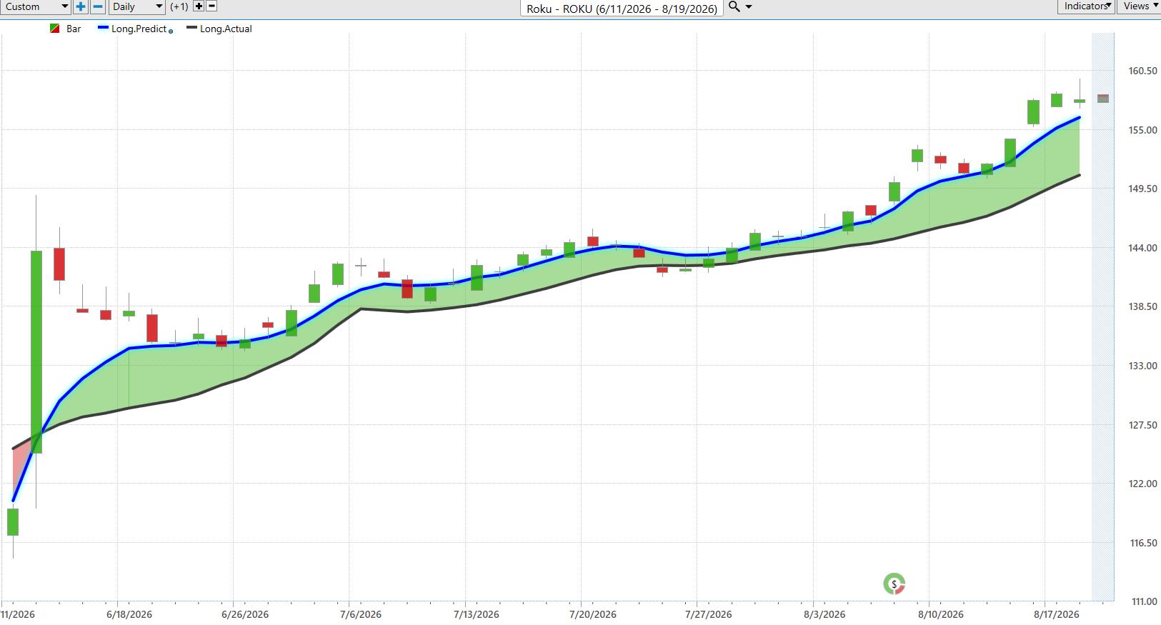
The Predictive Blue Line is VantagePoint’s predicted moving average, while the black line represents the actual moving average. When the blue line moves above the black line and both begin rising, the market is essentially putting up a green road sign saying buyers have the advantage.
Watch the distance between the blue and black lines. When the blue line stays above the black line, the forecast is stronger than the recent historical trend. When that gap expands while both lines are rising, bullish momentum is accelerating.
For traders, the message is simple: don’t argue with a rising Predictive Blue Line. As long as the blue line remains above the black line and its slope remains positive, the evidence favors the bulls and pullbacks deserve attention as potential opportunities rather than automatic reasons to sell. The first warning would be the blue line flattening while price struggles to advance. A stronger warning would be the blue line turning down and crossing beneath the black line.
VantagePoint AI Neural Index
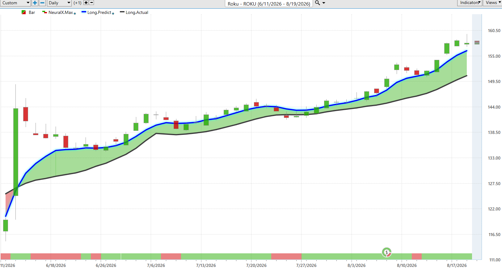
The Neural Index is designed to forecast short-term price strength or weakness over roughly the next 48 to 72 hours. Green signals indicate anticipated strength, while red signals warn of potential short-term weakness. That distinction matters. The Predictive Blue Line tells us the broader trend, while the Neural Index helps traders judge whether the immediate market conditions are confirming or contradicting that trend.
VantagePoint AI Daily Range Forecast
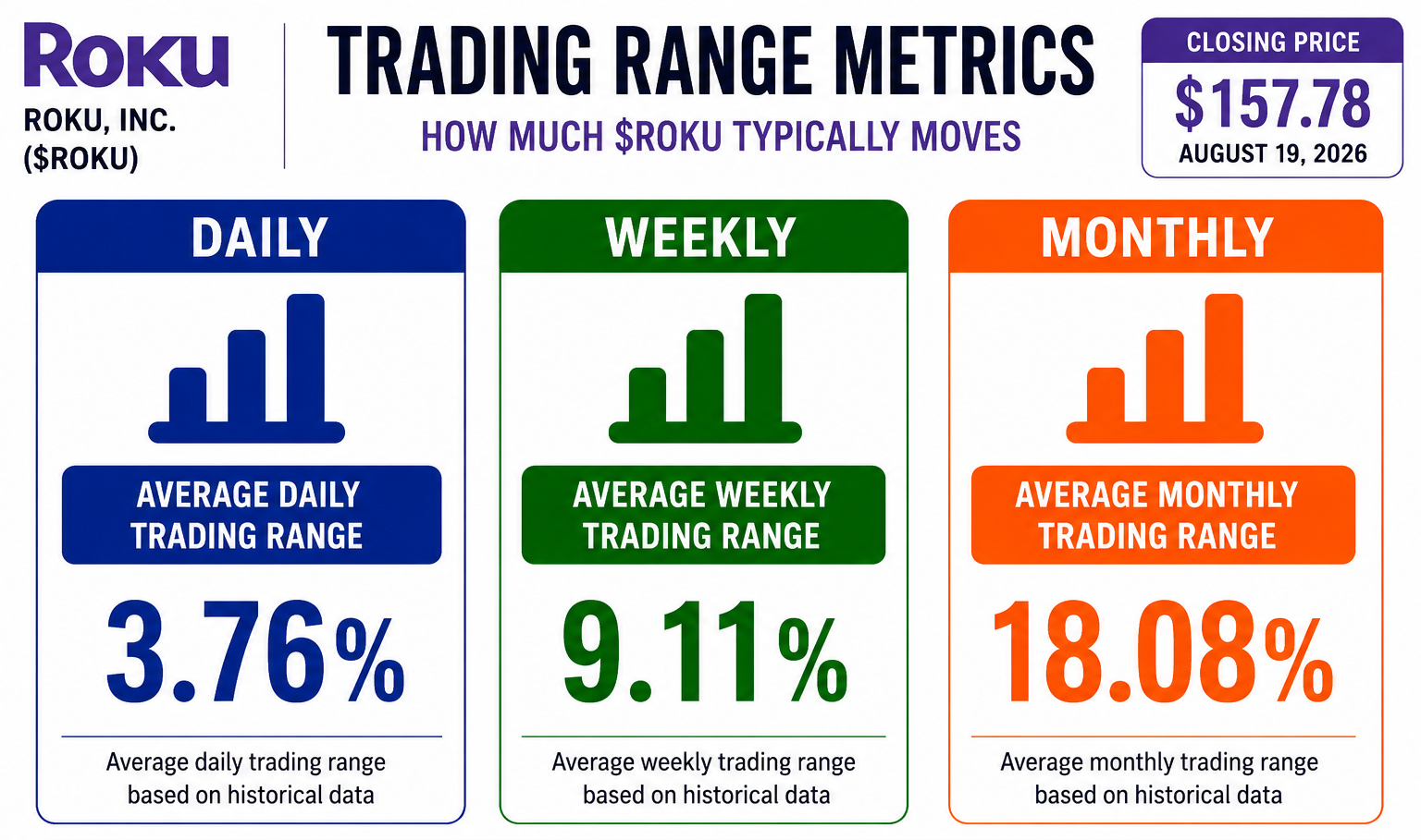
The Daily Range Forecast is where prediction becomes practical. Pfizer is not a high-volatility stock. Its average trading range is approximately 2.0% per day, with an implied volatility of approximately 21% annualized. Those numbers tell traders something important before the opening bell: PFE routinely gives you less room to make money than a high-beta momentum stock, but it also gives you less room to be wrong. A 2.0% average daily range means that on a $28.55 stock, a normal day’s high-to-low movement can represent roughly $0.57. That is not a forecast that PFE will move $0.57 tomorrow. It is a useful measure of the territory this stock has historically been capable of covering.
This is where VantagePoint’s Daily Range Forecast becomes especially valuable. On the chart, the predicted high and predicted low create a forecast range around each trading session. Instead of asking the vague question, “How high can PFE go today?” the trader gets defined price boundaries to work with.
The real advantage comes when the Daily Range Forecast is combined with the other predictive indicators. In that environment, the predicted low becomes particularly interesting as a potential value zone during temporary weakness, while the predicted high provides a logical area for traders to consider taking profits or tightening risk. But remember the numbers: approximately 2.0% daily, with an annualized volatility of approximately 21%. PFE has been rewarding patient investors with a substantial dividend and improving price action, but it carries enough pipeline binary risk to punish anyone who confuses a value stock with a risk-free trade. The forecast gives you the boundaries. The trend tells you which side deserves your attention.
Intermarket Analysis
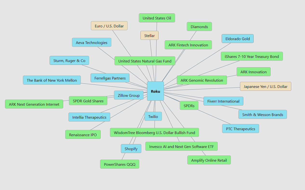
Intermarket analysis is like looking under the hood instead of simply admiring the paint job. PFE does not trade alone. The graphic shows connections to healthcare markets, pharmaceutical ETFs, large-cap value stocks, the S&P 500, Treasuries, gold, oil, the U.S. dollar and major currencies. It also connects PFE with individual companies that VantagePoint’s intermarket analysis identifies as having meaningful statistical relationships to PFE’s price behavior. The important point is not that each market causes PFE to rise or fall. Rather, VantagePoint’s intermarket analysis identifies markets with meaningful statistical relationships to PFE’s price behavior. And buried inside these relationships traders will often discover other market gems they were not originally watching.
PFE’s price action is connected not simply to pharmaceutical competitors but to interest rates, currencies, commodities, broader equity indexes, and healthcare sector flows. That matters because a pharmaceutical company’s fortunes can change when borrowing costs move, healthcare policy shifts, or money rotates between defensive and growth assets. The network tells us what to watch. Price and predictive indicators tell us whether those relationships are presently helping or hurting.
For traders, that makes intermarket analysis an early-warning system. If PFE remains strong while its important related markets and predictive indicators continue confirming the move, confidence in the trend increases. If those relationships begin deteriorating while PFE continues making new highs, that divergence deserves attention because the stock may be running ahead of its supporting forces. That argues for respecting the trend, while using the intermarket network to watch for cracks before they become obvious on the price chart. Strong trends rarely travel alone.
Our Suggestion
Pfizer presents one of those situations traders love and fear at the same time: the fundamentals are improving, but the market is pricing in significant uncertainty about the future. Revenue traveled from $41.65 billion in 2020 to a peak of $100.33 billion in 2022, then declined to $62.58 billion in 2025 as COVID-19 revenues collapsed. Net income followed a similar arc, from $9.16 billion in 2020 to $31.37 billion in 2022, then settling at $7.77 billion in 2025. The important change is that the underlying business, excluding COVID-19 products, grew 6% operationally in 2025, and adjusted diluted EPS actually rose to $3.22 from $3.11. That matters because it demonstrates that Pfizer’s cost-cutting and portfolio optimization are protecting profitability even as top-line revenue compresses.
Pfizer’s management sounds confident because it has been delivering results, not simply making promises. First-quarter 2026 revenue rose 5% to $14.5 billion, with launched and acquired products growing 22% operationally. Second-quarter 2026 revenue reached $15.03 billion, with adjusted diluted EPS of $0.77 beating the consensus by nine cents. Management raised the midpoint of full-year 2026 revenue guidance by $500 million to $60.5 billion to $62.5 billion, while reaffirming adjusted EPS guidance of $2.80 to $3.00. The company also announced $2.5 billion in additional cost cuts, targeting $9.7 billion in total net savings through 2029. Management believes the pipeline: in oncology, obesity, immunology, and vaccines, is advancing on schedule, but it remains cautious about generic competition, healthcare policy, COVID-19 revenue decline, and clinical trial risk.
The important issue for traders is that expectations remain low. The forward P/E of approximately 9.5 to 10.2 and the 6% dividend yield reflect a market that is skeptical about the pipeline’s ability to replace the patent cliff. Pfizer has been rewarding that skepticism with improving non-COVID revenue growth, cost-cutting execution, and pipeline progress. That creates an opportunity. If clinical readouts deliver, particularly the mevrometostat Phase 3 in Q4 2026 and the berobenatide obesity program, the market may need to re-rate PFE significantly higher. If they disappoint, the market’s pessimism will be confirmed and the stock could retest its lows.
The Daily Range Forecast adds an important warning: PFE historically moves approximately 2.0% daily with an annualized volatility of approximately 21%. This is lower volatility than a high-beta momentum stock, but it carries enough pipeline binary risk to require disciplined position sizing.
Wall Street provides perhaps the clearest picture of the opportunity and the argument against it. Using the targets supplied in this study, analysts range from $25.00 to $35.00, with an average target of $28.28. The $10.00 spread represents approximately 35.0% of PFE’s current price, showing meaningful disagreement about what comes next. More telling, the consensus target is actually slightly below the current market price. In other words, PFE has essentially caught Wall Street’s average forecast, while the most optimistic analysts still see substantial upside. That creates opportunity, but it also raises the burden of proof. Pipeline readouts, non-COVID revenue growth, and cost-cutting execution increasingly need to justify what the stock price has already begun to reflect.
Our suggestion is therefore to respect the turnaround without underestimating the patent cliff. PFE currently checks several boxes we want in a value and income opportunity: improving non-COVID fundamentals, a high dividend yield, a low forward valuation, strong cost-cutting momentum, and a pipeline full of potential catalysts. A decisive move through $29.09 would establish fresh 52-week highs and strengthen the bullish case. But this stock has also demonstrated that pharmaceutical pipelines are binary, clinical trial failures can reprice a stock overnight. At the 90th percentile of its annual range, the risk is no longer hidden.
The next major catalysts are the mevrometostat MEVPRO-1 readout expected in Q4 2026 and the ongoing berobenatide pivotal studies throughout 2026. Third-quarter earnings in early November will also provide an important test of whether the non-COVID growth trajectory is accelerating. Management has earned credibility, but now it must continue delivering against a backdrop of patent cliff headwinds.
Practice great money management on every trade, and use the VantagePoint AI Daily Range Forecast to identify short-term trading opportunities while keeping risk firmly under control.
It’s not magic. It’s machine learning.
Disclaimer: THERE IS A HIGH DEGREE OF RISK INVOLVED IN TRADING. IT IS NOT PRUDENT OR ADVISABLE TO MAKE TRADING DECISIONS THAT ARE BEYOND YOUR FINANCIAL MEANS OR INVOLVE TRADING CAPITAL THAT YOU ARE NOT WILLING AND CAPABLE OF LOSING.
VANTAGEPOINT’S MARKETING CAMPAIGNS, OF ANY KIND, DO NOT CONSTITUTE TRADING ADVICE OR AN ENDORSEMENT OR RECOMMENDATION BY VANTAGEPOINT AI OR ANY ASSOCIATED AFFILIATES OF ANY TRADING METHODS, PROGRAMS, SYSTEMS OR ROUTINES. VANTAGEPOINT’S PERSONNEL ARE NOT LICENSED BROKERS OR ADVISORS AND DO NOT OFFER TRADING ADVICE.
VantagePoint AI Hot Stocks Outlook for August 28, 2026
Hello again traders and welcome back to the hot stocks outlook for August 28th, 2026. Hope you all have had an excellent week out there in the financial markets.
And as always, we are here to take a look at the most recent Vantage Point AI predictive forecast. So, if you haven’t already, be sure to go ahead and click the link down in the description below and get signed up for a live demonstration and you can learn all the specifics about how these predictive indicators and artificial intelligence technology is helping traders make much better trading decisions out in the marketplace.
So we have a lot of examples to look at today. Actually a lot going on in the software space, which we actually looked at this uh back in July where a lot of these trends started. Uh but a nice example of how all of these tools work on shares of Appian here. And so what we have here is daily price action of course, right? So each one of these candles, well that’s going to represent a full and complete trading day. And right up against that daily price action, you’re first going to notice that there’s a black line and also a blue line value. And so what the black line is is quite simply a simple moving average. So a very common technical analysis indicator. uh we refer to this as the actual simple moving average. And all this value is is just looking back at the previous 10 closes, adding them all together, and then dividing by that number. And now, if we think about that calculation, well, that means that all of that data really just comes from the past of this one specific market in question. And it has no predictive capability. It really just summarizes what has already occurred. But what vantage points tools are able to do is actually predict where prices are likely headed next. And we do that uh actually through this vantage point predicted moving average. And so for this number essentially what we can think of as a price here for this price to get calculated and plotted and placed on the chart every evening for the trader. Well, this is where the technology of artificial neural networks come into play. And they’re performing what we would call intermarket analysis.
And so what that means is that rather than just looking at that past price data, Vantage Point’s technology is looking at dozens of other markets that are known to drive and influence future price. So essentially the data set that’s used to generate the value of these predicted moving averages is coming from not only the target market uh but it can be ETF groups, right? So ETFs are going to wrap up a large sector or grouping of stocks. It can come from other individual stocks throughout the stock market. But it even takes a global approach in that it looks at things like the value of the dollar index uh major currencies major uh uh indices as well as interest rates uh and even where applicable which we looked at last week uh certain commodities right so if gold or oil uh is very important to the stock you’re trading well it’s going to factor that in and use that to generate these highly accurate predictions. So whenever we see that blue line value in this case cross above the actual moving average or that black line what’s suggesting that these average prices are going to start moving higher uh and traders can look to take a long position. Now we see here since that forecast came through uh Appian shares up here about 60% just in the past 23 trading days. Uh and this has been an area of the market where a lot of these software and uh enterprise resource stocks uh have really been beaten down sort of like Salesforce here where we’ll take a look at uh but have been rallying over the past couple of months uh in a pretty strong way here.
So uh in addition to that uh predicted moving average, if you look at the very bottom of the chart here, you’re going to notice this bar that goes from green to red and back to green. Well, this is what’s called the Vantage Point predicted neural index. And it’s also utilizing that technology of artificial neural networks, but it’s really tuned to solve a different problem here. And that problem is much more geared towards the short term in anticipating short-term strength or weakness just over the next 48 hours, right? So just a couple of candles at a time moving forward. Uh and so you’ll notice here that as we get that blue line crossing above the black line, the neural index goes bearish here. You see a little bit of a gap down. So intraday uh lows being set here. Again, neural index gets bearish against some lower lows over the next 48 hours. Uh, but overall, this has a very high level of accuracy. So, it gets us right upwards of 86 87% of the time. And we can combine that output with the overall trend direction uh to manage those opportunities and really know when to anticipate potentially some short-term weakness. Now, uh lastly here, you’re of course provided the vantage point predicted high and predicted low. So in addition to the overall trend direction uh that short-term strength or weakness uh projected by the neural index, you’re also given actual intraday predicted levels of where the market is likely to trade. Uh and so this is where things get very interesting each week as we look back and say, well, how accurate have all of those predictions been against the actual market data?
So what’s going to happen is we have Friday coming in here. We’re going to fill in the actual market data and we’ll see how accurate this predicted high and predicted low value are. But as we look back and traders can say, okay, well, how would I have managed this opportunity? You’ll actually notice we take a look at this quite a bit uh uh from week to week where you see all the price action is bullish even on this trading day here and where’s the market trade the next trading day right into that level uh that vantage point predicted and then as we move forward just offers up these levels daytoday for traders to manage uh these opportunities. So even just this past week uh what would have been uh Tuesday here uh the market moving higher already up uh just this week about 8.4% uh and you see how the market just barely moves past that predicted low and trades higher. So really nice opportunity here in shares of Appian again about a 60% rally uh just really over the month here.
So uh we can take a look at Brookdale Senior Living and I wanted to bring this through because we’ve had a very mixed market, right? So, uh, we, you know, went through a period where stocks were just rallying every single day. The the broader indices were moving higher. Uh, but as things start to get mixed, well, you’re going to see some stocks start to struggle. Uh, and here you see that really just the exact opposite of what we had in the last chart, right? That blue line moving below the black line, neural index bearish. Now, you will again get these periods where the neural index can get bullish and you see that bullish subsequent price action over those 48 hour periods moving forward.
But very clearly the market is in a strong downtrend. And so uh if traders are looking to hedge or just looking again for directional trades, uh we see here Brookdale down about 19.4% just over the past 22 trading days. Uh and the exact same thing. We can take a look at those Vantage Point predicted highs and lows and you end up getting this road map moving forward. And one of the great things about Vantage Point is it adapts, right? So every single trading day, this technology is looking at not only the target market, but those intermarket relationships and then projecting that forecast forward for the trader so that they can make intelligent decisions on how they want to manage their trades. So uh a pretty strong decline here in Brookdale.
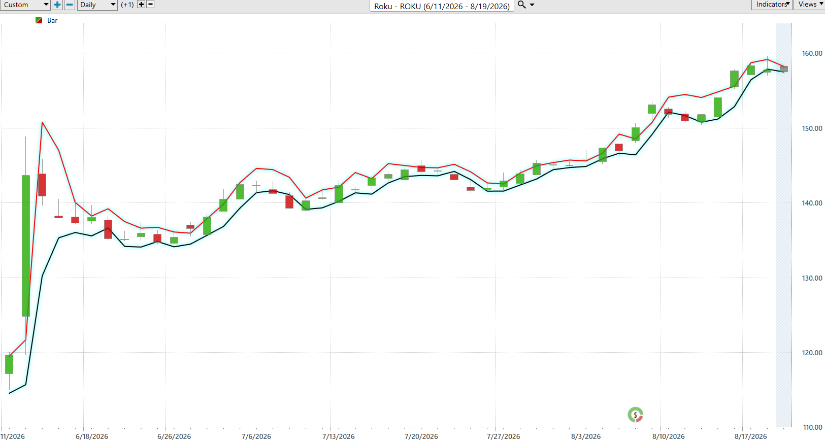
Back to the software side though, here’s Paycom software and you start to see a lot of these relationships uh and grouping of stocks turn higher uh all at the same time. And so this is where features like the vantage point intelliscan actually allows traders to scan through all of these predictive indicators and really see hey where are these market trends starting to shift what area of the market is that happening in uh not only what stocks to focus on but then getting that road map uh while you’re managing the trade and uh we progress forward through time. Uh so again you see that this neural index goes bearish you get a little sideways price action over the subsequent 48 hours. Uh but notice that the blue line is still very much above the black line. The trend is still solidly bullish. Uh and of course as traders manage this, they’ve got those predicted high and low values. So again, you see the exact same scenario here moving u you know all the price action is bullish in the uptrend and then you scoot right back into those predicted levels uh and the trend resumes. We have earnings here which is always going to act as a catalyst here. Uh but just multiple days here just moving down to that predicted low sometimes closing pretty much right at that level. uh things like this where you gap down and just immediately trade higher uh as the market is in a strong uptrend. So uh again as we look overall just over the past few weeks here uh shares up about 51% now uh in just the past 23 trading days. So, um, in a lot of these software names, I encourage you to go back and look at a lot of these hot stocks outlooks at the beginning of July. Uh, we were looking at Wayar, Jack Henry, uh, Thompson Reuters, all of which have rallied uh, pretty strongly here. And this just being a couple more examples uh, of that in the software space. Now, uh, here’s Pfizer. Pretty straightforward forecast, very popular stock here, but again, blue line getting above the black line.
A good example of these neural index is just going, look, we’re running sideways here over those 48 hour periods. And you see how you get these lower lows in the price action. Uh, just letting you know that that’s likely to see some short-term weakness over those 48 hour periods. Again, you see here getting a gap down. Um, and so again, it just helps traders really anticipate what is likely to occur in the short term so they can make those better potentially longer term decisions on how to manage that trending opportunity. You see shares up about 12% now uh just over the past 23 trading days. So pretty much just one month of time shares up about 12%. Uh and of course you have that road map of the predicted highs and lows. Uh and again you see these previous predicted lows being hit uh and then the market rallying here. You see even here you’re getting that range moving lower uh before the trading day. Right? So it’s letting you know look expect this weakness. Expect to trade down towards these predicted lows. But as long as that blue line remains above the black line, the overall trend is still bullish. Uh and we see the market start to uh firm up and and go higher here. So nice opportunity there uh in Pfizer and and you know even things like Amgen we looked at last week just a lot of bullishness in uh some of these large pharmaceutical stocks. Uh back to some weakness though.
Here’s shares of Levi Strauss, right? So blue line below the black line. And notice this how the neural index goes bullish here. And notice that you don’t just immediately start declining, right? The market stays in this sideways price action, but very clearly it’s letting you know that look, these neural network relationships are actually skewing this to stay on the bearish side, right? It’s it’s looking at those relationships and kind of adding this depressionary effect to forecast where things are likely moving.
Uh and so once the neural index gets bearish, you see, well, now you really get that momentum kicking into the market. So this is a pretty substantial move when there’s not earnings or anything’s going on here. But you can see very clearly a lot of that separation between that predicted moving average and the actual very bearish neural index. And that’s where you see that momentum really kick in. Uh neural index goes bullish here and notice a couple of days of sideways price action before quickly going bearish and then again that very bearish momentum kicking back into the market here. Uh so really nice opportunity on the bearish side here in shares of Levi. uh and just generally you know an area of the market to avoid. So uh this is where we can collectively again use things like the Intelliscan to look at you know whether it be these ERP stocks whether it be uh uh uh you know the pharmaceutical companies and and really identifying those areas of consistent strength and and where we see uh sort of confluence as far as these predictions and vantage point forecast. So about a 14% decline now just over 19 trading days.
And lastly here, Salesforce, which uh was really the star yesterday with earnings uh and just seeing an extremely strong rally here, about a 50% rally now just over the past 24 trading days. Uh but this all starting you see very early uh going into the end of July, early August and and really all the things bottomed uh quite a while ago really uh going into the early part of July here. Uh so again, we can of course look at those vantage point predicted highs and lows uh and really just offering that roadmap for traders to say look, you want to be a buyer in an uptrend uh and potentially scoop up shares down at these predicted levels. So we’ll go ahead and leave it there for today. Uh but once again, this has been the Vantage Point hot stocks outlook for August 28th, 2026. Thank you all for watching. Best of luck out there and bye for now.
Most investors think they’re diversified because they own six different things with six different ticker symbols. Technology stocks. Utilities. REITs. Dividend stocks. Bonds. Maybe a homebuilder or two.
It looks wonderfully diversified right up until interest rates move sharply and everything starts heading for the same exit.
That’s when you discover diversification can be like ordering six different cocktails and finding out somebody poured vodka into every one of them.
Interest rates are the hidden ingredient in almost everything Wall Street serves. They influence what investors will pay for tomorrow’s earnings, what businesses pay to borrow, what families pay for mortgages, whether a dividend looks attractive, and whether investors want stock-market risk when Uncle Sam is offering a competitive yield.
You don’t own six different trades. You may own the same interest-rate trade six different ways.
The central question is simple:
How diversified are you if everything you own needs cheap money to prosper?
Traders shouldn’t merely ask, “What do I own?” They should ask, “What economic condition am I betting on without realizing it?”
Interest rates influence the availability and cost of credit throughout the economy, along with stock prices, bond prices, housing, and currencies.
Interest rates are financial gravity.
When money is cheap, gravity gets lighter. Businesses borrow cheaply, consumers finance houses and cars more easily, and investors become willing to pay higher prices for earnings expected far into the future. Falling rates also make cash and bonds less competitive, encouraging investors to take more risk.
Turn that process around and things get interesting. When rates rise, borrowing becomes more expensive and safe yields become more competitive. Suddenly the investor willing to accept a 3% dividend or pay an enormous multiple for earnings expected ten years from now has alternatives.
The company hasn’t necessarily changed.
The price of money has.
Stocks have their own version of duration. A mature business producing enormous amounts of cash today is different from one whose valuation depends on spectacular profits arriving years from now. Higher discount rates reduce the present value of those distant cash flows, which is why expensive growth stocks can become vulnerable when rates rise.
Real estate feels the same pressure. Higher Treasury yields can push mortgage rates higher, reducing what families can afford.
The house didn’t change.
The monthly payment did.
Utilities and REITs face another problem. Investors often own them for income, but suddenly that income has competition. If Treasuries offer substantially higher yields, investors have to ask why they should accept additional risk for only a modest increase in income.
Yet none of these relationships is automatic. Banks can sometimes benefit from higher rates. Insurers can reinvest at better yields. Companies producing substantial current cash flow may become relatively more attractive than businesses depending heavily on cheap capital.
And history teaches us something even more important:
Why rates are rising matters.
Rates rising because growth is accelerating can be very different from rates rising because inflation or government borrowing is becoming a problem. Strong growth can support corporate profits enough to offset some valuation pressure.
But if investors are demanding higher yields because of inflation, excessive borrowing, or growing Treasury supply, long bonds, housing, and other rate-sensitive assets can come under pressure.
The same interest-rate move can carry very different information depending on what caused it.
That’s why asking, “What should I buy when rates rise?” is the wrong question.
The better question is: “Why are rates rising, and where is the money going?”
If yields rise while industrials, financials, and economically sensitive stocks strengthen, the market may be anticipating growth. If inflation-sensitive assets strengthen, investors may be worried about inflation. If bonds, stocks, REITs, utilities, and homebuilders all weaken, the rising cost of capital itself may be the problem.
And sometimes money doesn’t rotate.
It leaves.
If cash and short-term Treasuries suddenly offer meaningful yields, investors don’t need to believe stocks will collapse to reduce equity exposure. They simply need to decide that the extra return isn’t worth the extra risk.
Every asset competes for capital.
A technology stock competes with a bank stock. A bank stock competes with a REIT. A REIT competes with a corporate bond. A corporate bond competes with a Treasury.
Eventually they all compete with cash.
This is where diversification becomes more complicated than owning different ticker symbols. If technology stocks, long-term bonds, utilities, REITs, homebuilders, and dividend stocks all prosper primarily when financing is cheap and yields are falling, you may not have six independent bets.
You may have one enormous interest-rate bet wearing six different costumes.
You can diversify your investments without diversifying your risks.
The 20% Question
Imagine I come to you with an offer.
I want to borrow your money and pay you 20% interest every year. Assume I have a AAA credit rating, an impeccable balance sheet, and enough respectable-looking paperwork to make an investment banker weep with happiness.
Twenty percent sounds terrific.
But before handing me the money, you would ask questions.
Can I actually pay you back? A 20% return isn’t impressive if accompanied by a 100% disappearance of principal.
Then you’d ask what your money will be worth when you get it back. If inflation is 2%, a 20% return looks extraordinary. If inflation is 18%, I’m not nearly as generous as I appeared.
Next comes duration. Am I borrowing your money for six months or thirty years? The longer I keep it, the more opportunity there is for inflation, economic conditions, interest rates, and my own circumstances to change.
Finally, you would ask the most important question:
Compared to what?
What can you earn somewhere else? What are Treasuries paying? What returns are available in stocks, real estate, bonds, or cash, and how much additional risk must you accept?
Four considerations dominate:
Creditworthiness. Inflation. Duration. Alternative returns.
That thought experiment is essentially what an interest rate is supposed to accomplish.
Interest is the price of money.
We talk about rates like weather reports: the Fed raised rates, the 10-year moved higher, mortgage rates declined, bond yields increased.
Then everybody goes back to discussing Nvidia.
But the cost of money is one of the fundamental prices around which the financial system organizes itself.
As of August 26, 2026, the 10-year U.S. Treasury yield was approximately 4.70%. Treasury yields are commonly used as a benchmark for the so-called risk-free rate, the baseline return against which other investments are evaluated.
That doesn’t mean Treasuries contain literally zero risk. Inflation and market-price risk remain. But Treasury credit risk is generally treated as the benchmark.
And 4.7% changes the conversation.
Suppose a corporate bond yields 5%. If you can earn roughly 4.7% from the Treasury, are you willing to accept corporate credit risk for another three-tenths of a percentage point?
Probably not without a very good reason.
Now suppose a stock yields 3%. Why accept equity volatility if Treasuries pay substantially more? The stock must offer enough capital appreciation or earnings growth to justify the risk.
The same applies to real estate. If an investment property produces 5% while Treasuries yield close to that, investors must decide whether tenants, maintenance, taxes, insurance, leverage, and illiquidity are worth the trouble.
Why should I give you my money when I can earn roughly 4.7% somewhere else?
When that benchmark was near zero, investors had to search for return. They accepted longer duration, greater credit risk, higher stock valuations, more leverage, speculative companies, and private investments.
Cheap money didn’t merely make borrowing inexpensive.
It changed what investors were willing to tolerate.
Raise the benchmark and future earnings become less valuable today. Borrowing becomes more expensive. Mortgages rise. Weak companies struggle to refinance. Long-term bonds lose value. Investors suddenly have alternatives to taking large risks.
An interest rate isn’t merely another economic statistic.
It is a price signal.
Compared to What?
A company can have the same factories, employees, products, CEO, and business plan on Tuesday that it had Monday and somehow be worth considerably less money.
Nobody burned down headquarters.
Interest rates changed.
This is where the discount rate comes in.
A dollar promised in the future isn’t worth as much as a dollar in your pocket today. The longer you wait, and the more you could earn elsewhere while waiting, the less that future dollar is worth now.
Suppose I promise you $100 ten years from today. At a 2% discount rate, that $100 is worth roughly $82 today. At 6%, it’s worth only about $56.
Same $100. Same ten years.
The measuring stick changed.
Now imagine billions of dollars of profits expected five, ten, or fifteen years from now. When rates are extremely low, Wall Street can place a large value on those distant profits. Raise the discount rate and those profits become worth less today.
That’s why growth stocks can be particularly rate-sensitive. Investors aren’t buying them solely for today’s cash. They’re buying tomorrow’s expected cash.
If Treasuries pay 2%, investors may willingly wait ten years for a company’s grand vision. If relatively safe securities pay 6%, patience becomes more expensive.
Nothing necessarily happened to the company.
Its competition for your money changed.
Follow the Money
Interest rates don’t move in isolation. Change the cost of money and you change the incentives facing lenders, borrowers, businesses, consumers, and investors.
Those changes spread across markets:
Interest Rates → Bonds → Dollar → Stocks → Housing → Commodities → Capital Flows
When rates rise, existing bonds paying lower rates generally become less attractive, pushing prices lower and yields higher. Those higher yields then compete with every other investment.
Higher U.S. yields can attract foreign capital and strengthen the dollar, although currencies also respond to growth, inflation, trade, government policy, and risk.
Stocks face higher discount rates and higher financing costs. Growth companies can be particularly sensitive, while heavily indebted businesses may face painful refinancing.
Housing feels the change through mortgage rates. A family doesn’t care that economists call it “monetary transmission.” They care that the house they could afford at 3% may not be affordable at 6%.
Commodities can face a headwind from a stronger dollar, but they are also driven by inflation, growth, geopolitics, inventories, and supply constraints.
Oil doesn’t stop caring about OPEC because Treasury yields went up.
Finally, follow the capital. Investors constantly compare stocks, bonds, currencies, commodities, real estate, and cash.
When relative rewards change, money moves.
But these are relationships, not mechanical laws.
That’s why traders should resist simplistic rules like “rates up, stocks down.”
Instead, ask what happens after the first domino moves.
Are bonds confirming the message? Is the dollar responding? Which sectors are strengthening? What are housing, commodities, and credit markets telling you?
The objective isn’t to predict every domino. It’s to recognize when several markets begin telling the same story.
That’s intermarket analysis.
Washington Enters the Bond Market
Because Treasury securities sit underneath so much of global finance, investors should pay attention when Washington takes steps to support that market.
Last week, Treasury announced it would increase liquidity-support buybacks of long-dated government securities after long-term yields had risen sharply.
This is not quantitative easing and it is not literally money printing.
But the signal matters.
The world’s largest borrower is increasingly sensitive to the price investors are demanding to lend it money.
Long-term yields initially fell following the announcement, but much of the relief was temporary. Meanwhile, gold and Bitcoin strengthened, although both had other catalysts.
None of this proves investors are abandoning Treasuries.
But the markets are worth watching together.
Japan adds another dimension. Concerns about yen weakness raised the possibility that Japan could need to sell some Treasury holdings to obtain dollars for intervention.
Put the pieces together.
Washington wants an orderly Treasury market. It has an interest in preventing major foreign holders from becoming forced sellers. And rising yields matter enormously because the United States now carries more than $40 trillion of public debt.
The potential danger is a feedback loop.
More government borrowing increases Treasury supply. Investors demand higher yields. Higher yields increase government financing costs, contributing to larger deficits and still more borrowing.
The borrower becomes increasingly sensitive to the interest rate demanded by the lender.
That brings us back to gold, silver, Bitcoin, and other alternative assets. Their strength doesn’t prove a monetary crisis is coming.
But investors keep asking:
Compared to what?
What return am I receiving? What inflation and currency risks am I assuming? What will those dollars buy when I get them back?
Markets don’t require a Treasury crisis to reprice risk.
They only require investors to decide that yesterday’s interest rate is no longer enough compensation for tomorrow’s uncertainty.
Interest Is Becoming a Budget Problem
The federal budget is increasingly dominated by enormous expenses.
Social Security is about $1.8 trillion.
Defense funding could exceed $1 trillion.
Net interest is roughly $1.1 trillion.
Medicare is roughly $1.1 trillion.
Interest has joined America’s largest entitlement and national-security commitments near the top of the federal ledger.
CBO projects net interest costs rising from about $1 trillion in 2026 to $2.1 trillion by 2036 as debt grows and existing securities refinance at higher average rates.
That’s why the Treasury market matters.
A sustained increase in government borrowing costs doesn’t merely inconvenience bond traders. It migrates into the federal budget, where higher interest expense requires more revenue, less spending elsewhere, or more borrowing.
And there is the uncomfortable circularity:
We borrow money. We pay interest on the money we borrowed. Then we borrow more money, in part, to pay the interest.
When interest becomes one of the government’s largest expenses, the cost of money stops being an abstract discussion about bond yields.
It becomes a budget problem.
Who Is Making Money?
Whenever I begin researching a market, the first thing I want to see is the 52-week chart.
Not an economist’s forecast. Not somebody’s price target. Not a television panel explaining what ought to happen.
I want to see what happened.
Then I ask:
Who is making money here? And how?
Markets keep score in price.
Apply that test to the 10-year Treasury futures chart.
Over the past year, prices have fallen from near the upper end of their 52-week range toward the bottom. There have been rallies, but they repeatedly failed to change the larger pattern.
The bears have been making the money.
Treasury futures are sitting just above their 52-week low after a prolonged decline. The recent bounce is visible, but small compared with the damage that preceded it.
Calling this a bull market because prices rallied for a few weeks would be like calling a man healthy because his fever dropped from 104 to 103.
Then came Washington.
On August 19, Treasury announced it would at least double its liquidity-support buybacks of longer-dated Treasury securities, raising the maximum from $2 billion to at least $4 billion per operation beginning September 9.
Bond prices rallied and long-term yields initially fell. But much of that yield decline was quickly reversed.
More recently, the 10-year yield fell to about 4.64% on August 25, helped by falling oil prices and softer economic data.
That matters.
But one rally doesn’t erase a 52-week trend.
So ask:
Where is the evidence that the bulls have taken control?
For the evidence to change, Treasury prices would need to stop testing the bottom of their annual range, establish higher lows, break above meaningful prior highs, and show that buyers can remain in control.
Until then, the burden of proof belongs to the bulls.
This matters far beyond bonds. Rising Treasury yields affect mortgages, corporate borrowing, long-duration growth stocks, real estate, and the relative attractiveness of every risky asset.
That’s why I don’t simply see a bad year for bondholders.
I see financial gravity getting stronger.
The next question is what happens elsewhere.
Do homebuilders weaken? Do utilities struggle? Do expensive technology stocks lose momentum? Does the dollar strengthen? Do gold, silver, or Bitcoin attract capital?
Those markets can provide confirmation.
The market still gets a vote.
And based on the 52-week chart:
The bears have been winning. The bulls have produced a bounce. Those are two very different things.
Six Years Tell an Even Bigger Story
Now extend the exercise from 52 weeks to roughly six years.
Draw a horizontal line across today’s Treasury futures price and ask:
Who is making money?
By my count, more than 80 monthly bars appear on the chart, yet only about five months show prices below today’s level.
In other words, buyers at the overwhelming majority of monthly price levels are sitting on securities worth less in the market today than when they bought them.
That’s not an opinion about fiscal policy.
It’s what the chart shows.
There is an important qualification. Treasury investors collected coupon interest, and investors holding individual securities to maturity have a different experience from someone marking a bond portfolio to market every day.
But interest income doesn’t eliminate capital losses.
And it doesn’t eliminate inflation.
Since 2020, cumulative consumer-price inflation has been roughly 30%. At the same time, the Treasury futures price shown on the chart has fallen roughly 22% from its starting area.
Coupon income offsets part of that damage.
But long-duration investors have been fighting declining bond prices and declining purchasing power at the same time.
The government honored its obligations and paid interest.
Yet investors who needed to sell before maturity discovered an old lesson:
Credit safety and price safety are not the same thing.
Now ask the bigger question.
Who wants to lend the United States money for ten, twenty, or thirty years if the compensation isn’t sufficient for inflation, duration risk, and possible capital losses?
Investors will lend.
But they may demand a higher price for doing so.
In the bond market, that means higher yields and lower prices.
Washington continually issues and refinances enormous quantities of debt. If investors demand higher yields to compensate for inflation, deficits, duration, and uncertainty, the government’s financing cost rises.
More debt requires more financing. Higher yields increase interest expense. Higher interest expense contributes to larger deficits, requiring still more borrowing.
None of this means a Treasury crisis is inevitable.
It means the price investors demand for lending Washington money matters enormously.
That’s not a prediction.
That’s observing the obvious.
A Treasury buyback is simple. The government steps into the open market and buys back its own older long-term bonds. That reduces the supply of bonds available, which can push bond prices higher and yields lower.
Treasury says buybacks are meant to keep the bond market running smoothly. Fair enough. But there is another benefit Washington doesn’t advertise quite as loudly: cheaper debt. When you owe trillions, every basis point knocked off the 30-year yield can save a serious amount of money. This isn’t just market maintenance. It is Uncle Sam trying to lower the carrying cost of an enormous debt burden.
Two dates will settle the argument
September 9 is when talk becomes action. That is the day the Treasury’s doubled bond buybacks actually begin. Until then, it is merely an announcement.
August 28 brings a different test. New Fed Chair Kevin Warsh delivers his first Jackson Hole speech. The Federal Reserve and Treasury are separate institutions, but the same bond traders will be scrutinizing every word.
Then watch 5.28%. That was the 30-year Treasury yield before the buyback announcement. If the yield climbs back to that level, the bond market will have delivered its verdict: the plan did not change the underlying problem.
Everybody Has a Number
Return to my imaginary 20% offer.
Would you accept it?
Almost certainly.
But the important question isn’t whether you’d accept 20%.
It’s how low I could go before you said no.
Everybody has a number.
A young investor trying to build wealth may demand substantial returns. A pension fund, insurance company, bank, or wealthy family may think differently.
They’ve already accumulated wealth.
Their first job is often to protect it.
The young investor might ask, “Why settle for 5% when I could potentially make 15%?”
The institution may ask, “Why risk losing 15% when all I need is 5%?”
Same markets.
Completely different numbers.
For generations, U.S. Treasuries occupied a special place in that second calculation. Institutions could earn interest, maintain liquidity, and assume relatively little credit risk.
They weren’t trying to hit the jackpot.
They were trying to protect the jackpot they already had.
That is what an interest-rate market is supposed to reconcile. Borrowers say what they’re willing to pay. Lenders decide what they require for inflation, time, credit risk, and opportunity cost.
Somewhere between those numbers, a market price emerges.
The Federal Reserve heavily influences that process at the short end of the yield curve by setting a target range for the federal funds rate and managing liquidity.
The Fed doesn’t dictate the 10-year Treasury yield. Markets determine it every day.
But Fed policy can exert enormous influence over the entire structure of rates.
After 2008, the Fed drove short-term rates near zero and purchased trillions of dollars of longer-term securities through quantitative easing.
The goal was to stabilize the financial system and support economic activity.
But there were consequences.
When safe investments yield almost nothing, institutions that need 4% don’t suddenly stop needing 4%.
So money moves farther out on the risk curve.
Treasuries become corporate bonds. Investment-grade debt becomes high yield. High yield becomes equities. Capital moves into real estate, private credit, leverage, and increasingly complicated strategies.
The Fed wasn’t ordering investors to take more risk.
It changed the economics of remaining conservative.
Ultimately, every interest-rate market is answering one question:
What is money worth?
And when that answer changes, the consequences eventually appear in asset prices, leverage, risk-taking, inflation, and purchasing power.
Stop Predicting the Fed. Watch the Evidence.
This is why traders shouldn’t spend all their time trying to predict what the Federal Reserve will do next.
Watch the evidence.
Watch Treasury yields. Watch the dollar. Watch gold. Watch technology, financials, utilities, housing, energy, commodities, and credit.
The Federal Reserve changes the incentives.
Markets tell you how investors are responding.
That’s the essence of intermarket analysis.
No market operates entirely by itself because capital is constantly comparing one opportunity with another. Bonds influence currencies. Currencies influence commodities. Interest rates influence housing. All of them can eventually influence the stocks in your portfolio.
This is where predictive intermarket analysis can be valuable.
Interest rates are the price of money, and the price of money eventually touches everything. Bonds, stocks, currencies, commodities, housing, gold, and cash compete every day for the same investable dollar.
When that price changes, capital moves, correlations change, and yesterday’s strongest market can become tomorrow’s weakest.
The opportunity belongs to traders who recognize those changes early.
The good news is you don’t need a degree in econometrics or quantitative finance to understand what the bond market may be telling you next.
You don’t need to spend your evenings calculating correlations between Treasury yields, the dollar, gold, technology stocks, commodities, and dozens of other markets.
Using patented artificial intelligence and predictive intermarket analysis, VantagePoint examines relationships that would be extraordinarily time-consuming for an individual trader to research manually.
Instead of staring at one chart and hoping you’ve found the answer, you can evaluate a market through the lens of other markets statistically connected to it.
AI can process enormous quantities of market data and translate changing relationships into predictive indicators designed to help identify trend direction and possible changes in momentum.
It doesn’t eliminate risk or guarantee the next move.
But it can improve the quality and speed of the information you bring to the decision.
And perhaps the greatest benefit isn’t simply time saved.
It’s peace of mind.
There is enormous value in having an objective analytical process helping identify where strong trends are developing and warning when previously strong trends begin to weaken.
You will never eliminate uncertainty from trading.
But you can eliminate much of the guesswork.
That’s what we’re trying to accomplish at VantagePoint AI.
We don’t need to predict every Federal Reserve meeting, Treasury auction, or headline out of Washington.
Find strength when the evidence supports strength. Recognize weakness when the evidence deteriorates. Manage risk when conditions change.
If you’d like to see how traders use predictive artificial intelligence to analyze trends, uncover intermarket relationships, identify potential opportunities, and recognize risk, I invite you to attend our Learn How To Trade With VantagePoint AI Live Online Masterclass.
You’ll see how these predictive tools can become part of a disciplined trading process without requiring you to become a quantitative analyst or spend your life buried in spreadsheets.
Because whether we’re talking about Treasury bonds, technology stocks, commodities, or the next great market opportunity, the objective never changes:
The right side of the right trend at the right time.
See you at the masterclass. It’s not magic. It’s machine learning.
THERE IS A SUBSTANTIAL RISK OF LOSS ASSOCIATED WITH TRADING. ONLY RISK CAPITAL SHOULD BE USED TO TRADE. TRADING STOCKS, FUTURES, OPTIONS, FOREX, AND ETFs IS NOT SUITABLE FOR EVERYONE.IMPORTANT NOTICE!
DISCLAIMER: STOCKS, FUTURES, OPTIONS, ETFs AND CURRENCY TRADING ALL HAVE LARGE POTENTIAL REWARDS, BUT THEY ALSO HAVE LARGE POTENTIAL RISK. YOU MUST BE AWARE OF THE RISKS AND BE WILLING TO ACCEPT THEM IN ORDER TO INVEST IN THESE MARKETS. DON’T TRADE WITH MONEY YOU CAN’T AFFORD TO LOSE. THIS ARTICLE AND WEBSITE IS NEITHER A SOLICITATION NOR AN OFFER TO BUY/SELL FUTURES, OPTIONS, STOCKS, OR CURRENCIES. NO REPRESENTATION IS BEING MADE THAT ANY ACCOUNT WILL OR IS LIKELY TO ACHIEVE PROFITS OR LOSSES SIMILAR TO THOSE DISCUSSED ON THIS ARTICLE OR WEBSITE. THE PAST PERFORMANCE OF ANY TRADING SYSTEM OR METHODOLOGY IS NOT NECESSARILY INDICATIVE OF FUTURE RESULTS. CFTC RULE 4.41 – HYPOTHETICAL OR SIMULATED PERFORMANCE RESULTS HAVE CERTAIN LIMITATIONS. UNLIKE AN ACTUAL PERFORMANCE RECORD, SIMULATED RESULTS DO NOT REPRESENT ACTUAL TRADING. ALSO, SINCE THE TRADES HAVE NOT BEEN EXECUTED, THE RESULTS MAY HAVE UNDER-OR-OVER COMPENSATED FOR THE IMPACT, IF ANY, OF CERTAIN MARKET FACTORS, SUCH AS LACK OF LIQUIDITY. SIMULATED TRADING PROGRAMS IN GENERAL ARE ALSO SUBJECT TO THE FACT THAT THEY ARE DESIGNED WITH THE BENEFIT OF HINDSIGHT. NO REPRESENTATION IS BEING MADE THAT ANY ACCOUNT WILL OR IS LIKELY TO ACHIEVE PROFIT OR LOSSES SIMILAR TO THOSE SHOWN.
This week’s AI stock spotlight is Five Below ($FIVE)
Five Below began in 2002 when David Schlessinger and Tom Vellios built a store around a beautifully simple idea: young people like cool stuff, parents like cheap stuff, and everybody enjoys believing they got a bargain. The company evolved from the original “five dollars or less” concept into a broader extreme-value retailer, including merchandise above $5, without abandoning its treasure-hunt personality. It survived the pandemic, expanded e-commerce, endured a nasty merchandising slowdown, changed CEOs, and then rediscovered growth under Winnie Park, who took over in December 2024. Today Five Below has more than 2,000 stores in 47 states. It matters to traders because this formerly wounded growth retailer has turned into one of retail’s more interesting comeback stories, and Wall Street is now debating whether the comeback has become a genuine transformation.
Five Below sells inexpensive merchandise aimed heavily at kids, teens, families, and adults who occasionally discover they urgently require a miniature basketball hoop, candy the color of nuclear waste, or a Bluetooth gadget they did not know existed five minutes earlier. Most products remain between $1 and $5, although the company now sells higher-priced value merchandise as well. Its merchandise categories include Candy, Style, Party, Room, Create, Tech, Sports and New & Now.
Financially, the business can be viewed in three broad merchandise groups. On a trailing basis, Leisure is the biggest, at roughly $2.3 billion, followed by Fashion and Home at roughly $1.54 billion and Snack and Seasonal at approximately $1.23 billion. The trick is not merely selling cheap merchandise. The trick is constantly finding new merchandise that makes customers come back to see what has changed. A stale Five Below is just a warehouse full of plastic. A good Five Below is a treasure hunt with a cash register.
The company is headquartered in Philadelphia and is led by CEO Winnie Park. $FIVE currently lists approximately 24,600 employees. Park brought more than three decades of retail experience, including CEO roles at Forever 21 and Paper Source. Competitors range from Dollar Tree and Dollar General to Walmart, Target, TJX and specialty retailers competing for the same discretionary dollar. Five Below’s distinction is that it combines value with novelty. Dollar stores sell things you need cheaply. Five Below would prefer to sell you things you suddenly decide you need.
The financial history explains why Wall Street has become interested again. Revenue has marched upward remarkably consistently, while earnings have been bumpier. That distinction matters. Opening stores can manufacture revenue growth. Producing more profit from those stores is what proves the machine actually works.
The numbers tell a simple story: Five Below knows how to grow sales, but profits have taken the scenic route. Revenue climbed from $1.96 billion in 2020 to $4.76 billion in 2025, an increase of roughly 143%, while net income rose from $123.4 million to $358.6 million, nearly tripling. But notice the bumps. Earnings slipped in 2022 and again in 2024 even as revenue kept climbing, telling traders that more stores and more sales do not automatically mean better profitability. The encouraging part is 2025: revenue jumped sharply and net income surged 41%, suggesting that Five Below may finally be turning its expanding sales machine into substantially more bottom-line profit.
Traders are really asking two questions now. First, was the extraordinary recent comparable-sales growth temporary, driven partly by viral merchandise, easy comparisons and hot products, or has management permanently improved merchandising and store execution? Second, how much of that improvement is already reflected in the stock price? Those are considerably more useful questions than asking whether children will continue buying candy.
The evidence supporting the bulls is impressive. First-quarter fiscal 2026 sales jumped 32.5% to $1.286 billion. Comparable sales increased an extraordinary 22.7%. Operating income rose to $154.2 million from $50.8 million, and net income increased to $123.1 million from $41.1 million. Management consequently raised its full-year outlook to $5.40 billion to $5.48 billion in sales and $480 million to $502 million in net income. That is not merely a good quarter. That is the sort of quarter that forces analysts to reopen their spreadsheets and discover that yesterday’s price target has become today’s embarrassment.
The most important news of the last 30 days has therefore been less about corporate press releases and more about Wall Street changing its opinion. Jefferies recently upgraded Five Below to Buy and reportedly raised its target from $210 to $350, arguing that the improvement is structural rather than merely the result of viral products. Mizuho also raised its target to $260 from $220. Reports have highlighted strong back-to-school demand, improving store traffic and Five Below’s ability to capitalize on popular intellectual property and social-media trends.
Some of this optimism is obviously priced in. Through August 24, FIVE had gained approximately 17.3% over three months and 36.6% year to date. The SPDR S&P Retail ETF, XRT, gained only about 7.6% over the comparable three-month period and roughly 4.2% year to date. FIVE is not merely participating in a retail rally. It is mugging the retail index and taking its lunch money.
Why? Earnings acceleration, huge comparable-sales growth, improving margins, stronger cash generation, successful merchandising and the belief that Winnie Park’s turnaround is becoming repeatable. The viral merchandise helped get attention, but the stock’s continued strength suggests investors increasingly believe there is a better operating system underneath the toys.
That is also where Wall Street could be wrong. Analysts have a charming habit of discovering “structural improvement” after a stock has already doubled or tripled. The stock now trades around 30 times trailing earnings and the high-20s on forward estimates. At those multiples, “pretty good” can become disappointing very quickly.
The upside opportunity is straightforward. If comparable sales remain materially positive while store expansion continues and margins hold, earnings could grow faster than the market currently expects. Five Below has demonstrated that its store concept still has room to expand, recently passing 2,000 locations, and management continues to describe substantial geographic white space. The biggest upside surprise would be evidence that double-digit or near-double-digit comparable growth persists after the viral-product comparisons become tougher. That would support the argument that the company has genuinely changed.
The biggest risk is exactly the same thing wearing a fake mustache. Expectations are high. Management guided second-quarter comparable sales growth to approximately 7% to 9%, dramatically below Q1’s 22.7%, although still excellent by ordinary retail standards. If traffic weakens, hot products fade, tariffs squeeze merchandise margins, or management guides cautiously for the holidays, investors may suddenly remember that they are paying a growth-stock valuation for a retailer selling inexpensive merchandise.
The catalyst calendar is unusually simple. September 2, 2026 is the big one: second-quarter results after the close, followed by the 4:30 p.m. ET conference call. September 15 brings CEO Winnie Park and CFO Dan Sullivan to the Goldman Sachs Global Consumer and Retail Conference. There is also a CFO appearance at Barclays on September 9. Earnings matter most because traders will finally discover whether the spectacular first quarter was an opening act or the whole fireworks show. The conferences matter because management will get an early opportunity to discuss trends following the report.
The company is performing extremely well. The stock knows it. That means the risk is no longer whether Five Below can recover. The risk is whether the business can improve quickly enough to justify what traders are already paying for that recovery.
FIVE therefore looks best suited to momentum and growth traders comfortable with volatility, not bargain hunters searching the clearance rack. The trend can continue if comparable sales remain healthy, traffic stays strong, margins hold and management demonstrates that the merchandising improvement is repeatable rather than fashionable.
The early warning sign is simple: watch comparable sales and margins before listening to the story. If those weaken together, especially alongside cautious guidance, respect the message. Retail fashions change quickly. Wall Street fashions change faster. And at roughly 30 times earnings, Five Below may sell cheap merchandise, but nobody should confuse the stock itself with something from the five-dollar bin.
Wall Street Analysts Annual Forecasts
Before deciding whether to be bullish or bearish on Five Below, it helps to see what Wall Street’s professional fortune-tellers are saying. These analysts watch FIVE constantly, study the financial statements, question management and then somehow arrive at answers separated by $135. The most bullish target is $350. The most bearish is $215. With FIVE closing at $259.41, that is an enormous range of opinion. Wall Street is not confused about whether Five Below sells inexpensive merchandise. It is confused about how much investors should pay for the company’s growth. That disagreement is valuable because volatility becomes less abstract when the people paid to understand the company cannot agree on what it is worth.
The math makes the disagreement impossible to ignore. Take the $350 high target, subtract the $215 low target, and divide the $135 difference by the current $259.41 price. You get an analyst-disagreement reading of approximately 52.4%. Meanwhile, the average analyst target of $266.53 sits only about 2.7% above the current price. That may be the most important number on the page. FIVE has rallied so aggressively that the stock has nearly caught Wall Street’s consensus forecast. The analysts are no longer debating whether the turnaround has happened. They are debating how much good news is already baked into the price.
For traders, that’s where things get interesting. FIVE has powerful momentum, improving fundamentals and exceptional relative strength, but the average analyst is effectively saying, “Wonderful company. Now what?” The opportunity lies in the enormous gap between consensus and the $350 bull case. Strong earnings, continued comparable-sales growth, improving margins and higher guidance could force analysts to raise targets and chase the stock upward. Disappointment could send the argument rapidly toward the bears because expectations are already high. This remains a momentum trader’s setup, but 52.4% disagreement among Wall Street analysts is a giant reminder that conviction and certainty are two entirely different things.
52 Week High and Low Boundaries Analysis
Another powerful way to understand volatility is to forget predictions and study what FIVE has already done. Over the past 52 weeks, the stock traveled from roughly $137.83 to $263.87, a massive $126.04 trading range. Divide that range by the current $259.41 price and you get a historical volatility proxy of 48.6%. Put simply, FIVE covered a distance equal to nearly half its current price during the past year. Today it sits in the 96.4th percentile of that range, just $4.46 below its 52-week high. That tells you immediately where the pressure is. Buyers are in control, momentum is strong, and FIVE is behaving like a leader.
The midpoint of the 52-week range is approximately $200.85. What matters is what happened next. FIVE broke away from that middle zone and marched toward the top of its range. If we use the stock’s 48.6% historical volatility as a rough stress test and apply it around the $200.85 midpoint, we get extreme theoretical boundaries of roughly $298 and $103. Those are not forecasts. They simply remind us that this stock has demonstrated an ability to travel a very long distance when momentum gets moving.
Now comes the part traders need to respect. FIVE is strong, but strength and safety are not the same thing. At the 96th percentile of its annual range, you’re buying very close to territory where every buyer over the previous year has eventually stopped buying. A clean breakout above $263.87 would put FIVE into new 52-week-high territory and confirm that the trend remains intact. A rejection at the highs followed by sustained weakness would tell us something has changed, with the $200.85 midpoint becoming an important longer-term reference point. For momentum traders, the setup remains attractive because price is doing exactly what strong stocks are supposed to do. But with a 48.6% historical range, risk management is not optional. The trend says stay interested. The volatility says stay disciplined.
Best-Case/Worst-Case Analysis
Five Below has been teaching traders an expensive lesson: a powerful trend does not travel in a straight line. The best-case chart shows repeated advances of roughly 13% to 52%, while the worst-case chart shows corrections ranging from about 10% to 25%. That is the personality of FIVE. When buyers take control, they can move this stock a long way. But when momentum breaks, the exits can get crowded quickly.
FIVE has rallied from roughly the mid-$170s to above $260 in its latest major advance, approximately 52%, the strongest advance highlighted on the chart. More important than any single percentage is the pattern: the stock has repeatedly recovered from corrections and gone on to establish higher price territory. Earlier advances on the chart ranged from approximately 13% to 43%, demonstrating that FIVE has historically rewarded traders who recognize when momentum has reasserted itself. With the stock now challenging its 52-week high near $263.87, a decisive breakout would tell us buyers are still willing to pay up. There is no historical resistance above a fresh 52-week high. That opens the door to price discovery.
But here’s what the bulls cannot afford to ignore. FIVE bites. The worst-case chart shows several meaningful corrections, ranging between 10% and 25%. The important lesson is not whether the next correction will be 10% or 25%. Nobody knows. The lesson is that double-digit declines have been a normal part of owning this trend. Most revealing was the roughly 25% correction before the latest rally. The stock got hit hard, found buyers, and then exploded higher. That tells traders two things at once: FIVE has tremendous recovery power, and tremendous downside volatility.
So here’s the line in the sand. As long as FIVE continues making higher highs and buyers aggressively defend meaningful pullbacks, the bulls own the field. A clean move above $263.87 strengthens that argument. The danger appears when the character changes: rallies become weaker, previous breakout areas fail to hold, and sellers begin producing lower highs and lower lows. That would tell us the stock is no longer merely correcting inside an uptrend. It may be transitioning into something more dangerous.
The biggest mistake here would be looking at FIVE near its highs and concluding that the stock is safe. It isn’t. Strength is not safety. The historical record on these charts says FIVE can deliver spectacular advances and painful corrections inside the same larger trend. Momentum traders have the advantage while price keeps confirming the bullish thesis, but they also need an exit plan before the market gives them a reason to use it.
That’s the trade in one sentence: respect the rocket, but remember what happens when the engine cuts out.
Five Below is not merely beating the market. It is separating from it. Over the past year, FIVE gained 84.65%, compared with 19.23% for the S&P 500, 21.92% for the Nasdaq, 18.32% for the Dow, and 28.68% for the Russell 2000. That is enormous relative strength. The important point is not simply that FIVE went up. It went up dramatically more than every major benchmark on this scoreboard. When a stock outperforms this broadly over a full year, traders should pay attention because institutional money is clearly treating it differently from the average stock.
The shorter time frames make the story even more interesting. FIVE is up 34.10% year to date, versus 11.94% for the S&P 500, and it has gained 25.20% in just the past month, compared with only 3.56% for the S&P. Over the latest week, FIVE added another 7.62% while the S&P fell 0.51%, the Nasdaq dropped 0.92%, and the Russell 2000 lost 0.86%. That’s exactly what traders want to see in a leader. The market gets soft, but the stock keeps attracting buyers. Even over six months, where the advantage is narrower, FIVE still leads every major benchmark shown.
The takeaway is simple: FIVE has relative strength across every measured time frame. Annual, six months, year to date, monthly and weekly, the stock beats the S&P 500 in every column. That does not mean chase it at any price. Strong stocks can correct hard, and FIVE’s own history proves that. But until this relative-strength pattern begins breaking down, the evidence says traders should treat weakness as something to study for opportunity rather than automatically assuming the run is over. Price is voting, and right now FIVE is winning the election by a landslide.
VantagePoint AI Predictive Blue Line
The Predictive Blue Line is telling us something traders should never ignore: the trend is up, and it has been up for weeks. The blue line represents VantagePoint’s predicted moving average, while the black line represents the actual moving average. When the blue line moves above the black line and both begin rising, the market is essentially putting up a big green road sign saying buyers have the advantage. On FIVE, that bullish relationship began early in July and has remained remarkably persistent. Price climbed from roughly the $180 area to above $260 while the Predictive Blue Line continued marching higher.
But here’s where this gets interesting. Watch the distance between the blue and black lines. When the blue line stays above the black line, the forecast is stronger than the recent historical trend. When that gap expands while both lines are rising, bullish momentum is accelerating. That’s exactly what we see on the right side of this chart. After a brief period of compression around the $239 area, the Predictive Blue Line turned sharply higher again and pulled away from the black line as FIVE exploded toward new highs. That is confirmation. The prediction is not fighting the price action. It is moving with it.
For traders, the message is simple: don’t argue with a rising Predictive Blue Line. As long as the blue line remains above the black line and its slope remains positive, the evidence favors the bulls and pullbacks deserve attention as potential opportunities rather than automatic reasons to sell. The first warning would be the blue line flattening while price struggles to advance. A stronger warning would be the blue line turning down and crossing beneath the black line. Until that happens, FIVE remains in a powerful predictive uptrend. The price is making new highs, the Predictive Blue Line is rising, and the indicators are confirming each other. That’s the kind of alignment traders want on their side.
VantagePoint AI Neural Index
The Neural Index adds an important second layer to the FIVE story because it is designed to forecast short-term price strength or weakness over roughly the next 48 to 72 hours. Green signals indicate anticipated strength, while red signals warn of potential short-term weakness. That distinction matters. The Predictive Blue Line tells us the broader trend, while the Neural Index helps traders judge whether the immediate market conditions are confirming or contradicting that trend.
What stands out is how often the Neural Index turned temporarily bearish without destroying the larger advance. All of these signals were opportunities to position in $FIVE at better prices. FIVE experienced several red periods as the stock climbed from roughly $180 toward $260. Those signals often coincided with pauses or pullbacks, but the Predictive Blue Line generally remained above the black actual moving average and continued rising. That is an important lesson for traders. A red Neural Index inside a strong bullish trend is a warning about short-term weakness, not automatically a signal that the entire trend has reversed. The stronger message arrives when both indicators agree.
And right now, they agree. At the far right of the chart, the Neural Index is green, the Predictive Blue Line is rising sharply above the black line, and FIVE has surged into new high territory. That is what we call double confirmation. The longer-term predictive trend and the short-term forecast are pointing in the same bullish direction. Traders should still respect how extended the stock has become, but until the Neural Index turns red and the Predictive Blue Line begins flattening or rolling over, the artificial intelligence is telling us the same thing price is telling us: the buyers still have control.
VantagePoint AI Daily Range Forecast
The Daily Range Forecast is where prediction becomes practical. Five Below is not a quiet stock. Its average trading range is approximately 3.66% per day, 8.20% per week, and 17.8% per month. Those numbers tell traders something important before the opening bell: FIVE routinely gives you room to make money, but it also gives you plenty of room to be wrong. A 3.66% average daily range means that on a $260 stock, a normal day’s high-to-low movement can represent roughly $9.50. That is not a forecast that FIVE will move $9.50 tomorrow. It is a useful measure of the territory this stock has historically been capable of covering.
This is where VantagePoint’s Daily Range Forecast becomes especially valuable. On the chart, the predicted high and predicted low create a forecast range around each trading session. Instead of asking the vague question, “How high can FIVE go today?” the trader gets defined price boundaries to work with. Look closely at the past two months and you can see price repeatedly operating within or around those predicted boundaries as FIVE advanced from the $180 area toward $260. The forecast does not eliminate uncertainty. Nothing does. Its purpose is more useful than that: it turns uncertainty into a measurable range where traders can plan entries, targets, stops and risk before emotion enters the conversation.
The real advantage comes when the Daily Range Forecast is combined with the other predictive indicators. FIVE’s larger trend is strongly bullish, the stock has pushed toward new highs, and the Neural Index at the far right of the chart is green. In that environment, the predicted low becomes particularly interesting as a potential value zone during temporary weakness, while the predicted high provides a logical area for traders to consider taking profits or tightening risk. But remember the numbers on the first graphic: 3.66% daily, 8.20% weekly and 17.8% monthly. FIVE has been rewarding trend traders handsomely, but it carries enough natural movement to punish anyone who confuses a strong trend with a risk-free trade. The forecast gives you the boundaries. The trend tells you which side deserves your attention.
Intermarket Analysis
Intermarket analysis is like looking under the hood instead of simply admiring the paint job. FIVE does not trade alone. The graphic shows connections to consumer discretionary and retail markets, small and mid-cap stocks, QQQ, Treasuries, gold, oil, natural gas, the U.S. dollar and major currencies. It also connects FIVE with individual companies including Ross Stores, Burlington Stores, Ulta Beauty, Cheesecake Factory, Super Micro Computer and Laboratory Corporation of America. The important point is not that each market causes FIVE to rise or fall. Rather, VantagePoint’s intermarket analysis identifies markets with meaningful statistical relationships to FIVE’s price behavior. And buried inside these relationships traders will often discover other market gems they were not originally watching.
The picture is unusually broad. FIVE’s price action is connected not simply to retail competitors but to interest rates, currencies, commodities, technology, consumer stocks and broader equity indexes. That matters because a retailer’s fortunes can change when borrowing costs move, consumers become more cautious, energy costs change, or money rotates between growth and defensive assets. At the same time, FIVE has been displaying powerful independent strength, recently pushing toward the top of its 52-week range while outperforming the major indexes. The network tells us what to watch. Price and predictive indicators tell us whether those relationships are presently helping or hurting.
For traders, that makes intermarket analysis an early-warning system. If FIVE remains strong while its important related markets and predictive indicators continue confirming the move, confidence in the trend increases. If those relationships begin deteriorating while FIVE continues making new highs, that divergence deserves attention because the stock may be running ahead of its supporting forces. Right now, FIVE’s own evidence remains impressive: price is near its 52-week high, relative strength is exceptional, the Predictive Blue Line is rising, and the Neural Index is bullish. That argues for respecting the trend, while using the intermarket network to watch for cracks before they become obvious on the price chart. Strong trends rarely travel alone.
Our Suggestion
Five Below presents one of those situations traders love and fear at the same time: the fundamentals are improving and the market has already noticed. Revenue increased from $1.962 billion in 2020 to $4.764 billion in 2025, while net income increased from $123.4 million to $358.6 million. The important change is that 2025 brought acceleration on both lines. Revenue increased roughly 23%, while net income jumped approximately 41% based on the figures in this study. That matters because FIVE’s earlier growth was not always accompanied by consistent earnings growth. The fundamental question now is whether management can keep expanding the store base and comparable sales while protecting margins. If it can, the market has a legitimate reason to continue rewarding the shares.
Five Below’s management sounds confident because it has been delivering results, not simply making promises. First-quarter sales rose sharply, comparable-store sales were strong, earnings exceeded management’s previous guidance, and the company raised its full-year outlook. Management believes merchandising, marketing and store execution are improving, but it remains cautious about inflation, fuel costs, tariffs, consumer spending and tougher comparisons later in the year.
The important issue for traders is that expectations have risen with the stock price. Management has provided bullish full-year guidance, while Wall Street is now expecting another strong quarter. FIVE has been rewarding that optimism with exceptional relative strength and a move toward 52-week highs. That creates a higher hurdle. A good quarter may no longer be enough. Traders should pay particular attention to comparable-store sales, margins and whether management maintains or raises guidance.
The technical evidence is even harder to ignore. FIVE gained 84.65% over the past year, compared with 19.23% for the S&P 500, and it is outperforming the S&P across every period in our comparison, including six months, year to date, one month and one week. At $259.41, the stock sits in roughly the 96th percentile of its 52-week range, just below the $263.87 high. The Predictive Blue Line is rising above the actual moving average, while the Neural Index is bullish, giving us double confirmation. The Daily Range Forecast adds an important warning: FIVE historically moves approximately 3.66% daily, 8.20% weekly and 17.8% monthly. This is powerful momentum attached to meaningful volatility.
Wall Street provides perhaps the clearest picture of the opportunity and the argument against it. Using the targets supplied in this study, analysts range from $215 to $350, with an average target of $266.53. The $135 spread represents approximately 52% of FIVE’s current price, showing enormous disagreement about what comes next. More telling, the consensus target is only modestly above the current market price. In other words, FIVE has largely caught Wall Street’s average forecast while the most optimistic analysts still see substantial upside. That creates opportunity, but it also raises the burden of proof. Earnings, comparable-store sales, margins and guidance increasingly need to justify what the stock price has already anticipated.
Our suggestion is therefore to respect the trend without chasing the story blindly. FIVE currently checks many of the boxes we want in a market leader: improving fundamentals, exceptional relative strength, price near 52-week highs, bullish predictive indicators and strong momentum. A decisive move through $263.87 would establish fresh 52-week highs and strengthen the bullish case. But this stock has also demonstrated repeated double-digit corrections, including a decline of roughly 25% during the past year. At the 96th percentile of its annual range, the risk is no longer hidden.
The next earnings report is expected September 2, 2026, after the close, making it the next major test of the bullish thesis. Management has earned credibility, but now it must continue delivering against increasingly demanding expectations.
Practice great money management on every trade, and use the VantagePoint AI Daily Range Forecast to identify short-term trading opportunities while keeping risk firmly under control.
It’s not magic. It’s machine learning.
Disclaimer: THERE IS A HIGH DEGREE OF RISK INVOLVED IN TRADING. IT IS NOT PRUDENT OR ADVISABLE TO MAKE TRADING DECISIONS THAT ARE BEYOND YOUR FINANCIAL MEANS OR INVOLVE TRADING CAPITAL THAT YOU ARE NOT WILLING AND CAPABLE OF LOSING.
VANTAGEPOINT’S MARKETING CAMPAIGNS, OF ANY KIND, DO NOT CONSTITUTE TRADING ADVICE OR AN ENDORSEMENT OR RECOMMENDATION BY VANTAGEPOINT AI OR ANY ASSOCIATED AFFILIATES OF ANY TRADING METHODS, PROGRAMS, SYSTEMS OR ROUTINES. VANTAGEPOINT’S PERSONNEL ARE NOT LICENSED BROKERS OR ADVISORS AND DO NOT OFFER TRADING ADVICE.
DoorDash has become much more than a restaurant-delivery company. It now describes itself as a global local-commerce platform spanning restaurants, grocery, retail and merchant services, with operations extending internationally through businesses including Wolt and Deliveroo. The fundamental story is increasingly about scale, diversification and converting growth into profitability.
DoorDash ($DASH) began in 2013, when Stanford students Tony Xu, Stanley Tang, Andy Fang and Evan Moore started a small delivery service originally called Palo Alto Delivery. In those early days, the founders themselves made the deliveries, operating out of Stanford student housing with little more than a website, their cars and phones. Thirteen years later, DoorDash has evolved into one of the world’s largest local-commerce platforms, operating across more than 40 countries through businesses that now include DoorDash, Wolt and Deliveroo.
The business model is straightforward: DoorDash makes money whenever commerce moves through its network. Merchants generally pay commissions based on the value of orders; consumers pay delivery and service fees; subscribers pay for programs such as DashPass, Wolt+ and Deliveroo Plus; advertisers pay to reach customers on its marketplaces; and businesses pay DoorDash for services through its Commerce Platform, including white-label delivery and online-ordering infrastructure. Restaurants remain important, but DoorDash increasingly connects consumers with grocery stores, convenience stores, retailers and other local businesses. In other words, DoorDash is trying to become less of a food-delivery app and more of the digital toll road connecting local merchants, consumers and delivery logistics.
The revenue and earnings table shows the transformation clearly. Revenue increased from $2.886 billion in 2020 to $13.717 billion in 2025, while net income moved from a $461 million loss in 2020 to a $935 million profit in 2025. The supplied analyst estimate calls for $17.81 billion of 2026 revenue and $1.14 billion of net income.
The latest quarter reinforces the growth story. Big time.
52-Week Range Analysis
Using the supplied values, DASH closed at $216, versus a 52-week high of $285.50 and a 52-week low of $143.30. That’s an enormous $142.20 trading range. Dividing that range by the closing price produces 52-week volatility of 65.8%, while $216 places DASH at approximately the 51.1 percentile of its annual range.
That last number is important. Despite the strength of the recent rally, DASH is nowhere near its old high. The stock has recovered substantially from its lows but remains almost exactly halfway between its annual extremes. The recovery has been powerful; the old damage has not been completely repaired.
Best-Case Analysis
The best-case chart demonstrates why DoorDash ($DASH) can be attractive to momentum traders. Across the major advances highlighted during the past year, DASH’s rallies have generally been substantial, with the average major advance approximately 30%. The strongest moves have reached the mid-30% range, showing that once momentum takes hold, DASH can cover considerable ground in a relatively short period.
The current advance is consistent with that historical personality. DASH has rallied strongly from its summer low and is again displaying the kind of upside momentum seen during its better trading cycles. The lesson is not that another 30% gain should be expected. Rather, DASH has demonstrated that sustained bullish trends can produce unusually large trading opportunities. The best-case chart establishes the stock’s upside potential; the current trend determines whether that potential is actually being realized.
Worst-Case Analysis
The worst-case chart provides the necessary counterweight. DASH’s major declines during the past year have averaged approximately 27%, with the most severe drawdowns exceeding 30%. In other words, this is not a stock where traders can casually ignore a deteriorating trend and assume that a small pullback will remain small.
Taken together, the two charts reveal the defining characteristic of DASH: large opportunity comes with large risk. Its major advances have averaged roughly 30%, while its major declines have averaged roughly 27%. That symmetry matters. DASH can reward traders handsomely when they are aligned with the trend, but being wrong and remaining wrong can become expensive very quickly. The objective is therefore not to predict how far DASH will travel. It is to identify the prevailing trend, participate while the evidence remains favorable, and respond quickly when that evidence changes.
Comparison Metrics
This may be the most revealing part of the entire Hot Stock Snapshot. $DASH has unperformed meaningfully across the longer term time frames but it has massively outperformed over the short term and medium term time frames.
The annual numbers say DASH has been a laggard: -8.88% versus +19.18% for the S&P 500. Even YTD, DASH’s +1.68% badly trails the S&P’s +11.90%. But when you switch you focus to the shorter term time frames $DASH over the past few months has been explosive.
Over six months, DASH gained 35.96% versus 11.38% for the S&P. Over one month, the gap exploded to +29.25% versus +3.54%. And most strikingly, during the latest week DASH advanced 3.47% while every major benchmark in the table declined.
The story isn’t simply that DASH is strong. It’s that a former laggard has recently become a relative-strength leader. For traders, changes in character like that deserve attention.
Predictive Blue Line
The VantagePoint Predictive Blue Line uses predictive calculations and intermarket relationships to anticipate trend direction rather than simply measuring where price has already been.
The chart is bullish. Since late July, the Predictive Blue Line has risen substantially, with the predictive line remaining above the actual line through most of the advance. Price has simultaneously moved from roughly the $180 area toward $220.
What confirms the signal? Continued upward slope in the Blue Line, price holding above it, and the predictive/actual relationship remaining positive. What contradicts it? A flattening and downturn in the Blue Line followed by price losing the predictive trend.
Neural Index
The Neural Index looks approximately 48–72 hours ahead for expected short-term strength or weakness. Its greatest value comes from combining it with the longer trend signal rather than trading it independently.
The chart is predominantly green, interrupted by brief bearish readings around August 10 and August 17. Those warnings did not develop into sustained reversals. Instead, the bullish Neural Index returned while the Predictive Blue Line continued rising.
That creates the condition traders want to see: double confirmation — bullish Predictive Blue Line plus bullish Neural Index. If the Neural Index turns persistently red while the Blue Line begins flattening, that would be an early reason to become more defensive.
Daily Range Forecast
The Daily Range Forecast addresses a different question. The Blue Line helps determine direction; the Daily Range Forecast helps determine location.
The chart shows the predicted high and predicted low climbing substantially during the recent advance, consistent with the broader bullish trend. Rather than chasing DASH after a strong move toward the upper forecast boundary, traders can use the lower portion of the predicted range to identify potential value zones and entries,.
These levels are not guarantees. Their purpose is to help traders answer a much more practical question: If the trend is bullish, where can I participate by paying as little as possible simply because the stock is moving?
Our Suggestion
DoorDash presents traders with an intriguing contradiction. The long-term performance remains unimpressive, but the short-term evidence has changed dramatically. DASH is still down 8.88% over the annual comparison period, yet it has gained 35.96% over six months and 29.25% over the latest month. Most importantly, it gained 3.47% during a week when all four major indexes in the supplied comparison declined.
The fundamentals provide support. Q2 revenue grew 36%, orders increased 27%, Marketplace GOV increased 36%. Meanwhile, the Predictive Blue Line is rising and the Neural Index is predominantly bullish.
The thesis is bullish while those conditions remain intact. Confirmation would come from continued relative outperformance, a rising Predictive Blue Line, bullish Neural Index readings and price continuing to establish higher highs and higher lows. Invalidation would begin with persistent Neural Index weakness, deterioration in the Blue Line and a breakdown of the recent higher-low structure.
The important distinction is between being bullish and being careless. DASH’s 52-week history contains rallies exceeding 30% and declines exceeding 30%. That’s why the Daily Range Forecast matters: follow the trend, look for value, and define the risk before entering the trade.
The objective isn’t to predict every turn. It’s to remain on the right side of the right trend—and change when the evidence changes.
It’s not magic.
It’s machine learning.
THERE IS A SUBSTANTIAL RISK OF LOSS ASSOCIATED WITH TRADING. ONLY RISK CAPITAL SHOULD BE USED TO TRADE. TRADING STOCKS, FUTURES, OPTIONS, FOREX, AND ETFs IS NOT SUITABLE FOR EVERYONE.IMPORTANT NOTICE!
DISCLAIMER: STOCKS, FUTURES, OPTIONS, ETFs AND CURRENCY TRADING ALL HAVE LARGE POTENTIAL REWARDS, BUT THEY ALSO HAVE LARGE POTENTIAL RISK. YOU MUST BE AWARE OF THE RISKS AND BE WILLING TO ACCEPT THEM IN ORDER TO INVEST IN THESE MARKETS. DON’T TRADE WITH MONEY YOU CAN’T AFFORD TO LOSE. THIS ARTICLE AND WEBSITE IS NEITHER A SOLICITATION NOR AN OFFER TO BUY/SELL FUTURES, OPTIONS, STOCKS, OR CURRENCIES. NO REPRESENTATION IS BEING MADE THAT ANY ACCOUNT WILL OR IS LIKELY TO ACHIEVE PROFITS OR LOSSES SIMILAR TO THOSE DISCUSSED ON THIS ARTICLE OR WEBSITE. THE PAST PERFORMANCE OF ANY TRADING SYSTEM OR METHODOLOGY IS NOT NECESSARILY INDICATIVE OF FUTURE RESULTS. CFTC RULE 4.41 – HYPOTHETICAL OR SIMULATED PERFORMANCE RESULTS HAVE CERTAIN LIMITATIONS. UNLIKE AN ACTUAL PERFORMANCE RECORD, SIMULATED RESULTS DO NOT REPRESENT ACTUAL TRADING. ALSO, SINCE THE TRADES HAVE NOT BEEN EXECUTED, THE RESULTS MAY HAVE UNDER-OR-OVER COMPENSATED FOR THE IMPACT, IF ANY, OF CERTAIN MARKET FACTORS, SUCH AS LACK OF LIQUIDITY. SIMULATED TRADING PROGRAMS IN GENERAL ARE ALSO SUBJECT TO THE FACT THAT THEY ARE DESIGNED WITH THE BENEFIT OF HINDSIGHT. NO REPRESENTATION IS BEING MADE THAT ANY ACCOUNT WILL OR IS LIKELY TO ACHIEVE PROFIT OR LOSSES SIMILAR TO THOSE SHOWN.
Welcome to the Artificial Intelligence Outlook for Forex trading.
VIDEO TRANSCRIPT
VantagePoint A.I. Market Outlook
Okay, hello everyone and welcome back. My name is Greg Firman and this is the Vantage Point AI market outlook for the week of August the 24th, 2026.
US Dollar ($USDU)
Now, to get started this week, we’ll begin where we always do with that very important US dollar. Now, the USDU is being used because it takes a broader look [snorts] at the US dollar, not just the like the dollar index where it basically is mainly focused on the euro. So, for now, we remain positive on the calendar year. Definitely the dollar under pressure with the uh the Treasury’s debt buyback program that was uh came out of nowhere this past week affecting the the dollar obviously affecting Bitcoin and gold. These are not seasonalities guys.
These are fundamental events which we’ll discuss on here today. So for now 2576 is a very key level for the dollar index and for this particular ETF. In most cases, the US dollar is strong in the month of September for again a fundamental reason that a seasonal can that can identify meaning that the US fiscal year end is in September is on September 30 or the month 30th the month of September and basically there’s a large demand for US dollars to settle trade balances to close the books for the year and that’s why I found the Treasury department’s uh I found it very interesting their timing on the debt buyback program knowing that that would weaken the dollar that would actually give them uh potentially the opportunity to pick up cheap US dollars. So keep that in mind guys. But for now uh the dollar is still holding firm above that calendar yearly opening.
Gold ($XAU/USD)
Now last week with gold I had mentioned exclusively that uh in most cases most cases not all the gold doesn’t do that well or I would not be a buyer of gold into the end of August or September that I would normally prefer to pick that up in October. Now again, as we can see, this past week, we were we retraced back to the calendar yearly opening price, the level that I talked about in last week’s outlook and said that’s the level you need to focus on. And if we can hold above it, then gold will extend higher. But as you can see, it was moving lower and then in comes the Treasury buyback uh the debt buybacks from the Treasury Department and that immediately sent gold higher. Now, what I do find interesting about this particular move, which I’ll talk about in a minute, is that gold has about a 95% positive correlation to the euro.
The euro has not breached its yearly opening price at this point. But once again, when we look at that, and I did state very clearly that this is a positive development. We’ve moved above the yearly opening price right here. uh and again we’ve extended higher but there this is a double-ended sword for the treasuries uh department here because in my view and I’m watching the Fed funds very very closely and they ticked up meaning the there was basically very little possibility of a rate hike in September and I still don’t think there is but this uh buyback debt buyback program that could trigger a rate hike And that would be positive for the dollar, negative for Bitcoin, negative for gold, and potentially negative for the equities. So, it’s going to be very interesting to see how this one plays out. But for now, as I [clears throat] stated last week, uh, and again, one of the reasons I had mentioned this too about August is that Vantage Point uses advanced seasonal technology.
In my respectful opinion only, uh 20 years is is becoming uh there’s lag in a 20-year seal. Vantage Point’s new seasonal tool can come down to as starting a starting point as little as 5 years. Very much like the difference between say a 200 day moving average and a 20-day moving average. The we’re getting the lag out of it. Now again, Vantage Point was also positive on gold this month, but it had hit its price targets as of last week, and that’s why I mentioned that.
Uh, and again, I would encourage everybody to come into the Vantage Point live training room. We we do gold, the dollar, forex pairs, stocks with this advanced technology every single week. uh but again the retracement point now for gold and this [clears throat] is one big positive that I will say for gold when the T-Cross Long crosses over the yearly opening price which is what occurred this past week that is normally very bullish uh so September could it be a better month for gold possibly but again watch out for any talk of rate hikes and the best advice I can give you is keep a very close eye on Fed fund futures and see if they tick up over 50% in the coming in the days and weeks ahead.
Global X DAX ($DAX)
Now, with the Global X DAX, uh once again, it’s moving higher. It it actually has performed very well this past week. Uh we’re made a new 52- week high yet again back up here on the 17th. Now, our T-Cross Long here is coming in at 4667.
Now again with this type of trade setup in your vantage point software there there it’s very objective. We have our T-Cross Long is our key level. Then we have our yearly opening price to identify the primary trend. Then we can identify how we’re doing on the quarter and how we’re doing on the month by using that opening price. So we’re positive on the quarter, we’re positive on the month and we’re positive on the year while at the same time above the single predicted moving average. There’s very little to be confused with this and and that’s what I would point out here guys.
So again when we’re we’re looking at the different markets it is important that we identify what the market is doing not what a partic necessarily what somebody’s opinion is or series of of indicators. we have to look at those opening prices uh because often it will it will be a potentially that needle in the haststack that we’re looking for to to identify the trend. So right now the DAX does look pretty good.
Invesco QQQ ($QQQ)
Now the Q’s when we look at the Q’s I’m a little surprised by this one after the big move up bit Bitcoin being of course the big winner this week. uh gold coming in number two to Bitcoin. But both of them again it proves that theory that that Bitcoin is potentially a digital gold and it does positively and inversely cor correlate itself to gold but it’s nice to see them both going up. So right now with the Q’s uh I would expect some type of rebound here. Uh but the the indicators and the seasonal pattern on equities equally not a great month for the equities.
If we look back at the Q’s one year ago, you can see that last year we got a bit of a boost in September there and it was all based around very similar to where we were right this year in 2026 is very similar. We’re all talking about rate cuts. But again, did that debt buyback program could that alter the path of the new Fed? Yes, it actually could. So again, last year in September, the Q’s did relatively well actually uh and again but Bitcoin was also in a in a bull market last year at this particular time. So I believe the Q’s either way will do just fine come midepptember and October.
But for now, we’re struggling a bit. But again guys, let’s identify the primary trend both on the monthly and on the yearly. The Q’s the calendar yearly opening price is 6206. The primary trend is up. The monthly opening price is coming in down here at 68830.
Again, the primary trend on the month is still up. These are retracement points, guys. Uh but the but again, my only concern is we’ve slipped below the T-Cross Long at 71492. I would like to see us get back up above that.
SPDR S&P 500 ETF ($SPY)
We’ll see something very similar with the SPYs, but the SPYs are a little tricky. You can see how they closed just above the T-Cross Long at 764.95. Now, I do prefer personally that’s just personally I do prefer the SPYs versus the Q’s because it’s a little less volatile. Uh but the primary trend here actually the SPYs are a little bit stronger than the Q’s. But you can see once again we have a medium-term and a long-term crossover to the downside.
But this is why it’s very important. And again, if you look at my indicator list on here with the triple cross, you can see that I’ve removed the short and the medium. I don’t want any confusion. I want a line in the sand here, guys, to say, okay, if I can break down below this and stay below that level for two days, then and only then would I consider shorts. But that’s a very tricky uh way to do it, guys, because the primary trend is clearly up.
Bitcoin ($BTC/USD)
Now, again, the big winner this past week is Bitcoin. Now, Bitcoin, uh, again, what I would like to point out here, guys, is I talked about last week that we’re we’re coming to the end of of a bare market on Bitcoin. There was several analysts the other week, uh, just two weeks ago actually, that were calling for Bitcoin is going to 10,000, quantitative computing will kill it, blah, blah, blah. And I’m like, no, no, no, no.
There’s a very clear seasonal pattern in Bitcoin over a longer period of time, 3 years up, one year down, three years up, one year down. And I found it very interesting on Monday that we we closed above the T-Cross Long and we we we’ve got a bullish hack and she signal and next thing you know Bitcoin starts climbing before the not after but well it did after too but it was already on the move prior to the Treasury announcement of the of the debt buyback.
So what I will point out here is again we’re still negative on the year 87,683. I believe we will get above that area by year end. I believe that next year the next three years going forward will be very strong years for Bitcoin and gold. Yes, I think gold can follow it. Maybe not at the same speed but very similar.
Uh so again our retracement point is our T-Cross Long 67,826 but just remember guys the primary trend on Bitcoin is still down while below that critical yearly opening price. The indicators in VP are starting to roll over and turning flat. There was a big shock to the market when they came out and made the announcement on Wednesday. Uh right out of the gate, Bitcoin went screaming higher. But be careful going forward until we get confirmation that the trend is going to shift. And that way we would do that is by breaching and staying above 87,683.
Euro versus US Dollar ($EUR/USD)
Now the Euro US as we enter the forex market this is where things get interesting guys. When I’m buying gold I am buying Euro US. The the two are literally joined at the hip. And I was a little surprised this past week after gold made the big push with Bitcoin that Euro US did not. So I believe the market could be thinking a little bit further out on this saying uh is this buyback debt buyback program good and or is it bad? Which one is it? And could that trigger the Fed to start hiking because of inflation? Well, we’ll see.
But right now, uh, this is either a very, very good short or it’s a very good long, but we need to get above 11730. So, what I always like to do, guys, is give a little bit to the bulls and a little bit to the bears. If you believe this is going lower, 11732 is your key level to sell at. If you believe that this is going higher and we need gold to continue higher, equities and Bitcoin, we need all of those going up to support the euro. Then you put a buy stop order above 11740. If it breaks up above there and gold is still rising, then you’ve got yourself a very good long trade. But if gold starts stalling out, that is a key driver of sending the Euro US lower.
Another one what I affectionately like to call is the poor man’s seasonality is we go back each year from this date and see what it’s done and you can see it was very very choppy but the euro did actually rise last year on almost the exact same fundamentals and that was the Fed cutting right so again I would be very very cautious uh assuming that the US dollar is just going to go lower because there’s a lot of things that are not Being said, if we look at the US economy, the business sector, it’s booming, guys.
So, uh again, I think that there’s a lot of once again, the media tends to pick and choose what it likes to talk about and it really likes to spin things on Monday morning. Whatever you hear on Monday morning, chances are by Tuesday morning, it they will be saying the exact opposite. So, be very very cautious what you believe in what the media is telling you. uh particularly on certain websites. So with the euro uh again I think I’ve covered that but all of the the bulls and the bears this is where the battle lines are drawn guys 11732.
British Pound versus US Dollar ($GBP/USD)
Now surprisingly the pound is made a clean break of the yearly opening price. Now, the stacking on this one looks pretty good because you can see we’ve got the year the yearly opening at 13448 134 134.86. But then the quarterly is all the way down at 13261.
So right now the British pound needs gold going higher. It needs the euro going higher. It needs the dollar moving lower in order to advance. But I believe there will be a potential retracement point here.
Now, one of the other ways that we can do that is when we look at our indicator list in vantage point, uh, I really do like to use the predicted moving averages by themselves. So, I can bring in the long PMA, which is the long-term crossover with just the blue line, and that gives me another powerful layer of support in this particular case. So, that long predicted will come in at 13,583. That is the key level that we would see if we can hold above if this is truly bullish.
So again, uh the indicators are a little bit mixed here. The medium-term predicted difference is below the long-term predicted difference, suggesting we’re losing momentum up here. So your retracement points would then be 13583 [snorts] and of course 13511, that very important T-Cross Long.
Australian Dollar versus US Dollar ($AUD/USD)
Now, the Aussie US pair. Uh, this has been hands down my one of my favorite long trades in the forex market in 2026. And the argument that I’ve made during this entire period of time is that we have never been below. We’ve never been negative on the year. So, when these pullbacks happen, guys, that is a retracement. That is not a new trend.
A new trend will form when we actually turn negative on the calendar year. But you can see we’re getting uh we’re getting higher highs. We’re uh we’re getting uh higher lows. Uh this is all bullish. Uh but the month of September not always the best month either.
So when we look at it again, last September, all based around the the Fed rate cuts again, uh it it gave a nice boost and and I could argue we’ve been climbing off that level basically ever since. So the Aussie currency remains uh one of the top ones to buy in my respectful opinion only. Uh so what we do is we identify areas in which we can potentially buy from the T-Cross Long 7069. Uh that is a very powerful level.
Now what I can do is go back here in my software click on properties and I can apply that long predicted to everything and say okay well maybe I should put another layer of support in there. And you can see we had a pull back on Wednesday all the way down to the T-Cross Long. Just remember guys, the Aussie is very sensitive to equity moves, right? Came back, hit the T-Cross Long to the number on Wednesday after that extremely volatile trading day after the treasury spoke and then you can see we tapped on the long predicted and then we tapped on it again on Friday.
So again, good buying. We identify the levels 7113 and our T-Cross Long at 7096. Those are two potential entry points. We look at the monthly opening price 7052. This is very very heavy support here guys. And then the primary trend 6671. So again everything looks pretty solid here for this to extend higher.
US Dollar versus Japanese Yen ($USD/JPY)
Now with the dollar yen and going back to the intervention this week from the Treasury Department, my view is that no intervention has ever worked. Uh Swiss National Bank, Bank of Japan, probably what the what the Treasury Department did this past week. This type of intervention seldomly works, guys. The importance of the calendar yearly opening price is right here.
This is a joint intervention between the Fed, the US Fed, and the Bank of Japan trying to talk the the US dollar down and try and prop the yen up. Didn’t work, guys. We we immediately rebounded and not one of these days did we close negative on the calendar year. And now we’re rising again. So, if we can break through the T-Cross Long, then you will have another buy on this pair 15943.
It’s very difficult for me to even say that there could be a long trade at at the 159 160 level. But the reality is this is the number one carry trade. That’s that’s a that’s fact, not fiction. The market wants to stay long this pair as long as they possibly can.
And just because of this debt buyback, uh I will again say it, the business side of the US is doing extremely well. And you can research that yourself. It’s not down and out. There’s not none of that is true. So again, watch that T-Cross Long very closely.
Now, with the new uh Vantage Point AI weekly outlook, I’ve I’ve got a lot of uh emails and uh requests to do some ETFs, throw in a couple of stocks and an ETF each week. I’m happy to do that for you guys, but I am going to stick on the metal side of this going forward.
Global X Uranium ($URA)
So, Global X Uranium. Now I think everybody’s aware now there is no deal between the US and Canada. So critical me minerals I believe are probably going to spike because there was a veiled threat from Governor Carnage Prime Minister Carney excuse me excuse me uh that um he kind of suggested over on Saturday yesterday that maybe they wouldn’t have access to that.
So that is probably going to cause I think that will indirectly now support your precious metals uh minerals like uranium like gold like silver all these things. So, uh, we’ve got a fresh hacken signal off of the T-Cross Long.
And when we look at this, you can see the medium-term. This is again, guys, uh, and again, this is for educational purposes only, the medium-term crossover. You must break down below the T-Cross Long before you validate a medium-term crossover. Uh, and you can see we hit the T-Cross Long, we got a hackenashi signal, and it was dead wrong. And that’s not a bad thing, guys, because I’ve actually talked about this in the live room. This is the signal we want.
And it’s sitting just like gold was last week, guys. The yearly opening price, which is coming in at 4347. We’re T-Cross Long 43.86 and a hackeny buy signal. As I said last week guys, hackenashi is not necessarily a Japanese candlestick or it doesn’t it’s not grouped in to the Japanese candlestick where there’s so many of them I don’t even know how many. With hackenashi you have three up down dogee that’s it.
So when the hackeni is used with the primary trend the yearly opening price the T-Cross Long the monthly opening you’ve got potentially got yourself a very good-look trade here. uh and it’s fresh and it’s ahead of the market because always remember guys this is an outlook not a recap that of something that happened a week ago two months ago whatever this is an outlook looking for opportunities for next week and you really you utilizing some of the more powerful tools in the VP software so right or wrong good bad or indifferent this is a very good trade setup and I do like to give potential price targets with these things too.
And I believe uh potentially we have a good shot and this is not I would argue that this is not a oneweek trade guys. I think we might be looking at a couple of months out of maybe even longer out of this one. But 6228 the 52- week high is absolutely a target going forward over the next several weeks, several months. So I would look closer at this one.
And again, the VP indicators are now back on the right side of the trend here again picking up on that volatility. And but again, without it breaking down and closing below the T-Cross Long, then that signal has not been validated. And again, the on that bearish hacken, you got the yearly opening and the T-Cross Long sitting right there. I am not trading against those two indicators, guys. I’m going to trade with the market, not against it.
Viper Energy Partners ($VNOM)
Okay. Now, Viper Energy Partners, we’ve been doing this one actually in the VP live training room for for probably about a week or two now. A couple of different buy signals have come off of this. Now, remember, identify the primary trend, the yearly opening, current yearly opening price 38.63.
We have a hacken signal there that formed on Monday of this past week. But I believe we have more upside, guys. I believe that 5113 is still in the cards, but again, I do like to give immediate targets and that would be between 47 and $49 a share.
So, with energy likely to spike next week with everything in the Middle East, we’ve got the the debt buyback program, we’ve got potentially equities and gold and uranium rising, then this one should follow it. That’s the the whole theory be behind inner market technical analysis. So again, our key level, our T-Cross Long, that’s coming in at 4310.
And then our long predicted, which I’ve added, is 4369. So there’s your buy area between 4369 and 4310. And for the more aggressive traders, you could use the predicted high and low, but I think we may see a well, it’s hard to say. We’ll see how the market starts off, but it’s going to be a choppy start, guys. uh with no trade deal between the US and Canada, it’s going to be a very cho choppy start to the week.
Ecolab ($ECL)
Now, a secondary stock here uh again a little bit more expensive stock, but just the same. We’re looking at uh Eolab ECL. Now, again, we want to identify that primary trend 26120, the yearly opening price. Uh we’re positioned pretty much right between the 52- week high and low. So, we’re looking for this one to move.
Now, I believe this stock can potentially by month end get towards 296, maybe even 306 to the upside. Uh the indicators here, we got a fresh crossover again. Now, you can see that that hei is on side. This is not on side, guys. We’re above the yearly opening price. No, it it was a good short-term trade, but we want to try and stay with the primary trend.
You can see all kinds of examples of this with the black arrow is a buy. The pink ar purple arrow is a sell. So, all of our support is sitting at 279 and 288. So, pretty decent area there to look for longs.
And again, we we always an easy way of checking something too on the immediate trend is look and see what it did last year, right? So, it did struggle a bit there last year, but when we look back and we go back two years, no, it did actually quite quite well. And when you go back 3 years, this is just a way to see if you can validate what’s happening. But this stock has come a long way here, guys, from all the way down at 150 up to where we are now. So I believe it to be a reasonable trade.
Uh but again this one would be more towards the for the towards uh this coming week and the end of the month. So uh I would definitely expect a choppy volatile start to the week but with that there will always be opportunity. So with that said, this is the Vantage Point AI market outlook for the week of August the 24th, 2026.
Hello again traders and welcome back to the Hot Stocks Outlook for August 21st, 2026. I hope you all have had an excellent week out there in the financial markets. And as always, we’re here to take a look at the most recent Vantage Point AI predictive forecast.
So, if you haven’t already, be sure to go ahead and click the link down in the description below, and you can get signed up for a live demonstration and learn all the specifics about how these predictive indicators and artificial intelligence technology is helping traders make much better trading decisions out in the marketplace.
And so we’ll go ahead and start out here with shares of DoorDash. A lot going on in the energy and metals and mining space. We’ll take a look at those stocks as well. But a really great example again, how all of these tools work together.
And so with DoorDash here, what we’re looking at is daily price action. And that means that each candle on the chart, well, that’s going to represent a full and complete trading day. And so you’ll first notice that right up against all that price data is there is a black line and also a blue line value.
And so what the black line is is actually a simple moving average. So this is a very common technical analysis indicator. In many ways we could call this traditional technical analysis in that it just looks back at the previous 10 close prices, adds them all together, and then divides by 10. And really, the weakness with traditional technical analysis is that all the data is coming from the past.
So, it’s really just reconfiguring what’s already occurred and has no forward-looking predictive capability.
Whereas VantagePoint’s predictive indicators, this blue line value on the chart for this number essentially this price for it to get calculated and plotted on the chart every evening.
Well, this is where the technology of artificial neural networks come into play and are performing what we would call intermarket analysis. And so what that means is that rather than just looking back at past prices, Vantage Point’s tools are looking at dozens of other markets that are known to drive and influence the future price of the target market in question. So in this case, DoorDash.
Now this can be things like other individual stocks that share sometimes leading or lagging relationships, sometimes positive or inverse correlations. And this is what artificial intelligence is good at is making sense of that huge amount of data and then generating predictions off of that information.
And so whether it’s those relationships within stocks, obviously ETFs that wrap up a lot of these technology and delivery stocks and restaurant stocks can come into play.
But this really takes a global approach in that it looks at things like the value of global currencies like the dollar, global interest rate and bond market as well as, which will become applicable later in this demonstration, particular commodities especially when they’re applicable to driving the future movement of the target market or the intended asset or stock that you’re looking at.
And so what we see here with DoorDash is whenever that blue line crosses above the black line, well, it’s suggesting that these average prices are going to start moving higher. And as long as that blue line remains above the black line, well, we’d expect the overall trend to be to the bullish side.
So you see 18 days ago we got that predicted moving average crossing above the actual moving average. There’s actually some very great features within Vantage Point called the Intelliscan. And what this allows traders to do is actually scan really all of the markets available within Vantage Point and find specifically what they’re looking for.
And so a lot of these predictive indicators and tools are really tuned to solve different problems for the trader, whether they be a longer-term swing or position trader or a shorter-term day trader.
And so in addition to that predicted moving average, it’s going to forecast the overall trend. If you look at the very bottom of the chart here, you’re going to see this bar that can go from green to red, back to green. Well, this is the Vantage Point predicted neural index.
And again, it’s another tool, but in this case, tuned to solve this different problem, highlighting short-term strength or weakness just over the next 48 hour period. And it does this with an extremely high level of accuracy.
So, you’ll notice that as the trend starts moving to the bullish side, see that neural index stays bullish, a lot of momentum in the market over that time period, the neural index goes bearish. And again, it’s only looking ahead 48 hours at a time. So, it does that again with a very high level of accuracy.
And you’ll notice that the market runs sideways for a couple days here. Again, we run sideways for a very short period of time. You see the market sold off towards the middle of the day there, but the overall trend is very bullish. And once that neural index gets bullish, we see that momentum start to kick into the market once again.
So, this helps traders again anticipate some short-term weakness in the market, potentially some buy on the dip scenarios.
But lastly here, and what’s very exciting is we’re also provided a predicted high and predicted low range. So, not only are you getting the overall trend direction, short-term strength or weakness via the predicted neural index, but also intraday predicted high and low levels that traders can set limit orders or profit targets from.
And as we look back every week, we go ahead and say, okay, well, how accurate are all of those predictions relative to the actual market data and what actually occurred?
And so, today on Friday, we’re going to get the market trading. It’ll fill in this area and we’ll see how accurate today’s predicted high and low was.
But you see previously how this works when you have these levels the day before the market opens at 6 p.m. the evening before you’re going to have all these levels for the next trading day at 9:30. And you really see how this works where we get that predicted range moving higher.
This is very interesting where you see you get a gap down and it’s gapping down straight to the previous predicted low. Right? So this price action, this range didn’t get filled. Well, first thing the next morning that range gets filled and then the uptrend continues.
You notice the market sort of settles at these predicted highs. But again, overall the trend is bullish here. So traders would want to look to buy down towards these predicted lows, target predicted highs.
And you see here about, you know, four, five, six, seven entries as this market trends higher about 20% just over the past few weeks here. So really nice opportunity here in shares of DoorDash.
But again once you understand how to interpret the indicators on one market well we can take that and apply that to any market you might want to trade.
This is a nice move this week in shares of Copart. So you see this blue line getting above the black line. And look at the neural index every single day just saying look expect some strength here even where we got this weakness on this red candle here.
Notice as we bring up those predicted highs and lows. Well what’s happening?
Well we’re scooting right down towards that predicted low. And just over the past few trading days now shares are up over 10%. So just this week really nice opportunity where the market if we really wanted to take a look at this predicted low pushed about 1% below the predicted low and then skyrocketed about 10%. So really nice trading opportunity there.
Now here shares of Halliburton and of course in the energy space and mining space really the just the raw material we’ve seen it in lithium stocks, rare earth stocks and companies.
Here you see this blue line getting above the black line indicating that there is a trend here. You also notice the amount of separation here between the predicted moving average and the actual is indicative of those very strong trends even if you get some short-term weakness in the meantime.
So you see here neural index it’s bearish here. You see we get a gap down and some weakness but very clearly this market is in an uptrend right? You’d only want to go long take profits on long positions.
And we see here over the duration of this move just about 11% rally just over the past 10 trading days. And of course we have those Vantage Point predicted highs and predicted lows. So a very good guide here that says look you want to be a buyer down at these predicted lows.
You see here as the neural index goes bearish it’s telling you expect the trading range to move lower. And sure enough we close right around that predicted low before the uptrend really starts to take off here.
So really nice move there in shares of Halliburton. Another 10% rally.
Here’s Hecla Mining. So GLD, the gold market’s been doing very well here. Here you see that blue line getting above the black line and just a lot of separation here, right? So indicating look, there is a strong trend here.
This is definitely an area where you might want to pay attention. And of course, every single day if you do want to get involved, well, you have those predicted highs and lows.
So you see how this works. Here again, filling that previous range, right? So, when you don’t hit those previous predicted lows, you want to be aware that look, we may fill that area.
You see all the price action is, you know, on the bullish side here, but sure enough, those predictions do a good job of letting us know where prices are likely to trade. And sure enough, we are in a strong uptrend here, in the metal and mining space.
So, here with Hecla Mining here, just about a 31% rally here over the past 11 trading days.
So clearly when we can identify those shifts in the trend early well that allows you to take a position and more importantly manage that position to make the most of these opportunities
Here’s shares of Tesla. Blue line crossing above the black line here. And you see here neural index bearish. You get a little bit of a gap down the next trading day. Running sideways with some selling in the morning here. Next day gap down.
But the overall trend is very clearly bullish here, right? Very great amount of distance between that predicted and the actual moving average.
And making it very clear, look, all you’d want to do is buy the market, take profits on long positions. See the market up almost 8% over just the past 11 trading days and a pretty strong trend in place here.
And so lastly we’ll look at Amgen. So this was a stock we looked at last week. A lot of things going on in just sort of the biotech and pharmaceutical space here with Amgen blue line over the black line.
Again you’ll get these periods where that neural index goes bearish but again that’s just a very short-term signal.
It’s only at any given time looking ahead 48 hours ahead on the chart. And so just this past week, if we look back at last Friday, which would have been this candle here, well, the forecast for the next trading day on Monday here down at that predicted low or Friday potentially Friday and Monday moving down to the predicted low.
We’ve already seen a 5% rally from those levels just last week here. So really nice opportunity here in shares of Amgen. Overall about a 20% rally just over the past 20 trading days.
And so some really exciting things going on. Now, we’ve seen the broader indices are sort of running sideways and flat here, maybe rolling over a bit, but that doesn’t mean there’s not some nice opportunities, but making sure that you’re looking in the right spots and really identifying some of that aggressive strength in the marketplace.
So, we’ll go ahead and leave it there for today. Once again, this has been the Hot Stocks Outlook for August 21st, 2026. Thank you all for watching. Best of luck out there and bye for now.
This past weekend marked the 55th anniversary of the United States and the Gold Standard parting ways. We have had 55 years of the Great Fiat Experiment. In that time frame we have seen the price of Gold increase 125x and the general price level of goods and services follow suit to a lesser degree. From that moment forward, the dollar was no longer constrained by a promise to exchange it for a fixed quantity of gold. The new fiat system gave politicians and policymakers far greater power to expand money and credit, but it also removed an important monetary restraint. The decades that followed brought rising asset values, but also substantial inflation, expanding government debt, repeated credit booms and busts, and a dramatic decline in the dollar’s purchasing power. Gold and the dollar did not merely go their separate ways. We entered a world in which the measuring stick itself could change.
The end result is that traders and investors now operate in a world where making money and preserving purchasing power are no longer the same thing. Stocks, bonds, real estate, and commodities are priced in a currency whose value changes over time, while interest rates, debt, liquidity and central-bank policy can dramatically alter what those prices mean. A portfolio can rise in dollars while its real purchasing power stagnates or falls. That makes the job harder: you must not only judge whether an asset is going up or down, but whether your wealth is actually growing after inflation and currency debasement. In this brave new world, the scoreboard moves, but so does the ruler measuring it.
The overriding problem today is that there is a great reluctance to lend Uncle Sam money. That is a very bitter pill to swallow. That is the message buried inside the Treasury market. A $10,000 investment in the IEF Treasury ETF on January 2, 2020 has fallen to roughly $8,272 based on price alone. Even someone who entered on January 2, 2026 is underwater before counting interest payments. The United States can still find lenders, but increasingly, those lenders are demanding higher yields as compensation for inflation, debt and fiscal uncertainty. This forces everyone to become a speculator,
Traders have an expensive habit. They embrace a narrative while it works, then cling to it after reality has changed. Fifty-five years after President Nixon severed the dollar’s final link to gold,we live in a “number go up” economy. Stocks rise, houses cost more, salaries increase, and retirement accounts grow, so we call it progress. But if your salary doubles while the price of a home triples, you did not become wealthier. You merely received a larger number measured with a smaller ruler. It is against this backdrop, the declining faith in the credit of the US government that all of the financial markets operate. The government will never outright default on their commitments but what has become visibly true is that the government has become very proficient at paying back its longer term obligations with debased dollars.
That is the real purpose of this article. It is not an argument that gold is superior to stocks or that America should return to the gold standard. It is an examination of how we measure wealth when the measuring stick keeps changing. If $1 million no longer buys the security it once promised, the larger number is not necessarily evidence of progress. It may simply reveal how much purchasing power the currency has surrendered while everyone was watching the scoreboard.
There are many ways to judge an investment, and we will explore several of them, but every asset has its spring, summer, fall and winter. Since the dollar’s final link to gold was severed, however, long-term planning has increasingly given way to rising account balances which are easily mistaken for rising wealth. The necessary question is always: compared with what? Measured from 1971, the Dow advanced roughly 6,177%, while gold rose about 10,086%, revealing distinct seasons for both assets but an unmistakable long-term winner. Gold, once money itself, outperformed an index representing 30 of America’s most prominent companies, and that is a bitter verdict on the ruler we have used to measure financial progress.
Regardless if you are new to the markets or a seasoned veteran, one of the side effects to a fiat based currency system is how quickly markets change and try to adapt to the forces that are driving it.
If you had invested $10,000 in January 2020, the Nasdaq would have finished slightly ahead at $29,305. Gold followed remarkably close at $28,785, while the S&P 500 reached $23,774. The Dow and Russell 2000 made money too, but they traveled at a considerably slower pace.
The useful lesson is that wealth does not always come from the asset with the most exciting story. Gold nearly matched America’s technology-heavy Nasdaq and comfortably beat the broader indexes. A sensible trader watches the scoreboard, keeps an open mind and remembers that yesterday’s slow horse can become tomorrow’s leader.
Now shorten the starting gate to January 2, 2026, and the horse race changes completely. Gold, which nearly matched the Nasdaq over the longer period, falls to last place with a gain of just 1.13%. Meanwhile, the Russell 2000 jumps from the worst long-term performer to the fastest horse of 2026, gaining 21.90%. The Nasdaq remains strong at 14.67%, followed by the S&P 500 at 12.93% and the Dow at 10.49%.
This is the nuance traders cannot afford to ignore. A long-term narrative may explain where an asset has been, but it does not tell you which asset has momentum now. Leadership changes. Seasons change. The horse that dominated the last six years may already be slowing, while yesterday’s laggard is moving into spring.
That is why performance should be evaluated across multiple time frames. The long-term view provides context, but shorter periods reveal rotation, momentum and emerging opportunity. The goal is not to defend a favorite investment. It is to recognize when the race has changed and position yourself with the horse that is actually running fastest now.
Everybody wants to own the fastest horse in the race. That sounds simple until you realize the winner changes depending on where you place the starting gate and when you stop the clock. Historians understand this. Traders often forget it. Change the dates, and yesterday’s champion can become today’s also-ran.
Every market has four seasons. Spring is when a new trend quietly begins. Summer is when momentum becomes obvious and profits come more easily. Fall is when the trend weakens, even though the old story still sounds convincing. Winter is when the narrative remains alive but the money starts disappearing. The trader’s job is not to marry the horse. It is to recognize the season.
That is where narratives become dangerous. A strong narrative moving in harmony with the trend can be extraordinarily profitable. But when the trend changes and the trader keeps believing the story, the narrative becomes an anesthetic. It dulls the pain, explains away the warning signs and keeps the trader committed while price moves in the opposite direction. Markets do not pay you for believing the best story. They pay you for being aligned with what is actually happening.
VantagePoint AI can help traders evaluate whether an asset is strengthening, weakening, or moving through a transition. It cannot eliminate uncertainty, but it can force us to compare the story against trend direction, momentum and intermarket relationships. That matters because the fastest horse in spring may be exhausted by winter.
A long-term narrative may explain where an asset has been, but it does not tell you which asset is leading next. VantagePoint AI can. Leadership changes. Seasons change. The horse that dominated the last six years may already be slowing, while yesterday’s laggard is moving into spring.
Beginning in January 2020, the Magnificent Seven did not merely beat the market. They mugged it, took its lunch money and are now buying a data center with the proceeds.
Nvidia was the undisputed champion. A $10,000 investment became $375,017, a gain of 3,650%. Tesla finished a distant second, although “distant” is a peculiar word for turning $10,000 into $118,305. Alphabet produced $50,267, Apple reached $40,696, and Microsoft nearly tripled the original investment. Even the group’s supposed laggards, Amazon and Meta, turned $10,000 into more than $27,000.
Nobody actually lost money over the full period. The only “losers” were stocks that failed to become outrageously rich as quickly as Nvidia. That is what happens when Wall Street creates a celebrity class. A 171% gain begins to look disappointing because the fellow standing next to you made 3,650%.
Compared with the broader market, the dominance was remarkable. The Nasdaq gained 193%, the S&P 500 rose 138%, the Dow advanced 85%, and the Russell 2000 gained 83%. Every member of the Magnificent Seven beat the S&P 500. Nvidia and Tesla did not beat it by a nose. They had finished the race, showered and attended the awards banquet before the index reached the final turn.
Then 2026 arrived and rearranged the furniture.
Nvidia remained the leader, but its gain was a comparatively ordinary 16.36%. Amazon climbed into second place at 14.55%, followed closely by Apple at 14.40%. Alphabet gained 9.22%, while Microsoft barely moved at 1.84%. The real shock came from Meta, down 16.41%, and Tesla, the former long-term silver medalist, down 23.10%.
The gap between Nvidia and Tesla in 2026 was nearly 40 percentage points. One turned $10,000 into $11,636. The other reduced it to $7,690. Same exclusive club. Same famous narrative. Very different result.
This shuffling is exactly what great traders monitor. They do not assume that yesterday’s fastest horse has signed a lifetime contract with victory. They watch leadership, momentum and relative strength because markets are under no obligation to preserve the old ranking. The Magnificent Seven may remain magnificent, but magnificence is not evenly distributed, and it certainly is not permanent.
The lesson is simple. Reputation tells you who won the last race. Price action tells you who is winning this one.
Let’s apply the same logic to the 11 stock market sectors.
From January 2020 through August 2026, Technology ruled the market with the confidence of a monarch who had eliminated elections. A $10,000 investment became $40,758, a gain of more than 307%. Industrials finished a distant second at $22,445, while Energy and Communication Services roughly doubled the original investment.
At the bottom were the sectors investors buy when they want excitement kept to a medically responsible level. Utilities produced $13,847, Consumer Staples reached $13,553, and Real Estate finished last at $11,729. Nobody lost money, but some sectors spent six years proving that positive returns and impressive returns are not the same thing.
Then the calendar turned to 2026 and the market changed the seating arrangement.
Energy surged 39.50%, turning $10,000 into $13,950 and taking first place. Technology remained powerful with a 28.63% gain, but it was no longer the unquestioned ruler. Industrials held third place at 16.20%, while Materials climbed 12.27%.
The most revealing changes occurred farther down the list. Real Estate, the worst performer over the longer period, jumped into fifth place with a 10.53% gain. Communication Services, which had more than doubled since 2020, fell to last place with a loss of 5.49%. Consumer Discretionary also slipped below the starting line, losing 1.68%.
This is sector rotation, Wall Street’s polite term for discovering that the thing everyone loved yesterday is no longer paying the bills. Capital moves. Leadership changes. Old laggards wake up, former champions slow down, and investors who remain loyal to a story discover that the market does not issue rewards for emotional commitment.
Great traders watch this shuffling because it reveals where money is moving now. They compare sectors across multiple time frames, measure relative strength and look for improving or deteriorating trends. The long-term chart tells you where wealth was created. The shorter-term chart tells you where the next opportunity may be forming.
Yesterday’s champion deserves respect. Today’s leader deserves your attention.
Great traders are students of performance, because markets have an inconvenient habit of rewarding strength longer than most people expect. Winners often keep winning, not because markets obey some permanent law, but because capital tends to migrate toward assets where earnings, momentum, liquidity and expectations are already improving. That is why the best traders are almost obsessive about two questions: What is working? And where is the money being made? Those questions force you to deal with the market that actually exists rather than the market you believe should exist. There will always be persuasive arguments for why an undervalued stock should rally, why an expensive market should fall, or why yesterday’s winner cannot possibly keep climbing. But price does not pay attention to elegant theories. Performance is evidence. Follow it closely enough, and it tells you where capital is moving, where leadership is emerging, and where opportunity exists right now.
The comparisons reveal how dramatically market leadership can change. Adjust the starting date, shorten the holding period or choose a different benchmark, and the fastest horse may suddenly appear quite ordinary. That is why traders watch momentum, relative strength and changing trends instead of relying exclusively on long-term reputations.
But every performance chart presented so far shares one assumption that is rarely questioned: the results are measured in dollars.
The dollar is treated as if it were a fixed yardstick. It is not. Its purchasing power changes as the supply of money expands, debt accumulates and the prices of scarce assets rise. If the ruler itself becomes shorter, the number being measured will increase even when little genuine progress has occurred.
That distinction sits at the center of the “number go up” economy. A portfolio rises, a house appreciates and a salary doubles, so we declare ourselves wealthier. But if housing, education, healthcare and retirement have become even more expensive, what exactly has been gained?
Price is not an absolute measurement. It is a ratio of exchange between an asset and the currency used to value it. Before deciding who won the race, therefore, we must examine the measuring stick. That brings us to August 15, 1971, when President Nixon severed the dollar’s final link to gold and America began a monetary experiment that continues 55 years later.
Once the dollar was no longer redeemable for a fixed quantity of gold, the monetary system had greater freedom to expand money and credit. Government debt could grow with fewer external constraints. Asset prices could rise to levels that would once have seemed extraordinary. Salaries could increase. Homes could become worth hundreds of thousands, then millions. The Dow could rise from roughly 900 to tens of thousands of points.
And thus began what might be called the “number go up” economy.
There is nothing wrong with numbers going up. The trouble begins when we confuse a larger number with greater wealth. If your portfolio rises from $1 million to $1.3 million while the purchasing power of the currency falls by a comparable amount, your brokerage statement looks more impressive without necessarily buying you much more.
Inflation therefore becomes the silent partner in every investment decision.
Consider the period since January 2020. Using the Consumer Price Index as the measuring stick, the cumulative increase in U.S. consumer prices has been roughly 30% through mid-2026. That means an investor who began with $100 of purchasing power needed approximately $130 simply to buy a similar basket of goods and services several years later. A portfolio that gained 20% may look successful on paper while losing ground in real purchasing power.
Inflation cannot be treated merely as an economic statistic released once a month. For anyone serious about building wealth, it is part of the hurdle rate. Your investments must first outrun the deterioration in purchasing power before genuine wealth creation begins. A 7% return in a world of 2% inflation is quite different from a 7% return in a world of 8% inflation. The brokerage statement may report the same gain. Your standard of living will not.
That leaves traders and investors with a deceptively simple responsibility: never confuse nominal wealth with real wealth.
Fifty-five years after Nixon closed the gold window, America has vastly larger stock indexes, larger salaries, larger home prices, larger government budgets and dramatically larger quantities of debt. The numbers have certainly gone up.
But that was never the most important question.
The question is how much more those numbers can actually buy.
The government does not have to miss a payment to default on a promise.
Treasury principal, Social Security benefits, pensions, annuities, bank deposits and insurance benefits are generally promised in dollars. And the government will deliver every one of those dollars, right on schedule, while quietly stripping away much of what they were supposed to buy.
The check arrives. The number is correct. The promise appears to have been honored.
But the grocery bill is higher. Housing costs more. Insurance costs more. Medical care costs more. The retirement income that once promised independence now requires compromise.
This is the fiat system’s most subtle form of default. There is no missed payment, bankruptcy filing or frightening announcement. The contract is honored numerically while being diminished economically.
You receive every dollar you were promised. You simply do not receive the life those dollars were supposed to provide.
Gold is not always the fastest horse. Sometimes it races. Sometimes it sleeps. But over long periods, gold performs another job: it grades the currency. When gold rises in dollars, two things may be happening. Gold may be gaining value, or the dollar may be losing purchasing power. Usually, it is some combination of both.
That is why the Dow/Gold ratio matters. When it rises, stocks are gaining ground against gold. When it falls, gold is gaining ground against stocks.
Gold is not the answer to every investment question. It is the ruler that exposes whether your answer is honest.
The Dow/Gold Ratio is a wonderfully simple scoreboard. It asks how many ounces of gold it takes to buy the Dow. When the green line is rising, stocks are winning the race. When the gold line is falling, gold is doing the better job of preserving wealth. And as the chart makes painfully clear, leadership can persist for years. Gold dominated the 1970s, stocks took command during the great bull market that followed, and since the 1999 peak, the contest has become considerably more complicated.
The lesson is not that stocks are better than gold or gold is better than stocks. That is like arguing whether you should own an umbrella or sunglasses. It depends on the weather. The important thing is to recognize where wealth is actually being created and preserved. In 1971, it took nearly 20 ounces of gold to equal the Dow. At the great stock-market peak in 1999, it took more than 42. Today it takes about 12. The numbers went up enormously over those 55 years, but this chart reminds us that what matters is what those numbers can buy.
According to the Federal Reserve’s own purchasing-power data, the U.S. dollar has lost approximately 88%of its value since Nixon closed the gold window. A dollar held in August 1971 now buys only about 12 cents’ worth of comparable goods and services. Meanwhile, the M2 money supply has expanded from $685.5 billion to more than $23.1 trillion, an increase of nearly 3,300 percent. Gold does not vote, make promises or hold press conferences. It simply records what governments do to money.
Trading has never been easy. But evaluating a financial decision in a world of persistent currency debasement and volatile interest rates is especially difficult because both the investment and the measuring stick are moving. A stock can rise while losing purchasing power. A bond can pay interest while declining sharply in market value. A portfolio can look larger on paper while supporting a smaller standard of living. The challenge is no longer simply finding an asset that goes up. It is determining what is rising, why it is rising and whether the trend is likely to continue.
The human mind was not designed for this assignment.
No trader can continuously track thousands of stocks, interest rates, commodities, currencies, global indexes and the relationships connecting them. We become tired. We grow attached to our opinions. We notice evidence that confirms what we already believe and dismiss evidence that threatens the story.
By the time the change becomes obvious, the market has often changed seasons and moved on without us.
VantagePoint’s patented Artificial intelligence is the most powerful analytical tool available to traders today because it can examine enormous amounts of market information with a speed, consistency and discipline no human being can match. It can identify patterns, compare relative strength, analyze intermarket relationships and monitor changes in momentum across many markets simultaneously. It can save hours of research, focus attention on the strongest opportunities and warn when a previously healthy trend begins to weaken. Most importantly, it can help traders evaluate what the market is doing instead of what they hope it will do.
Our Artificial intelligence gives traders an extraordinary opportunity to approach the markets with greater speed, clarity and confidence. It can organize immense amounts of information, uncover relationships the human eye may miss and replace unnecessary guesswork with objective evidence. Combined with sound judgment, position sizing and disciplined risk management, it becomes a powerful decision-making partner. The goal is not to predict every market move. It is to recognize stronger opportunities, respond more intelligently and make better-informed decisions with greater consistency.
That is precisely what VantagePoint AIwas designed to help traders accomplish. By studying intermarket relationships and forecasting trend direction, momentum and expected price ranges, it helps identify which markets may be moving into spring or summer and which may be slipping toward fall or winter. It gives traders a disciplined framework for finding the right trend, evaluating the right moment and recognizing when the evidence has changed. You remain responsible for every decision, but you no longer have to make that decision armed only with yesterday’s news, a favorite narrative and a shrinking financial ruler.
If you are curious but cautious, that is exactly how you should approach this. Do not accept grand promises. Examine the process. Learn how the forecasts are created, how the indicators work together and how artificial intelligence can be incorporated into a disciplined trading plan. The markets will continue changing, interest rates will continue moving and yesterday’s fastest horse will not lead forever. The question is whether you will recognize the change early enough to act.
Our goal at VantagePoint is simple: keep you on the right side of the right trend at the right time, while managing risk when the evidence changes. If you’d like to see how traders are using predictive artificial intelligence to uncover opportunities, identify emerging trends, understand powerful intermarket relationships, and make more disciplined trading decisions, I invite you to join us for our FREE Learn To Trade With VantagePoint AI Live Online Masterclass.
It’s not magic.
It’s machine learning.
THERE IS A SUBSTANTIAL RISK OF LOSS ASSOCIATED WITH TRADING. ONLY RISK CAPITAL SHOULD BE USED TO TRADE. TRADING STOCKS, FUTURES, OPTIONS, FOREX, AND ETFs IS NOT SUITABLE FOR EVERYONE.IMPORTANT NOTICE!
DISCLAIMER: STOCKS, FUTURES, OPTIONS, ETFs AND CURRENCY TRADING ALL HAVE LARGE POTENTIAL REWARDS, BUT THEY ALSO HAVE LARGE POTENTIAL RISK. YOU MUST BE AWARE OF THE RISKS AND BE WILLING TO ACCEPT THEM IN ORDER TO INVEST IN THESE MARKETS. DON’T TRADE WITH MONEY YOU CAN’T AFFORD TO LOSE. THIS ARTICLE AND WEBSITE IS NEITHER A SOLICITATION NOR AN OFFER TO BUY/SELL FUTURES, OPTIONS, STOCKS, OR CURRENCIES. NO REPRESENTATION IS BEING MADE THAT ANY ACCOUNT WILL OR IS LIKELY TO ACHIEVE PROFITS OR LOSSES SIMILAR TO THOSE DISCUSSED ON THIS ARTICLE OR WEBSITE. THE PAST PERFORMANCE OF ANY TRADING SYSTEM OR METHODOLOGY IS NOT NECESSARILY INDICATIVE OF FUTURE RESULTS. CFTC RULE 4.41 – HYPOTHETICAL OR SIMULATED PERFORMANCE RESULTS HAVE CERTAIN LIMITATIONS. UNLIKE AN ACTUAL PERFORMANCE RECORD, SIMULATED RESULTS DO NOT REPRESENT ACTUAL TRADING. ALSO, SINCE THE TRADES HAVE NOT BEEN EXECUTED, THE RESULTS MAY HAVE UNDER-OR-OVER COMPENSATED FOR THE IMPACT, IF ANY, OF CERTAIN MARKET FACTORS, SUCH AS LACK OF LIQUIDITY. SIMULATED TRADING PROGRAMS IN GENERAL ARE ALSO SUBJECT TO THE FACT THAT THEY ARE DESIGNED WITH THE BENEFIT OF HINDSIGHT. NO REPRESENTATION IS BEING MADE THAT ANY ACCOUNT WILL OR IS LIKELY TO ACHIEVE PROFIT OR LOSSES SIMILAR TO THOSE SHOWN.
The most important fact about Roku today is not its streaming devices, its advertising platform or even its improving profitability.
Fox has agreed to acquire the company.
Fox and Roku announced a definitive acquisition agreement on June 15, 2026, valuing Roku at approximately $22 billion in enterprise value. The transaction was announced at $160 per Roku share, but there is an important distinction for traders: this is not a $160 all-cash offer.
Roku shareholders are expected to receive $96 in cash plus 0.9693 shares of Fox Class A stock for each Roku share. At the reference price when the transaction was announced, the Fox shares were worth approximately $64, producing the $160 headline valuation.
That distinction matters enormously.
Roku is no longer trading solely on earnings, advertising growth or expectations for the streaming market. It is increasingly a merger security whose value depends on Roku’s underlying business, the price of FOXA, the probability that the transaction closes and the amount of time required to get there.
The transaction is expected to close in the first half of 2027, assuming the necessary approvals and closing conditions are satisfied. Because roughly 40% of the original consideration came in Fox stock, the actual value of the transaction can move above or below $160 as FOXA moves.
Traders should therefore not treat $160 as a guaranteed future price for Roku.
Roku’s numbers tell the story of a company that learned how to grow long before it learned how to make money.
Revenue climbed steadily from $1.78 billion in 2020 to $4.74 billion in 2025, while profits wandered around like a tourist without a map, including a spectacular $710 million loss in 2023.
But something important finally changed.
Losses collapsed in 2024, and Roku returned to an $88 million profit in 2025. Revenue growth was never Roku’s problem. The question was whether management could turn all those streaming households and advertising dollars into actual earnings.
For the first time in several years, the answer appears to be yes.
That is the underlying story traders should not overlook. Fox is not buying yesterday’s Roku. It is attempting to acquire Roku just as the economics of the business appear to be improving materially.
For years, Roku’s investment case rested heavily on scale. Get Roku into more households. Increase streaming hours. Build the advertising platform. Monetize the audience later.
The problem is that “later” has financed a great many disappointing technology stocks.
Roku is finally beginning to provide evidence that scale can translate into profits and free cash flow.
That also explains why Roku’s rally cannot simply be attributed to the Fox announcement. The stock had already been appreciating as investors recognized improving profitability, stronger advertising economics and better cash generation. Fox then placed a very large price tag on those improving economics.
The opportunity from here is straightforward.
Roku’s underlying business could continue strengthening while the transaction works its way toward completion. If Platform revenue maintains strong growth, advertising remains healthy and margins continue expanding, the market may conclude that Fox acquired Roku at an attractive point in its earnings cycle.
But from here forward, the risk is different.
Between now and the expected closing, Roku effectively becomes two investments wrapped inside one ticker symbol.
There is still the Roku business.
But sitting on top of it is a merger trade.
The first variable traders need to watch is FOXA. Because shareholders are expected to receive $96 in cash plus 0.9693 FOXA shares, Roku’s ultimate deal value moves with Fox’s stock price.
If FOXA rises, the value of the consideration rises.
If FOXA falls, it falls.
That means Roku traders suddenly have another stock to watch. FOXA now matters almost as much as ROKU.
The second variable is deal probability.
Between now and closing, the transaction must work through regulatory review, shareholder approval and the other required closing conditions. Good news on those fronts can increase confidence in completion and potentially narrow the merger spread.
Bad news can do precisely the opposite.
A regulatory challenge, unexpected delay, shareholder resistance or another development that causes investors to question whether the transaction will close could cause that spread to widen quickly.
Then there is time.
The transaction is not expected to close until the first half of 2027. Every additional month creates another opportunity for something to change. Fox shares can rise or fall. Roku’s business can strengthen or weaken. Markets can change. Regulators can create delays.
That is why a merger spread exists in the first place.
Investors are being compensated for waiting and accepting uncertainty.
But there is an even more important question every Roku trader should ask:
What is Roku worth if the Fox deal never closes?
Before the acquisition announcement, traders worried primarily about advertising demand, competition, losses and Roku’s ability to monetize its enormous installed base. Those risks did not disappear simply because Fox arrived with a checkbook.
If the transaction fails, Roku could quickly stop trading as a merger security and return to trading on its standalone revenue, earnings, cash flow, growth prospects and valuation.
That creates an asymmetry traders need to understand.
The remaining upside to the transaction may be relatively easy to calculate based on the current value of the cash-and-stock consideration. But the downside from a failed transaction could be considerably larger if the market believes Roku’s standalone value is substantially below the prevailing price.
There is, however, an important counterweight.
Roku’s underlying business appears to be improving while everyone waits.
If revenue continues growing, margins expand, profitability improves and free cash flow strengthens, Roku’s standalone value could potentially increase while the transaction moves toward completion.
That could become increasingly important if anything threatens the deal.
So the conclusion on Roku is very different from what it would have been six months ago.
Roku has improving fundamentals, expanding cash generation, strong price momentum and a strategic buyer. Those are powerful tailwinds.
But Fox’s acquisition agreement has transformed the nature of the trade.
From here forward, traders should watch ROKU, FOXA, the value of the merger consideration, the merger spread, regulatory progress and Roku’s underlying operating performance.
The central question is no longer simply:
How valuable can Roku become?
It is:
What is Fox’s offer worth today? How likely is the transaction to close? How long will shareholders have to wait? And what could Roku be worth if the deal doesn’t happen?
That is the new risk-reward equation.
In this analysis, we will review and evaluate forecasts using the following set of indicators and tools.
Wall Street Analysts Ratings and Forecasts 52 Week High and Low Boundaries Best-Case / Worst-Case Scenario Analysis VantagePoint AI Triple Cross Indicator Neural Network Forecast (Machine Learning) VantagePoint AI Daily Range Forecast Intermarket Analysis Our Suggestion
Wall Street Analysts Price Forecasts
Wall Street’s expectations for Roku are unusually compressed, and the reason is straightforward: Fox has agreed to acquire Roku in a transaction initially valued at $160 per share. With Roku trading at $157.78, the buyout has created a powerful valuation anchor around the stock.
That explains why analyst forecasts are packed into such a narrow range. The average 12-month target is $163.11, the high target is $175, and the low target is $155. The difference between the highest and lowest forecasts produces expected volatility of just 12.68%. For a stock as historically volatile as Roku, that would normally be remarkable. With a pending acquisition, it makes perfect sense.
The important detail is that Fox’s offer is not simply $160 in cash. The announced consideration consists of $96 in cash plus 0.9693 shares of FOXA for each Roku share. That means the ultimate value of the transaction moves with Fox’s stock price. Roku can therefore trade above or below the original $160 headline value as investors continually recalculate what the deal is worth and the probability that it closes.
For traders, this means the narrow analyst forecast range should not be interpreted as Wall Street suddenly reaching perfect agreement about Roku’s long-term prospects. The compression largely exists because the Fox acquisition has put a valuation anchor on the stock. Unless something changes with the transaction, Roku’s price is likely to remain heavily influenced by the changing value of the Fox consideration and the market’s assessment of deal risk.
Analysts can still debate Roku’s advertising growth, margins and future cash flow. But for the moment, Fox has put a price tag on the company. And that price tag is helping keep Wall Street’s forecasts unusually close together.
52-Week High and Low Boundaries
The 52-week chart of Roku tells a story traders should not ignore. The stock has traveled from a 52-week low of $78.53 to a high of $159.69, an enormous range of $81.16. At the $157.78 close shown in the analysis, Roku sits just 1.2% below its 52-week high and roughly 100.9% above its 52-week low.
That matters because the 52-week high and low are not just trivia for financial websites. They are boundaries that tell you where buyers and sellers have fought their biggest battles. The low shows where the market finally decided Roku was cheap enough. The high tells you where buyers have been willing to pay more than at almost any other time during the past year.
Now look at the chart. Roku spent much of late 2025 and early 2026 bouncing around between roughly $85 and $115. There was plenty of motion, but very little progress. Then something changed. Beginning in the spring, the stock started producing a clear sequence of higher highs and higher lows. Roku moved through $100, $120, $140 and eventually approached $160. That’s demand.
Roku’s position inside its annual range makes that message difficult to miss. At $157.78, the stock sits in approximately the 97th percentile of its 52-week range. In plain English, Roku has climbed through almost its entire annual trading range and is now knocking on the ceiling.
The important question is what happens at $159.69.
If Roku can decisively move through that boundary and hold above it, the old 52-week high can change from resistance into potential support. More important, there is no longer any overhead resistance from traders who bought Roku at higher prices during the previous 52 weeks. The stock enters price-discovery territory, where the market has to decide how much buyers are willing to pay next.
But don’t confuse strength with safety. Roku’s 52-week trading range represents approximately 51.8% of its closing price. This is a volatile stock. It can move quickly in both directions, and a failed breakout near $159.69 would deserve attention. A move above the high followed by an immediate retreat back inside the range would suggest buyers could not maintain control.
So keep this simple.
$159.69 is the line in the sand.
Above it, Roku is making new 52-week highs and confirming that buyers remain in command. Below it, particularly if price begins producing lower highs and breaking important predictive support levels, the character of the move begins to change.
Don’t argue with a stock because it looks expensive.
Watch the boundaries. Watch how price behaves when it reaches them. And make the market prove that the trend has changed before betting against strength.
Best-Case/Worst-Case Scenario Analysis
Volatility is very poorly understood by traders. It is not theoretical. It is what a stock has actually demonstrated it can do with real money in the real market. One of the fastest ways to understand Roku’s real-world risk and opportunity is to measure its largest uninterrupted rallies and declines over the past 52 weeks. On the upside, Roku’s significant rallies have ranged from approximately +23% to +75%, with the largest advance reaching +74.8%. That tells us immediately that when momentum takes hold, Roku is capable of producing exceptionally large upside moves.
Now look at the other side of the equation. Roku’s significant uninterrupted declines have ranged from approximately -12.5% to -32.1%, with the largest drawdown wiping out nearly one-third of the stock’s value. That’s the price traders have historically paid for Roku’s upside potential. A stock capable of producing 30%, 40% and even 75% advances does not hand out those returns without considerable volatility along the way. Roku’s history says that a trader pursuing its upside must also be prepared for double-digit corrections when momentum turns.
This is where the exercise becomes useful. Roku’s historical upside has been considerably larger than its downside, creating an attractive historical risk/reward profile, but only for traders who size positions appropriately and respect the volatility. The objective is not to predict another 75% rally or 32% decline. It is to understand the range of outcomes Roku has already demonstrated, establish realistic expectations, and watch whether the current trend continues to confirm strength or begins showing evidence that sellers are taking control. If you cannot handle the worst-case scenario, you have no business chasing the best-case outcome.
Next we compare the performance of $ROKU to the broader stock market averages.
Roku’s longer-term relative strength is difficult to ignore. Over the past year, the stock gained 70.98%, compared with 19.27% for the S&P 500, 21.54% for the Nasdaq Composite, 18.37% for the Dow, and 31.51% for the Russell 2000. That translates into outperformance of 51.71 percentage points versus the S&P 500 and 49.44 points versus the Nasdaq. Even against the stronger Russell 2000, Roku leads by 39.47 points. This is not simply a rising stock benefiting from a rising market. Roku has been a clear market leader.
The six-month numbers are even more impressive. Roku advanced 74.90%, while the S&P 500 gained only 11.78% and the Nasdaq 15.61%. That gives Roku relative-strength advantages of 63.12 percentage points versus the S&P 500 and 59.29 points versus the Nasdaq. Year to date, Roku is up 45.13%, compared with 12.15% for the S&P 500, an advantage of 32.98 percentage points. When a stock beats every major benchmark by this magnitude across multiple long-term time frames, traders should pay attention. Leadership this broad is rarely an accident.
There is, however, one important wrinkle in the numbers. Over the past month, Roku gained only 0.47%, trailing the S&P 500’s 3.34%, the Nasdaq’s 3.60%, the Dow’s 2.90%, and the Russell 2000’s 2.56%. Roku’s monthly relative strength therefore turned negative across every benchmark. After such an extraordinary six-month advance, that could simply represent consolidation, but it is the one area of the scoreboard that deserves watching. The long-term trend remains powerful, but the stock temporarily surrendered leadership during the past month.
Then look at the most recent week. Roku gained 4.73% while every major benchmark declined. It outperformed the S&P 500 by 4.78 percentage points, the Nasdaq by 6.19 points, the Dow by 5.60 points, and the Russell 2000 by 5.43 points. That rebound in relative strength is significant because Roku didn’t merely rise with the market. It advanced while the broader market moved in the opposite direction.
The message from the comparison metrics is therefore straightforward. Roku remains an exceptional longer-term outperformer, experienced a noticeable loss of relative strength during the past month, and then reasserted leadership sharply during the latest week. For traders, the question is whether that weekly strength marks the beginning of another sustained period of outperformance. If the monthly relative-strength numbers turn positive again while the longer-term leadership remains intact, that would provide powerful confirmation that Roku’s leadership trend is continuing rather than fading.
VantagePoint AI Predictive Blue Line
The Predictive Blue Line on Roku is sending a strongly bullish message. Since mid-June, the blue line has remained predominantly above the black actual moving average, while its slope has steadily moved higher. That combination tells us that VantagePoint’s artificial intelligence is forecasting higher average prices ahead. The most important feature is not simply that the line is blue. It is the direction of the slope and its relationship to the actual moving average that defines the trend.
The chart also shows why the Predictive Blue Line can function as a value zone for traders. During Roku’s advance, price repeatedly pulled back toward the blue line before resuming higher. Instead of chasing green candles after a sharp rally, traders can watch for retracements toward the Predictive Blue Line while its slope remains positive. Those pullbacks can identify areas where the risk/reward becomes more attractive within an established uptrend.
What stands out now is the acceleration in the Predictive Blue Line during August. Roku pushed from the mid-$140s toward the upper $150s, and rather than flattening, the blue line steepened higher while maintaining separation above the black line. That is confirmation of trend strength. The green shaded area between the predictive and actual averages also remains intact, showing that the predictive trend continues to lead the slower historical trend.
For traders, the message is straightforward: the primary trend remains bullish until the indicators say otherwise. We want the Predictive Blue Line rising, price generally trading above it, and the blue line remaining above the actual moving average. A flattening blue line would be the first reason to become more cautious. A decisive rollover followed by the Predictive Blue Line crossing beneath the actual moving average would represent a much more meaningful warning that Roku’s trend is changing.
The Predictive Blue Line does not tell us how high Roku must go. It tells us which side of the market currently has the advantage. Right now, based on the attached chart, that advantage remains with the buyers.
VantagePoint AI Neural Index (Machine Learning)
The Neural Index is the short-term confirmation tool in the VantagePoint forecast. It looks ahead roughly 48 to 72 hours and forecasts whether short-term market strength or weakness is expected. Green indicates expected strength. Red indicates expected weakness. The key is not to use it by itself, but to combine it with the direction of the Predictive Blue Line.
Look closely at Roku. The Neural Index has spent the majority of this chart green, particularly during the strongest portions of the advance. There have been brief red periods, including late June, early July, late July and again around mid-August. But those bearish readings were generally short-lived. They warned of temporary weakness without overturning the larger bullish trend.
This is where double confirmation becomes important. The Predictive Blue Line is above the black actual predictive moving average and is rising strongly. At the far right of the chart, the Neural Index is also green. When the longer-term predictive trend says up and the short-term Neural Index says strength, the two forecasts are confirming one another.
The red periods are equally useful. When the Neural Index turns red while the Predictive Blue Line remains bullish, we do not automatically assume the trend has reversed. Instead, it warns us that short-term weakness may be developing inside the larger uptrend. Those periods can help traders avoid chasing price and instead wait for the Neural Index to return to green before looking for renewed strength.
Right now, the message from Roku is straightforward. The Predictive Blue Line remains bullish and the Neural Index is green. That is double confirmation. The warning would come if the Neural Index begins producing sustained red readings while the Predictive Blue Line simultaneously flattens or turns lower. Until then, the artificial intelligence is continuing to forecast that buyers have the advantage.
VantagePoint AI Daily Range Forecast
The Daily Range Forecast gives Roku traders something far more useful than another opinion about where the stock ought to go. It provides a forecast of the expected high and low trading boundaries for the next trading session. On the chart, the upper boundary tracks above price while the lower boundary tracks beneath it. Rather than predicting a single closing price, VantagePoint is identifying a probable trading zone where the next day’s battle between buyers and sellers may take place.
The chart shows those forecast boundaries rising steadily with Roku’s price, particularly since late July. That matters because the Daily Range Forecast is confirming what we are seeing in the Predictive Blue Line and Neural Index: the underlying trend remains bullish. Roku has advanced from roughly the low-$140s toward $158, while both forecast boundaries have continued moving higher. When tomorrow’s predicted range keeps being recalculated at progressively higher levels, the artificial intelligence is effectively saying that the market’s expected value zone is moving higher with the stock.
This becomes particularly valuable for entries. A bullish trader does not necessarily want to buy Roku after a sharp move toward the predicted high. That is where the day’s upside opportunity may already be partially exhausted. Instead, when the larger trend remains bullish, traders can use weakness toward the predicted low as a potential area to look for opportunity. The objective is simple: buy closer to the lower boundary of the forecast rather than chase price near the upper boundary.
Roku has historically averaged approximately a 3.76% daily range, 9.11% weekly range, and 18.08% monthly range. Those figures remind us that Roku is capable of substantial movement. The Daily Range Forecast takes the analysis one step further by dynamically estimating where the next session’s high and low boundaries are expected to occur. The historical ranges tell us how much Roku tends to move. The Daily Range Forecast helps identify where that movement may occur next.
This is where the VantagePoint indicators work together. The Predictive Blue Line establishes trend direction, the Neural Index provides short-term confirmation, and the Daily Range Forecast helps refine entry and exit levels. With Roku’s predictive trend still bullish, the range forecast becomes especially useful for identifying pullbacks where traders may participate without blindly chasing strength.
The lesson is straightforward: direction tells you what side of the market to trade. The Daily Range Forecast helps determine where to trade it. For Roku, the trend remains higher, but a good trader still cares enormously about price. Buying near a predicted low and managing profits as price approaches a predicted high can dramatically improve the mathematics of the trade compared with simply buying because the chart looks bullish
VantagePoint AI Intermarket Analysis
The intermarket map shows why looking at Roku by itself gives you only part of the story. A stock does not trade on an island. Roku is connected to currencies, interest rates, commodities, technology stocks, ETFs and other financial markets. VantagePoint’s intermarket analysis looks for relationships among these markets because movements somewhere else can contain useful information about what may happen to Roku. The important point is that a connection does not necessarily mean one market causes Roku to move.
Look at how broad the network is. The map connects Roku with technology-related names such as Shopify, Twilio and Fiverr, along with the QQQ and several ARK-related funds. That makes intuitive sense because changes in investor appetite for growth and technology can affect many of these markets together. But the analysis goes much further, identifying relationships with the U.S. dollar, Japanese yen, Treasury bonds, gold, oil and natural gas. These are markets a Roku trader might never think to watch.
Why would currencies and bonds matter? Think about interest rates as the price of money. When rates change, investors may change how much they are willing to pay for companies whose expected profits are farther into the future. Currency movements can also signal changes in global money flows and investor attitudes toward risk. Roku’s price can therefore be influenced by forces that have nothing to do with how many people watched television last night.
The unusual relationships are actually one of the most interesting parts of the graphic. Roku is connected with markets ranging from Sturm Ruger & Co. and Smith & Wesson Brands to gold-related investments and biotechnology companies. I would not conclude from this chart that these companies directly control Roku’s price. The graphic only tells us that VantagePoint has identified these markets as relevant intermarket relationships within its analysis. Without the underlying correlation or predictive-weight data, we cannot responsibly say how strong each relationship is or whether it is positive or negative.
Think of it like predicting tomorrow’s weather. Looking out your bedroom window gives you information, but a meteorologist also studies temperature, wind, pressure and weather systems hundreds of miles away. Intermarket analysis tries to do something similar with financial markets. Instead of asking only, “What is Roku doing?” it asks, “What are all the markets connected to Roku doing?”
That is the real advantage for a trader. Price tells you what is happening to Roku. Intermarket analysis tries to identify the financial forces surrounding that price movement. When Roku’s trend, its predictive indicators and important related markets are all pointing in the same direction, the evidence becomes stronger. When they begin disagreeing, that disagreement can serve as an early warning to pay closer attention.
Our Suggestion
Roku is no longer a conventional momentum trade. The proposed Fox acquisition has changed the mathematics. Fox agreed to acquire Roku for consideration initially valued at $160 per share, structured as $96 in cash plus 0.9693 shares of FOXA for each Roku share. That means Roku increasingly trades on FOXA’s price, the probability the transaction closes, and how long completion takes.
What makes the timing interesting is that Roku’s business appears to be strengthening just as Fox wants to buy it. Based on the figures in this study, second-quarter revenue increased approximately 22% to $1.35 billion, advertising revenue rose 25%, subscription revenue increased 26%, and Platform revenue advanced approximately 25%. Roku also generated roughly $164 million in quarterly net income, while trailing twelve-month free cash flow exceeded $700 million.
The longer-term financial improvement is equally important. Revenue increased from $1.78 billion in 2020 to $4.74 billion in 2025. Roku lost approximately $710 million in 2023 and $129 million in 2024, before returning to approximately $88 million of GAAP net income in 2025. The story is shifting from revenue growth at any cost toward actual earnings and cash generation.
The market recognized that improvement before Fox arrived. Roku gained 70.98% over the past year versus 19.27% for the S&P 500, and 74.90% over six months versus 11.78%. Year to date, Roku is ahead 45.13% versus 12.15%. The acquisition did not create Roku’s bullish trend. It arrived after the repricing was already underway.
Roku is near its 52-week high, and the Predictive Blue Line remains above the actual moving average with a positive slope. The Neural Index is also green, providing double confirmation that the trend remains constructive.
The biggest risk has changed. Advertising, competition and profitability still matter, but deal risk now sits above them. Regulatory problems, shareholder opposition, falling FOXA shares, delays or evidence that the transaction could fail could quickly change Roku’s valuation.
Our suggestion is therefore simple: Finding the opportunity matters. Keeping the money matters more.
Practice great money management on all of your trades.
Let’s be careful out there.
It’s not magic.
It’s machine learning.
Disclaimer: THERE IS A HIGH DEGREE OF RISK INVOLVED IN TRADING. IT IS NOT PRUDENT OR ADVISABLE TO MAKE TRADING DECISIONS THAT ARE BEYOND YOUR FINANCIAL MEANS OR INVOLVE TRADING CAPITAL THAT YOU ARE NOT WILLING AND CAPABLE OF LOSING.
VANTAGEPOINT’S MARKETING CAMPAIGNS, OF ANY KIND, DO NOT CONSTITUTE TRADING ADVICE OR AN ENDORSEMENT OR RECOMMENDATION BY VANTAGEPOINT AI OR ANY ASSOCIATED AFFILIATES OF ANY TRADING METHODS, PROGRAMS, SYSTEMS OR ROUTINES. VANTAGEPOINT’S PERSONNEL ARE NOT LICENSED BROKERS OR ADVISORS AND DO NOT OFFER TRADING ADVICE.
We use cookies and similar technologies (collectively, “Cookies”) to enhance your experience, analyze website usage, and for marketing purposes. Consenting to Cookies will allow us to process data such as browsing behavior or unique IDs on this site. Not consenting to or withdrawing consent for Cookies may adversely affect certain features and functions. By clicking “Ok” or continuing to use this website, you agree to our Privacy Policy and our use of pixels, tags, and similar technologies to help us understand your engagement with our content.
Functional
Always active
The technical storage or access is strictly necessary for the legitimate purpose of enabling the use of a specific service explicitly requested by the subscriber or user, or for the sole purpose of carrying out the transmission of a communication over an electronic communications network.
Preferences
The technical storage or access is necessary for the legitimate purpose of storing preferences that are not requested by the subscriber or user.
Statistics
The technical storage or access that is used exclusively for statistical purposes.The technical storage or access that is used exclusively for anonymous statistical purposes. Without a subpoena, voluntary compliance on the part of your Internet Service Provider, or additional records from a third party, information stored or retrieved for this purpose alone cannot usually be used to identify you.
Marketing
The technical storage or access is required to create user profiles to send advertising, or to track the user on a website or across several websites for similar marketing purposes.
To provide the best experiences, we use technologies like cookies to store and/or access device information. Consenting to these technologies will allow us to process data such as browsing behavior or unique IDs on this site. Not consenting or withdrawing consent, may adversely affect certain features and functions.
Functional
Always active
The technical storage or access is strictly necessary for the legitimate purpose of enabling the use of a specific service explicitly requested by the subscriber or user, or for the sole purpose of carrying out the transmission of a communication over an electronic communications network.
Preferences
The technical storage or access is necessary for the legitimate purpose of storing preferences that are not requested by the subscriber or user.
Statistics
The technical storage or access that is used exclusively for statistical purposes.The technical storage or access that is used exclusively for anonymous statistical purposes. Without a subpoena, voluntary compliance on the part of your Internet Service Provider, or additional records from a third party, information stored or retrieved for this purpose alone cannot usually be used to identify you.
Marketing
The technical storage or access is required to create user profiles to send advertising, or to track the user on a website or across several websites for similar marketing purposes.










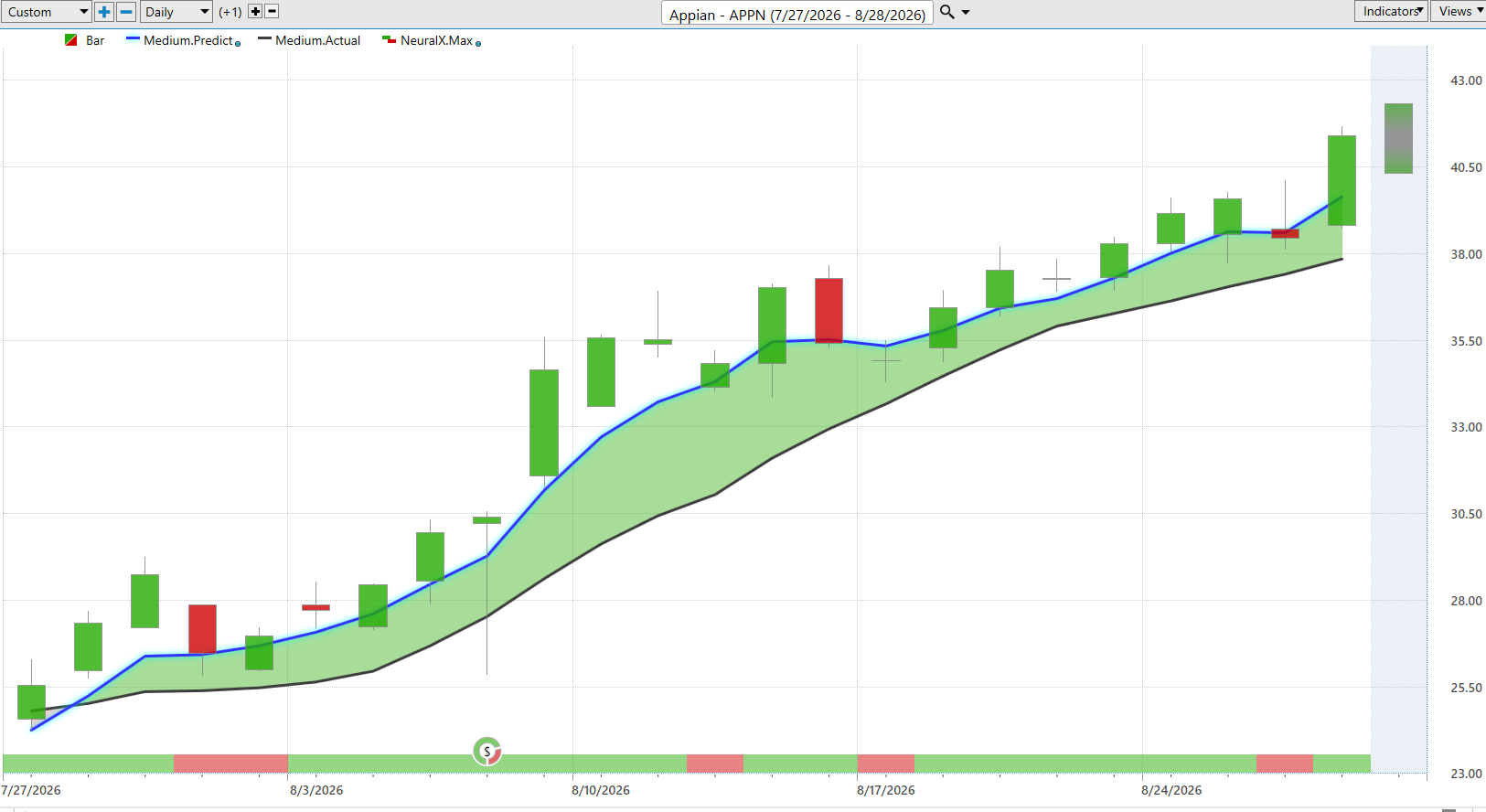
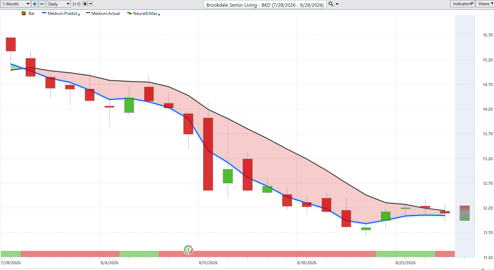
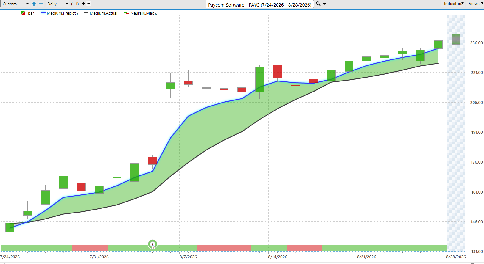
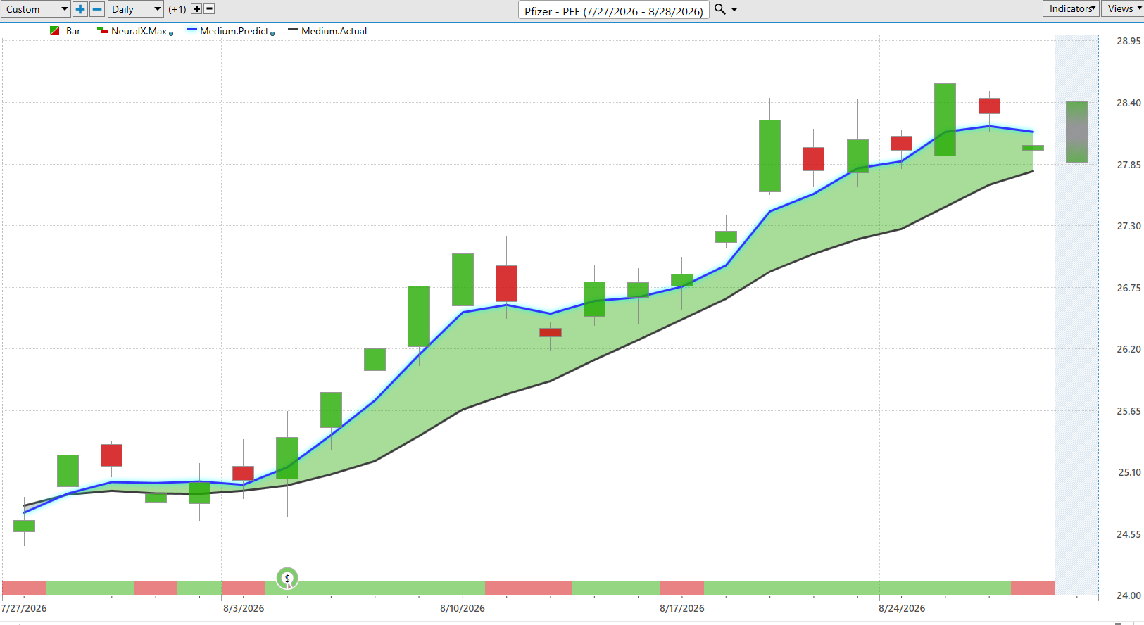
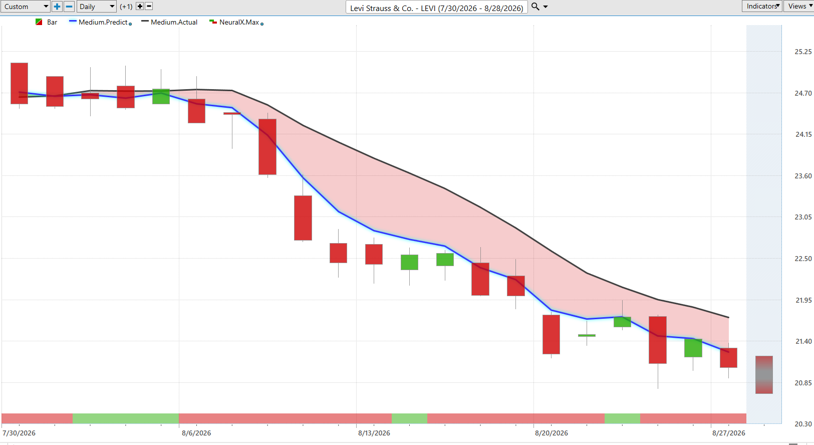
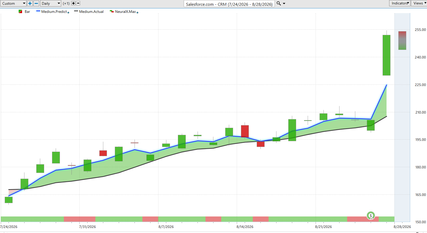



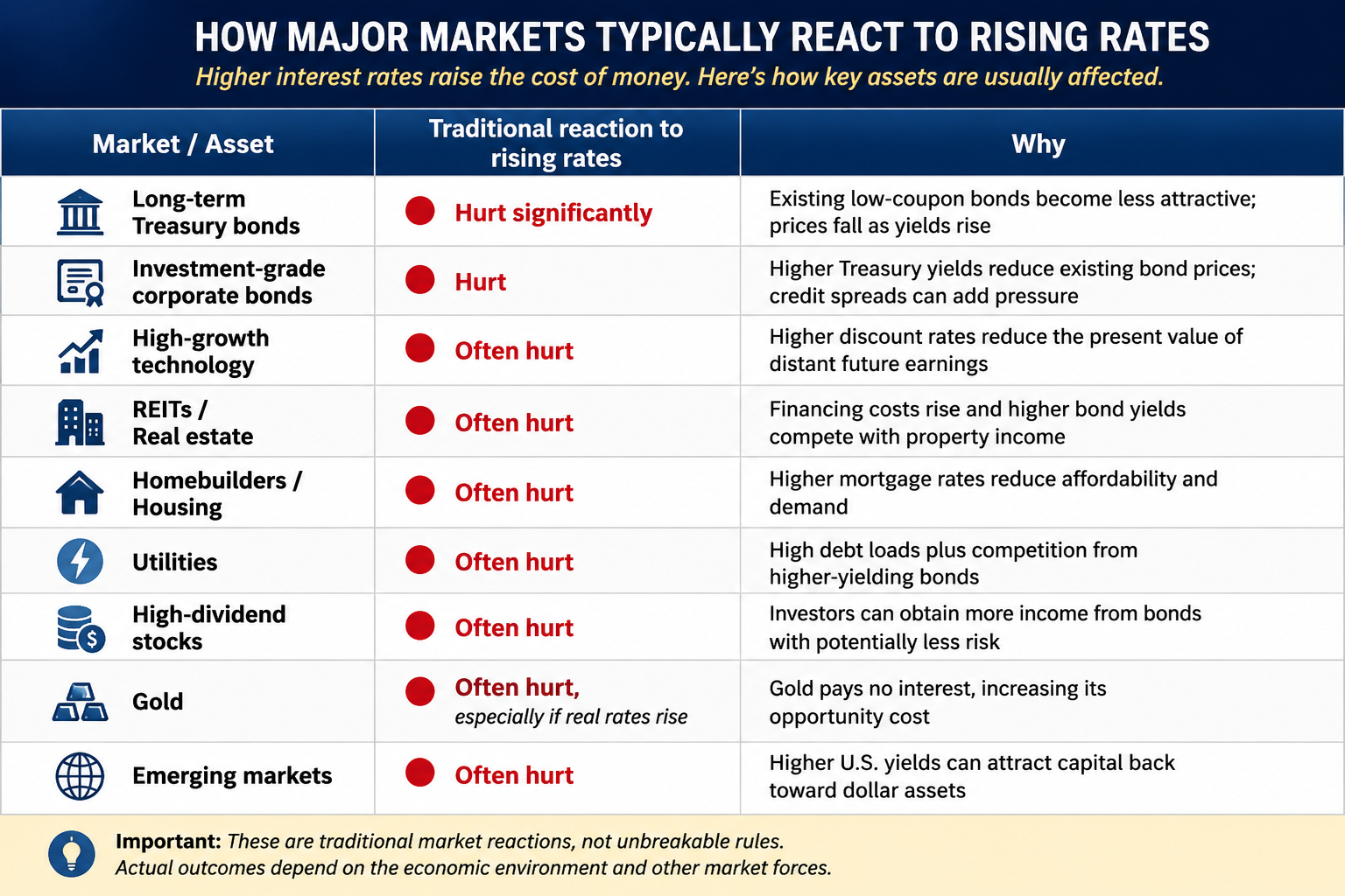
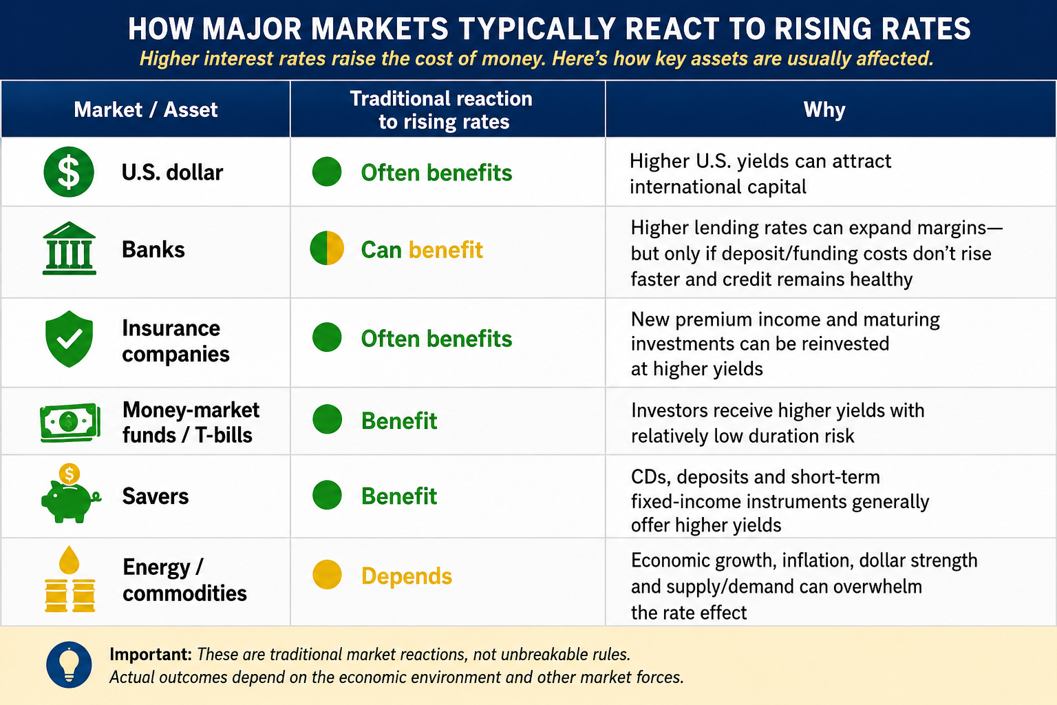
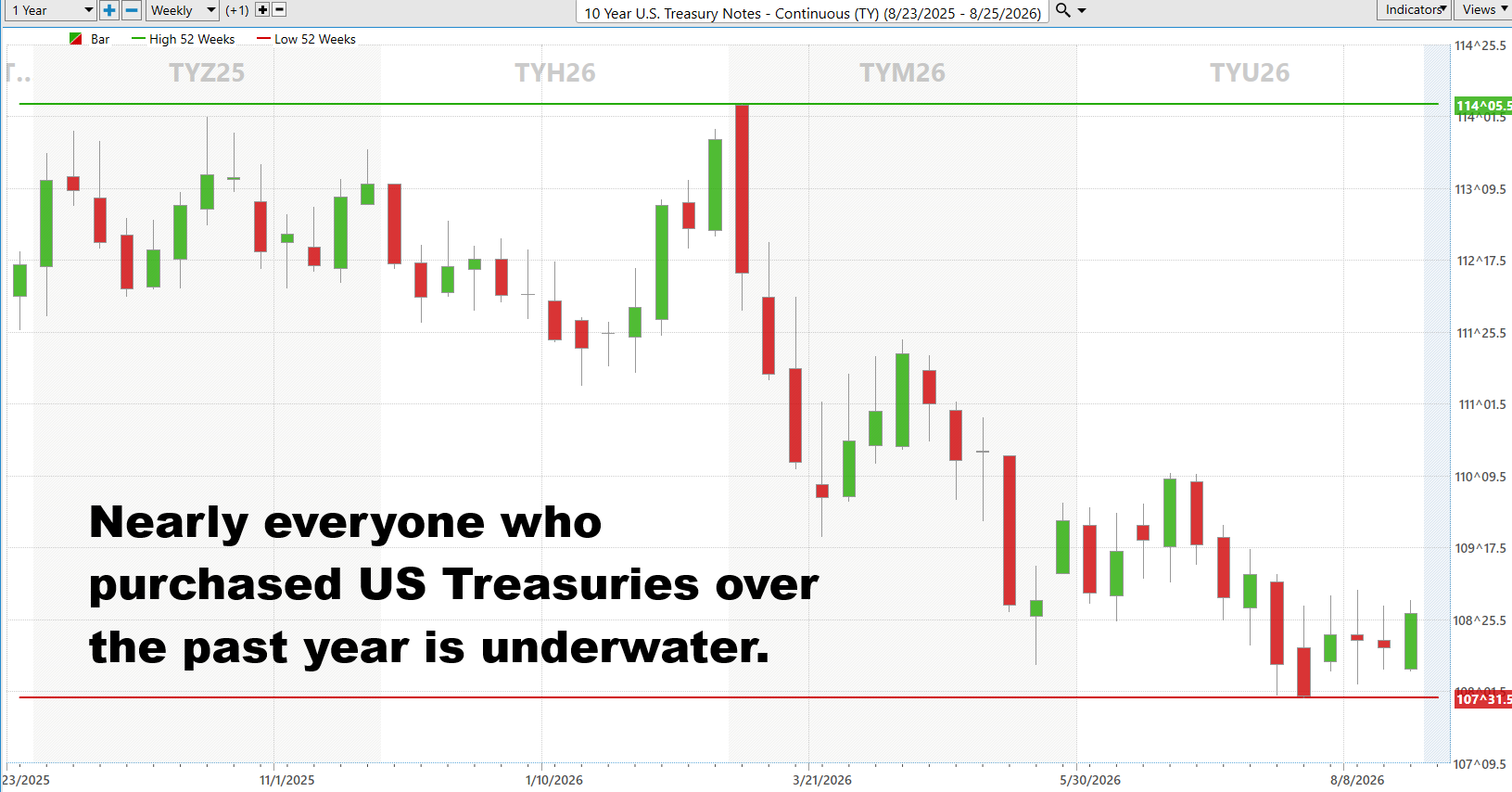
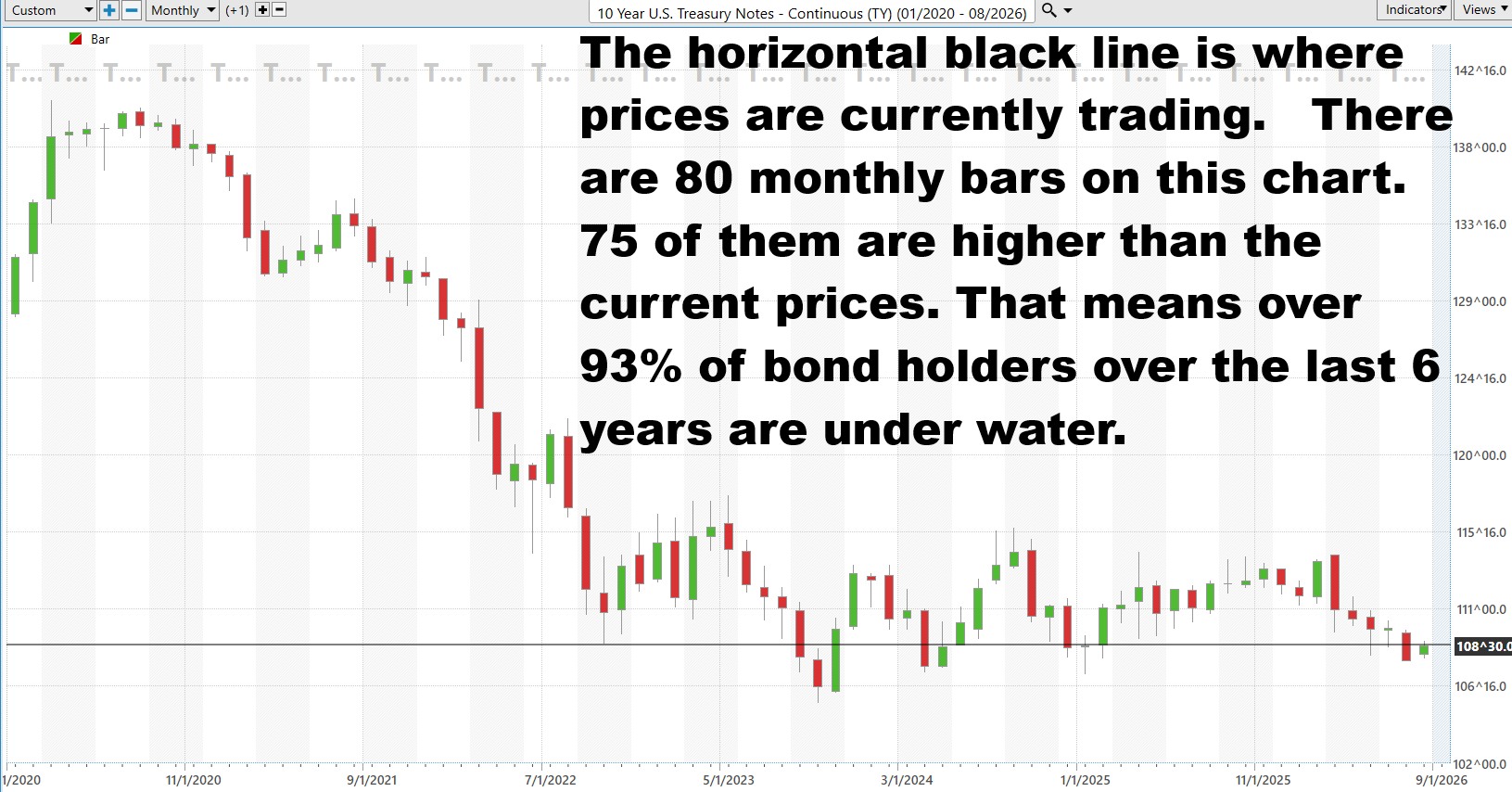

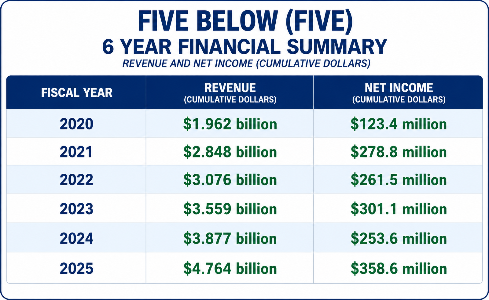 The numbers tell a simple story: Five Below knows how to grow sales, but profits have taken the scenic route. Revenue climbed from $1.96 billion in 2020 to $4.76 billion in 2025, an increase of roughly 143%, while net income rose from $123.4 million to $358.6 million, nearly tripling. But notice the bumps. Earnings slipped in 2022 and again in 2024 even as revenue kept climbing, telling traders that more stores and more sales do not automatically mean better profitability. The encouraging part is 2025: revenue jumped sharply and net income surged 41%, suggesting that Five Below may finally be turning its expanding sales machine into substantially more bottom-line profit.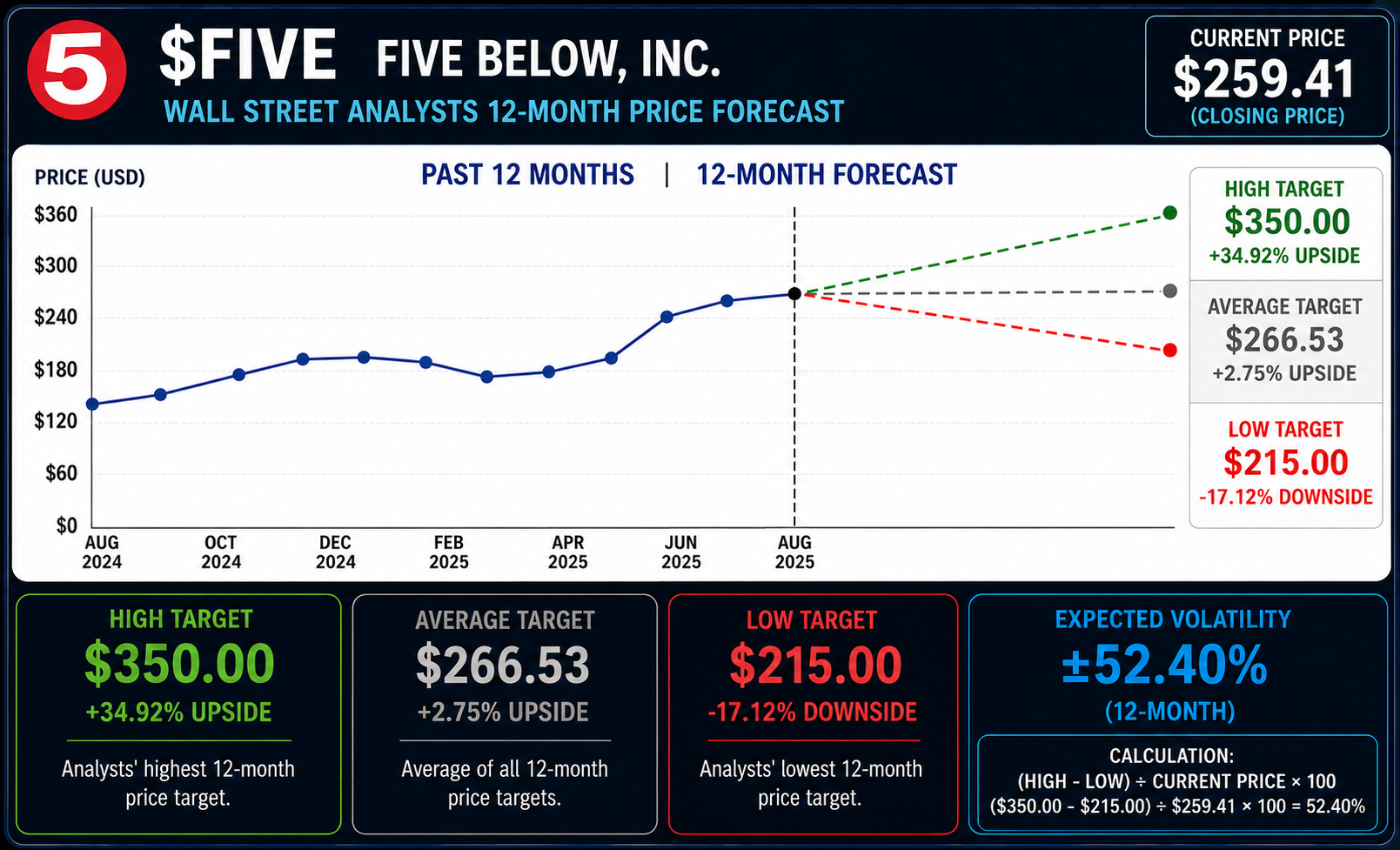
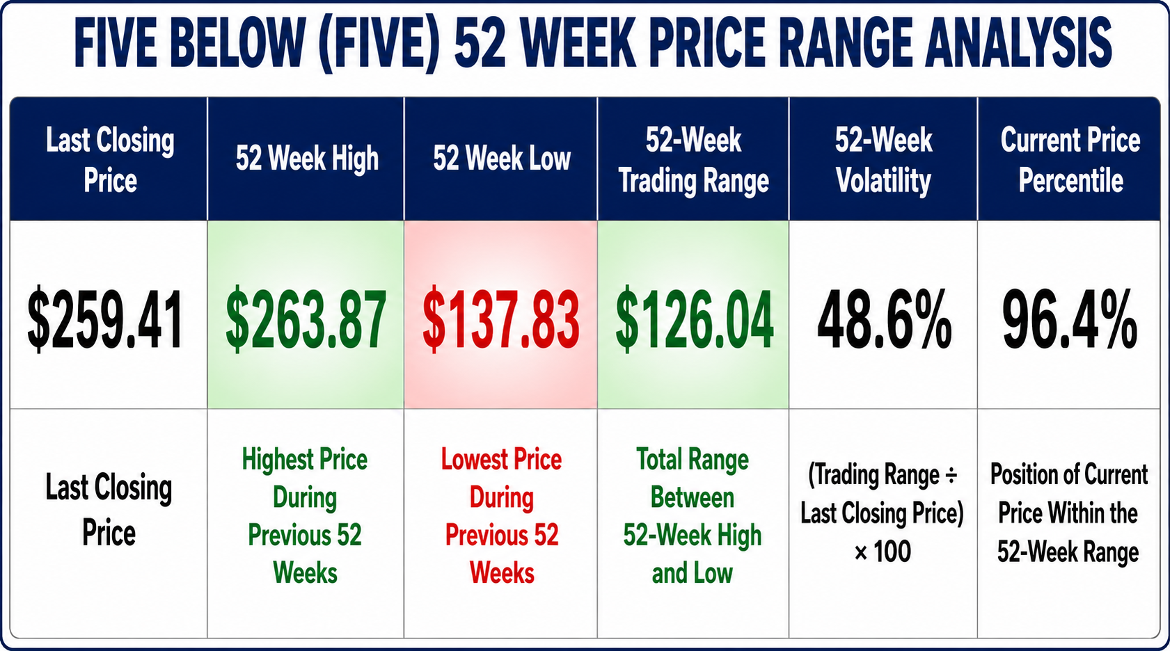
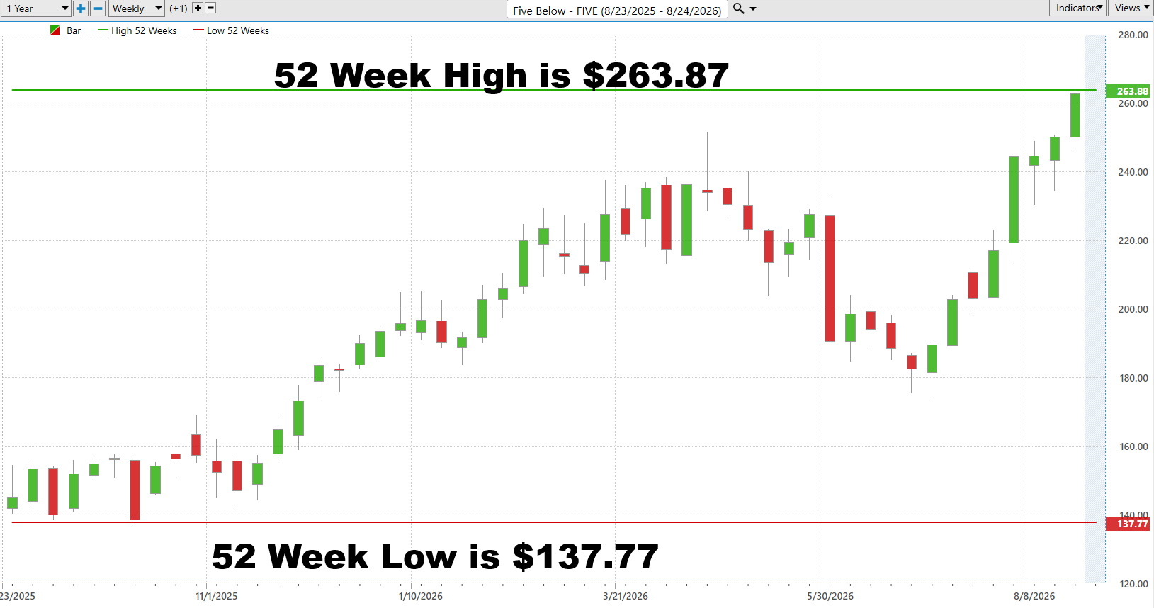
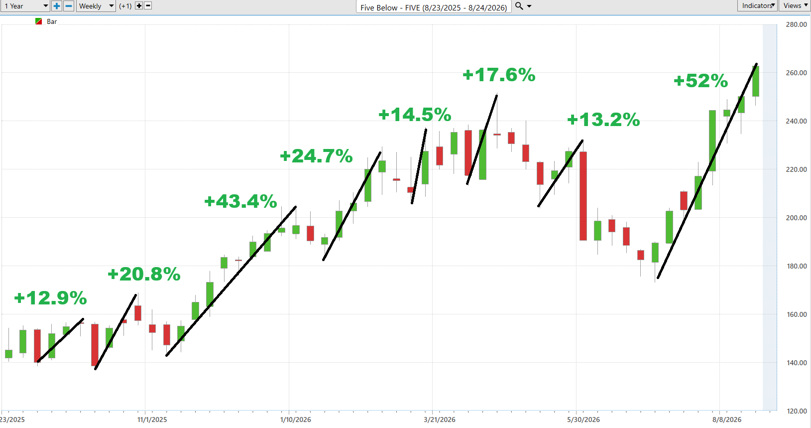
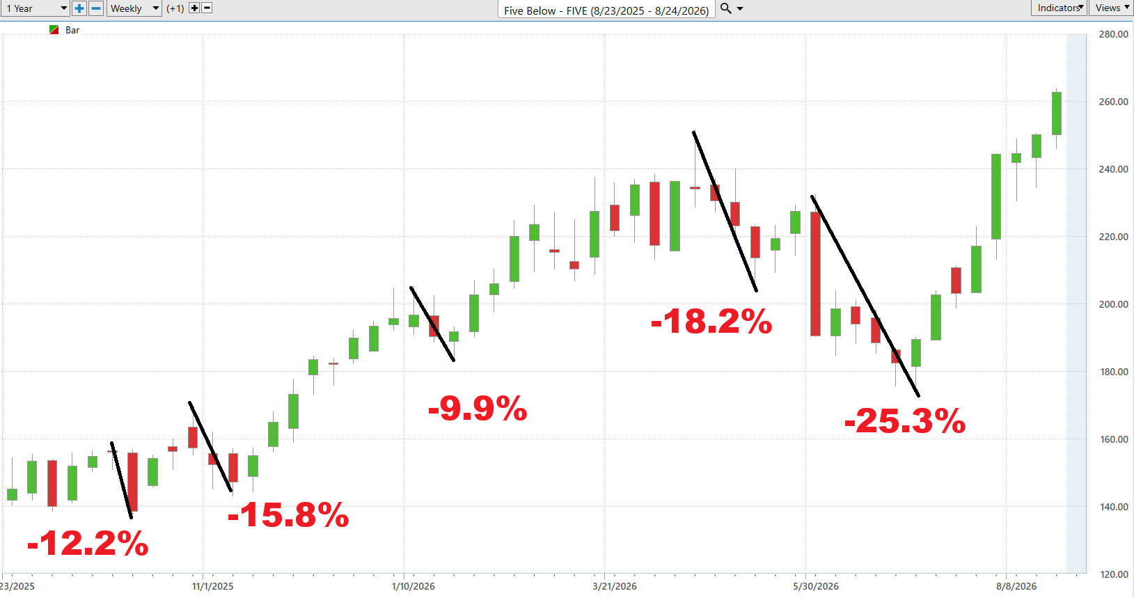

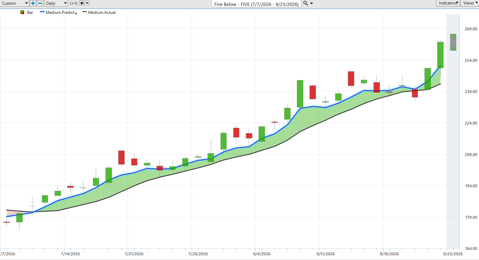
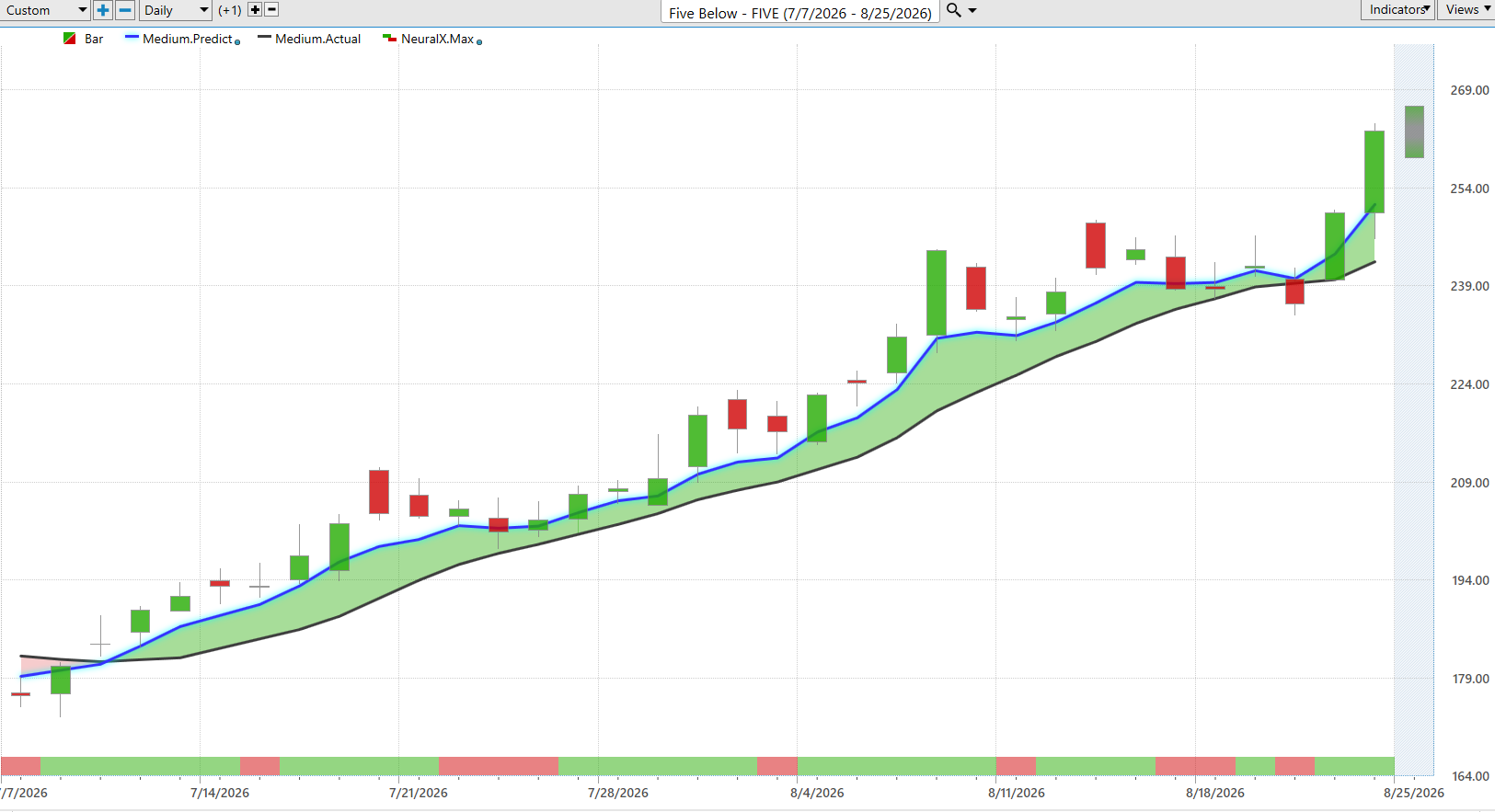
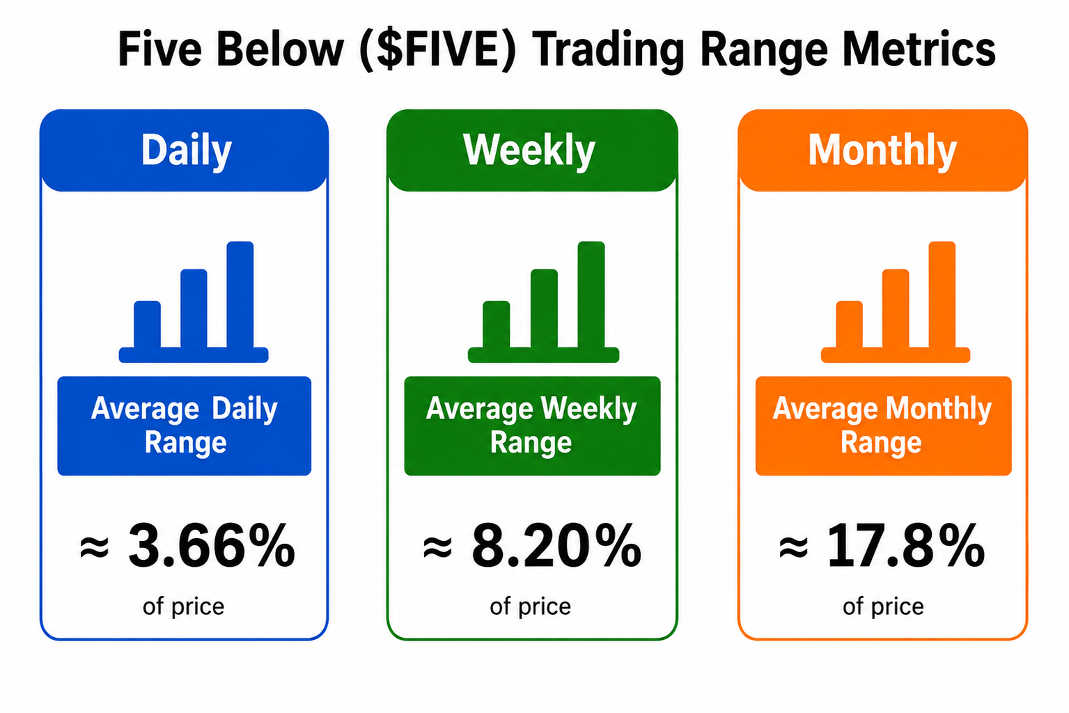
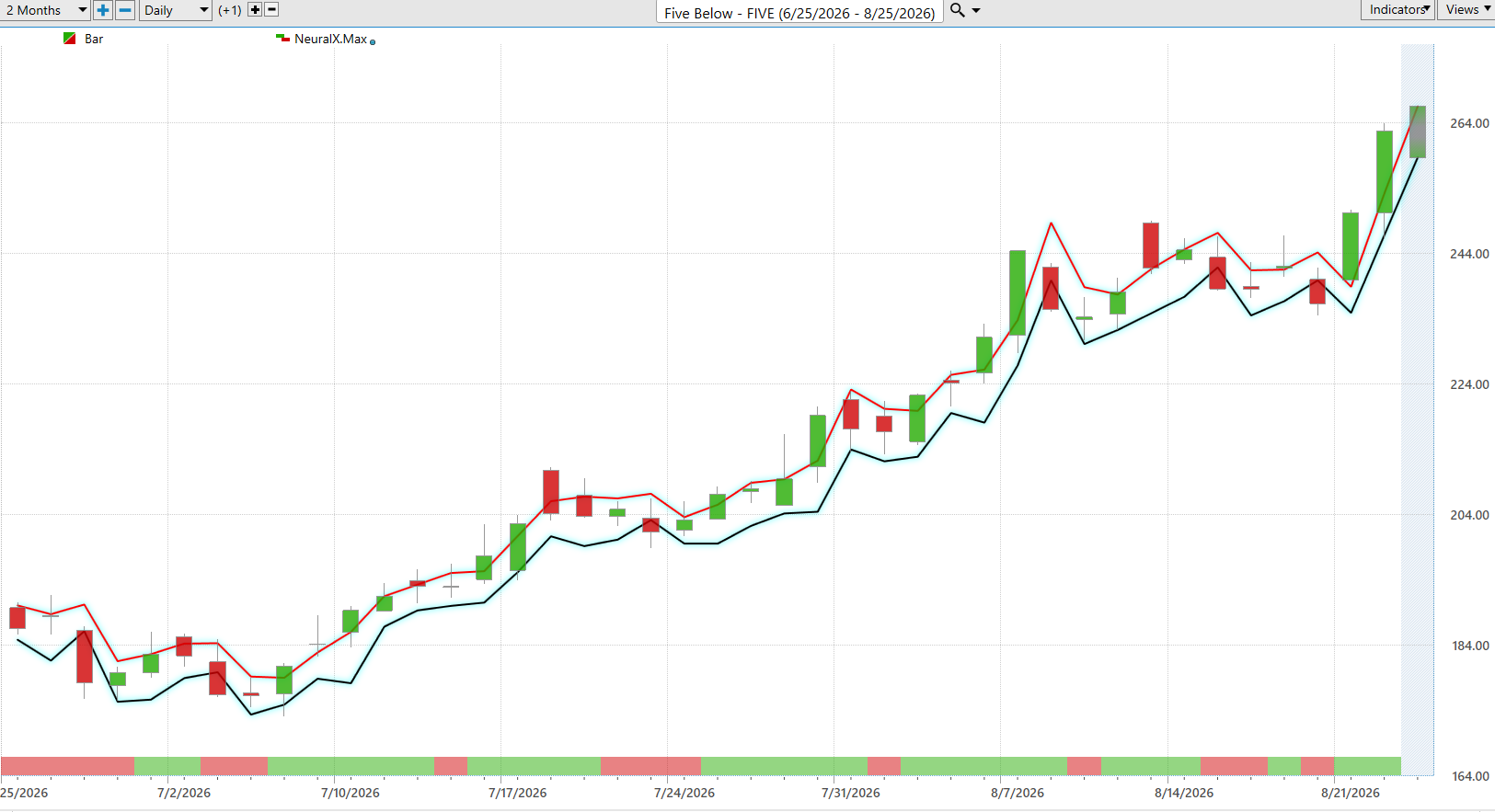
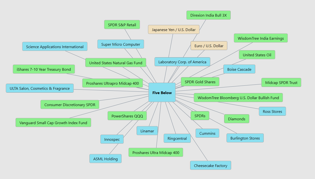 Our Suggestion

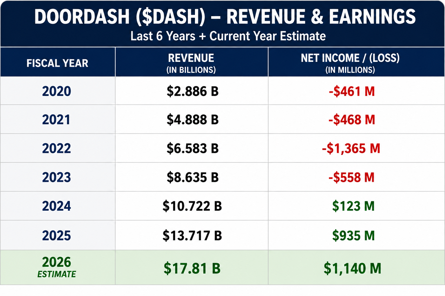
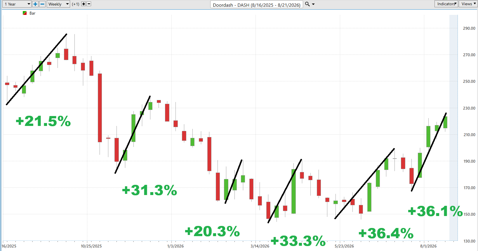
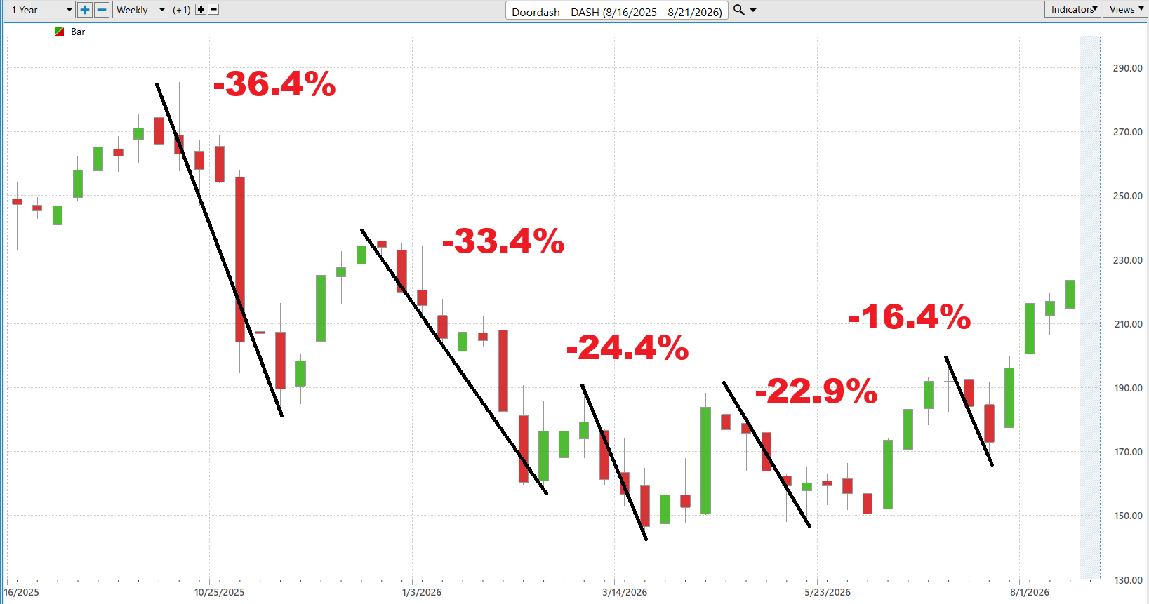

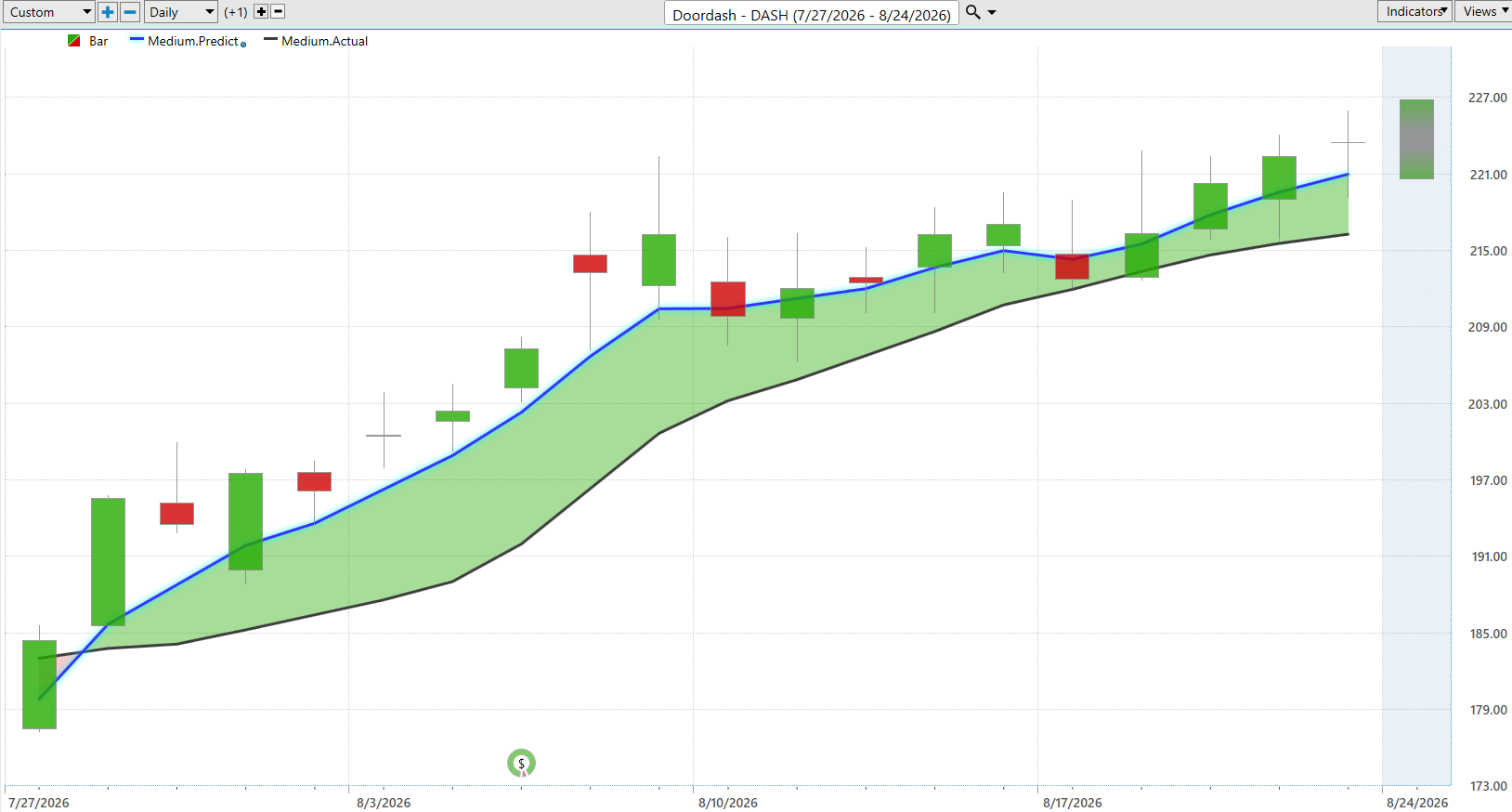
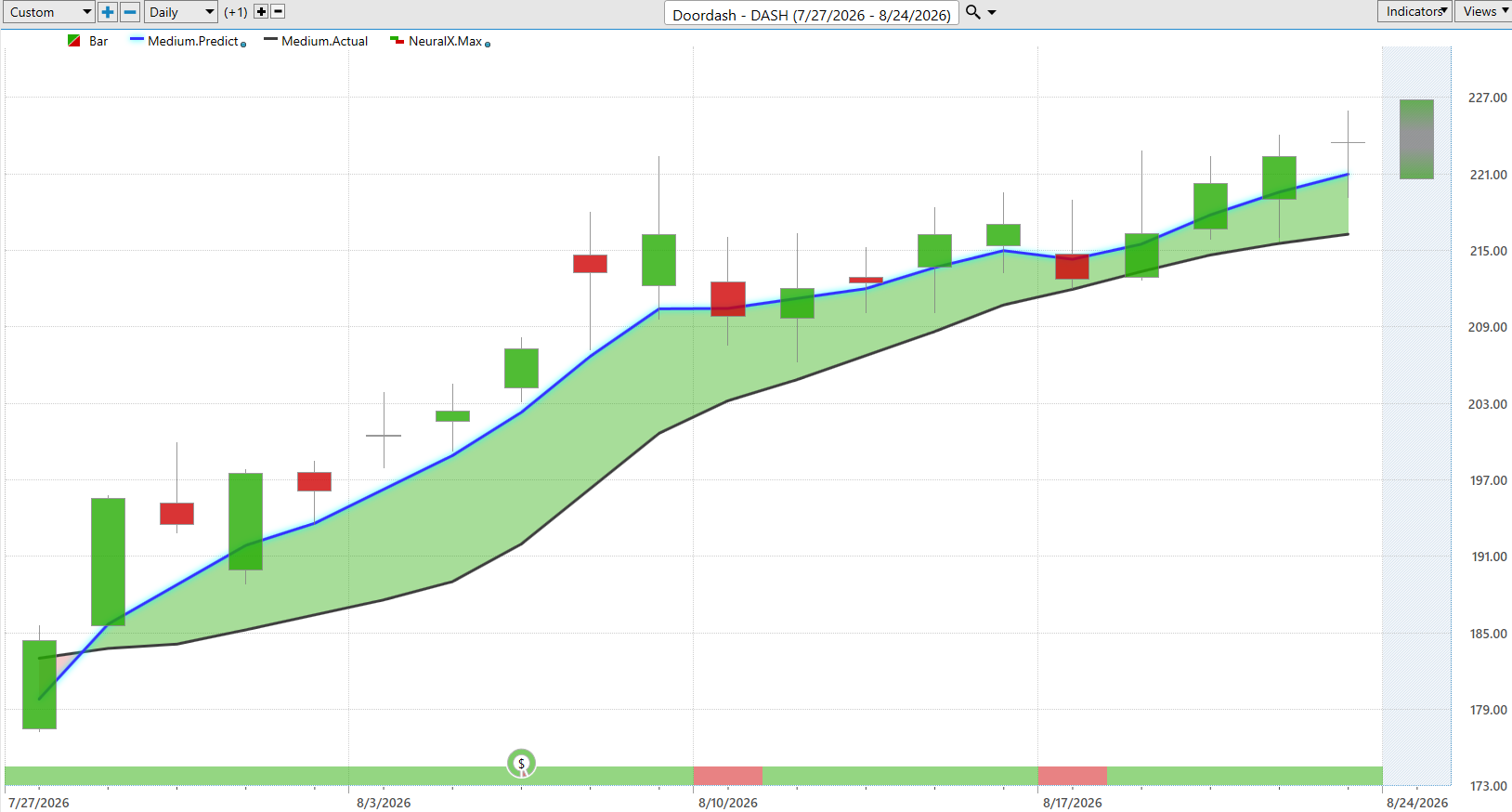
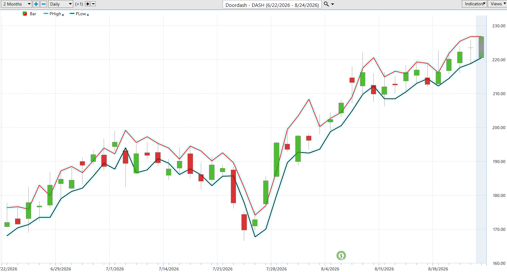
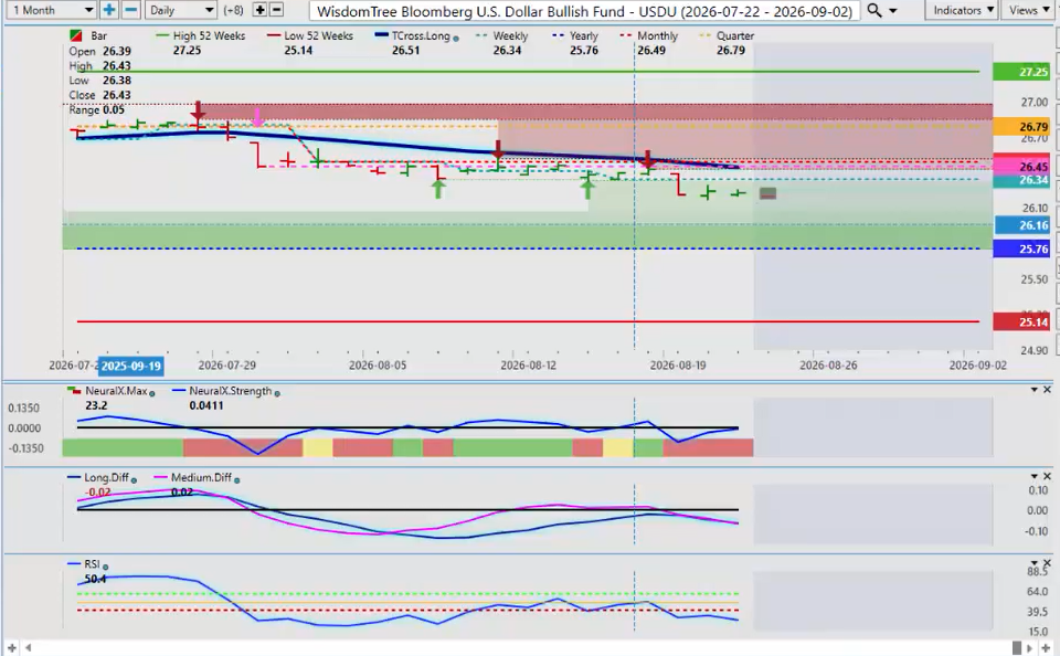
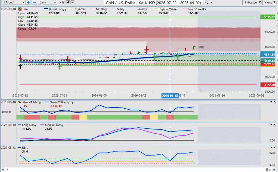
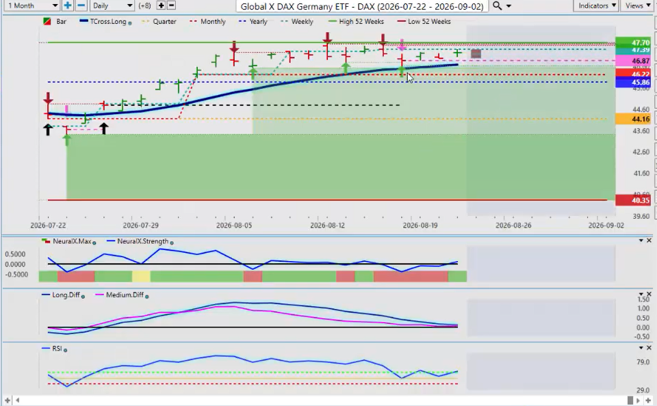
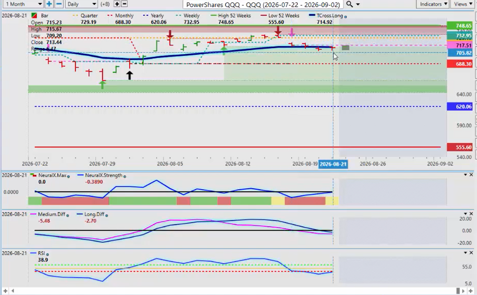
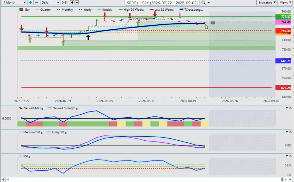
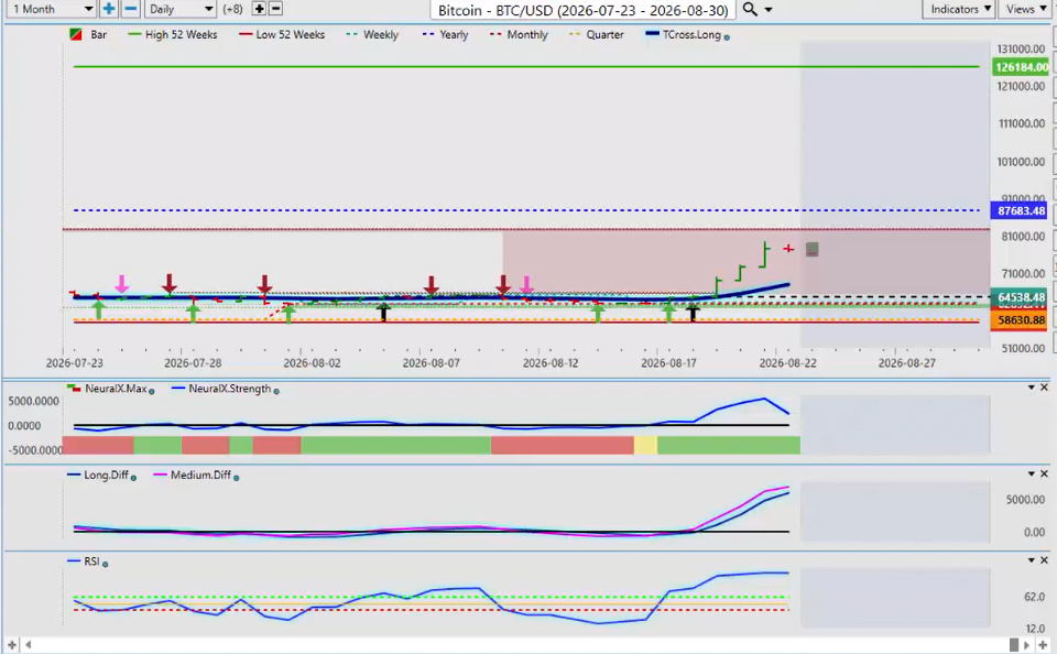
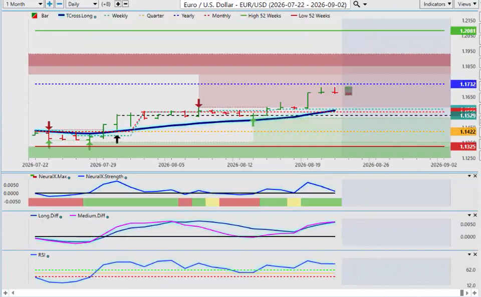
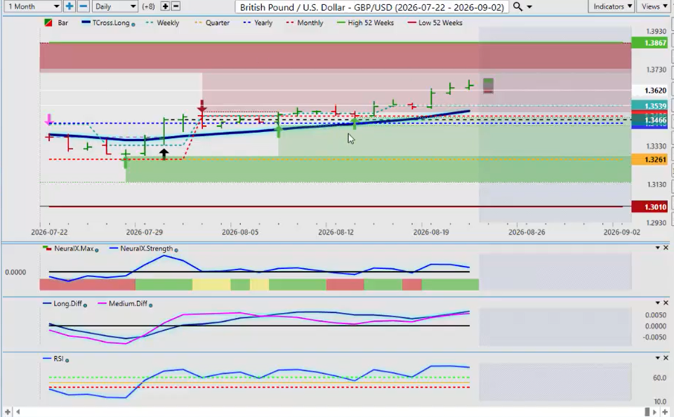
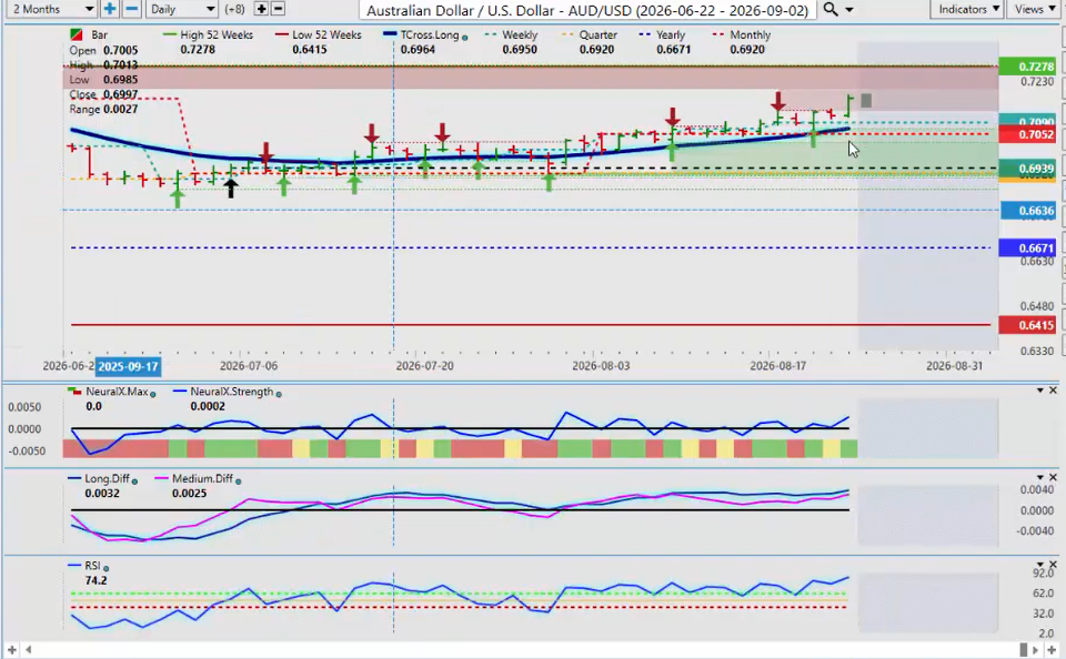
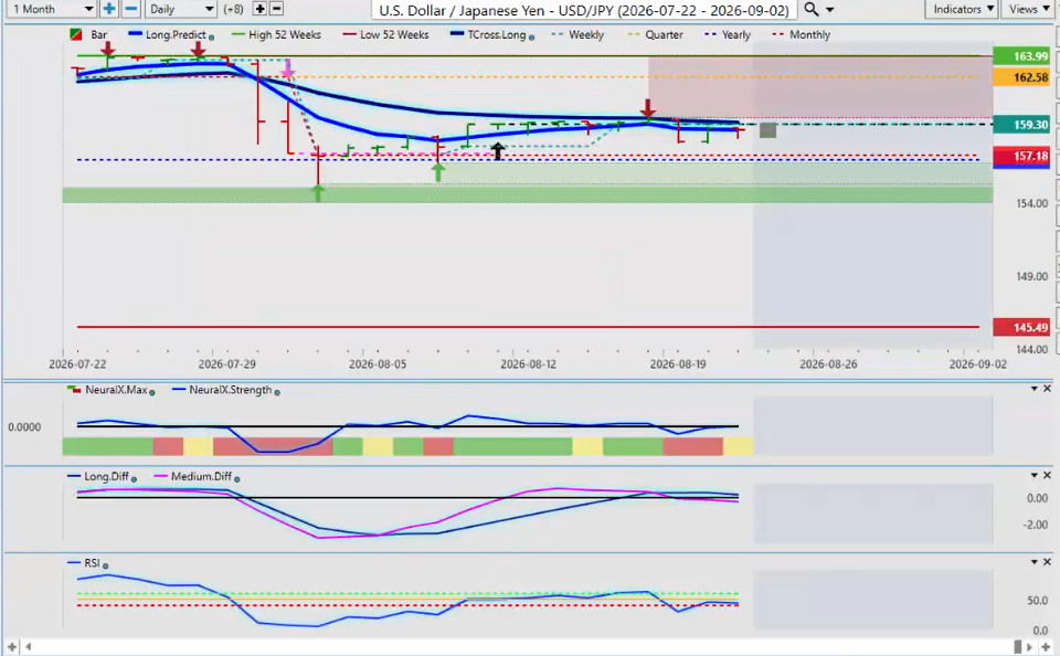
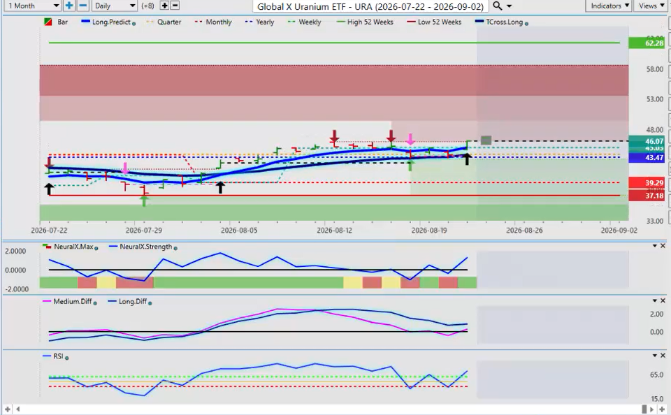
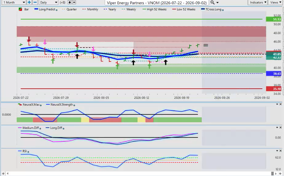
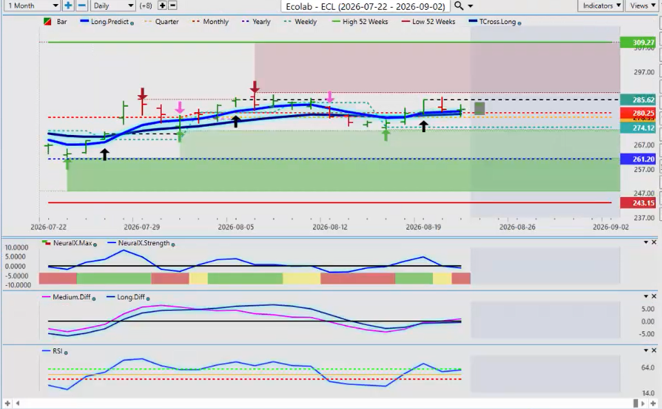
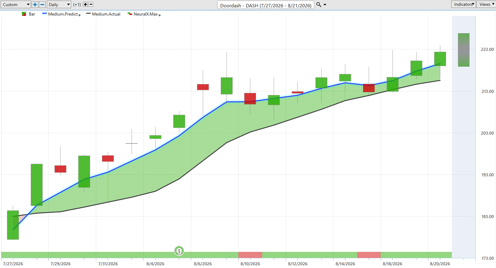
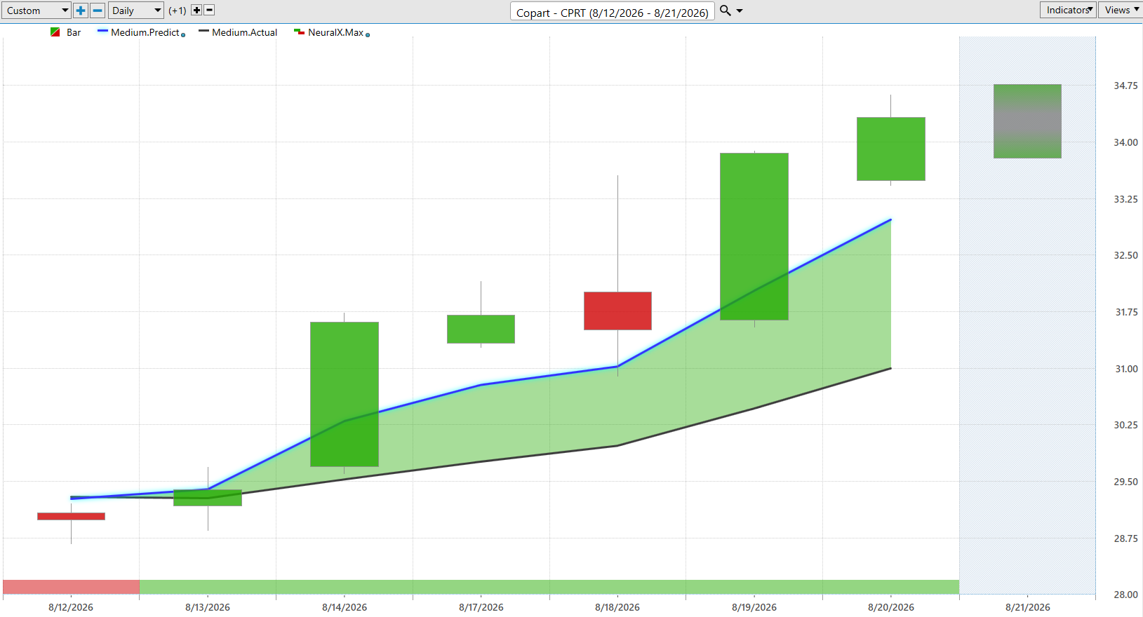
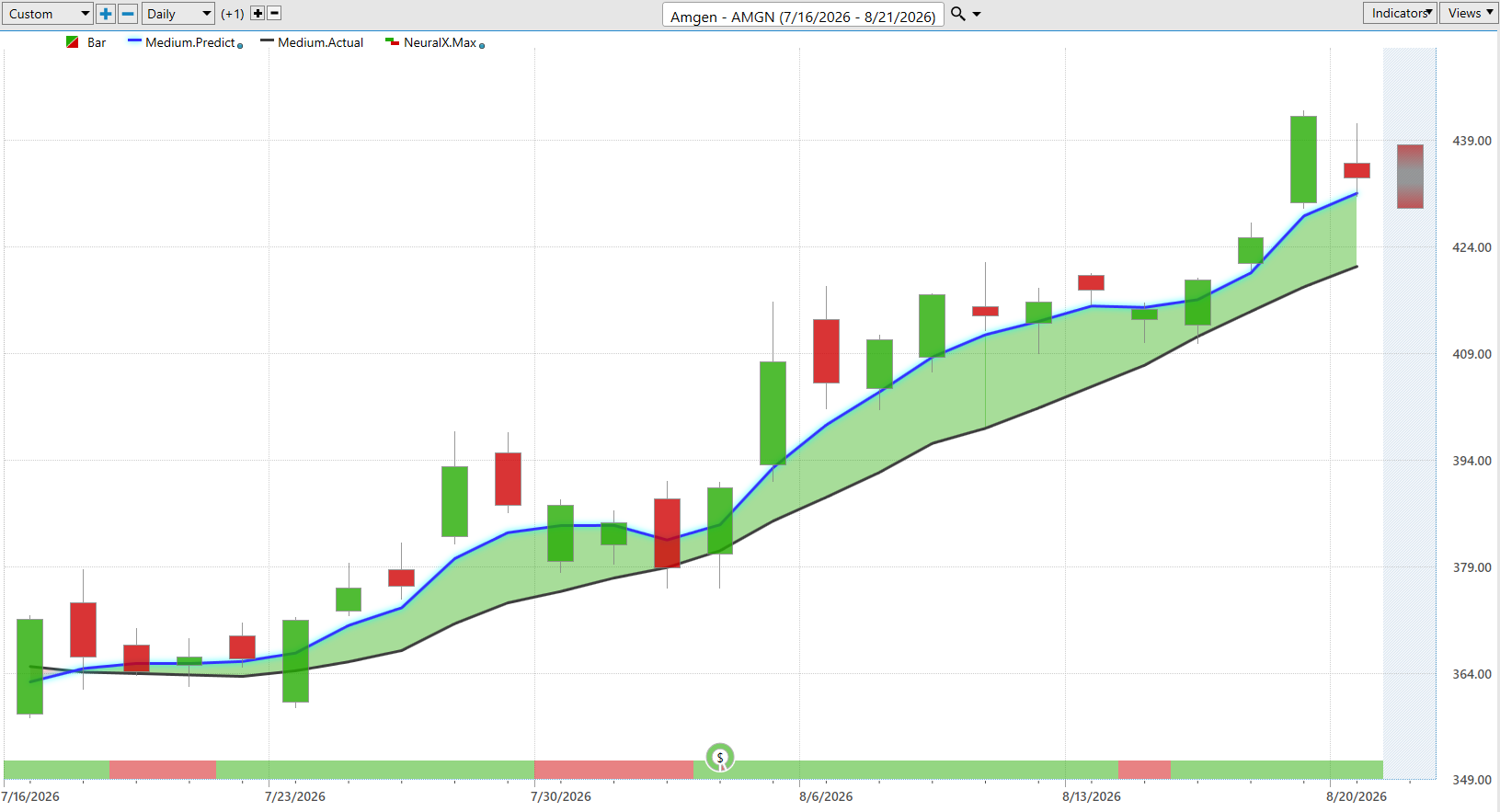
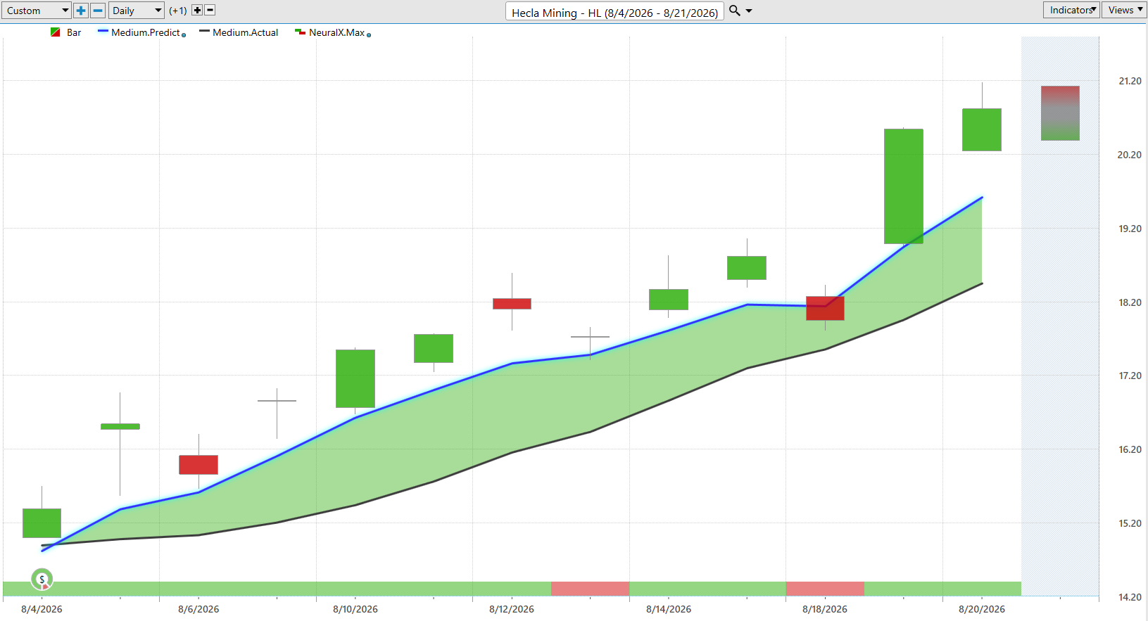
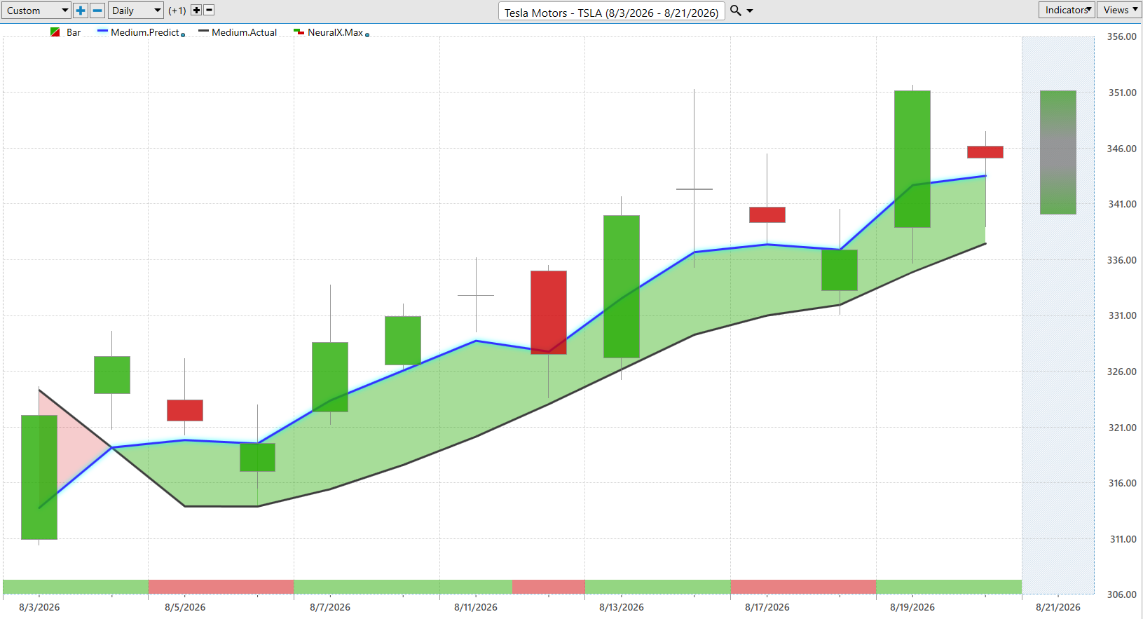
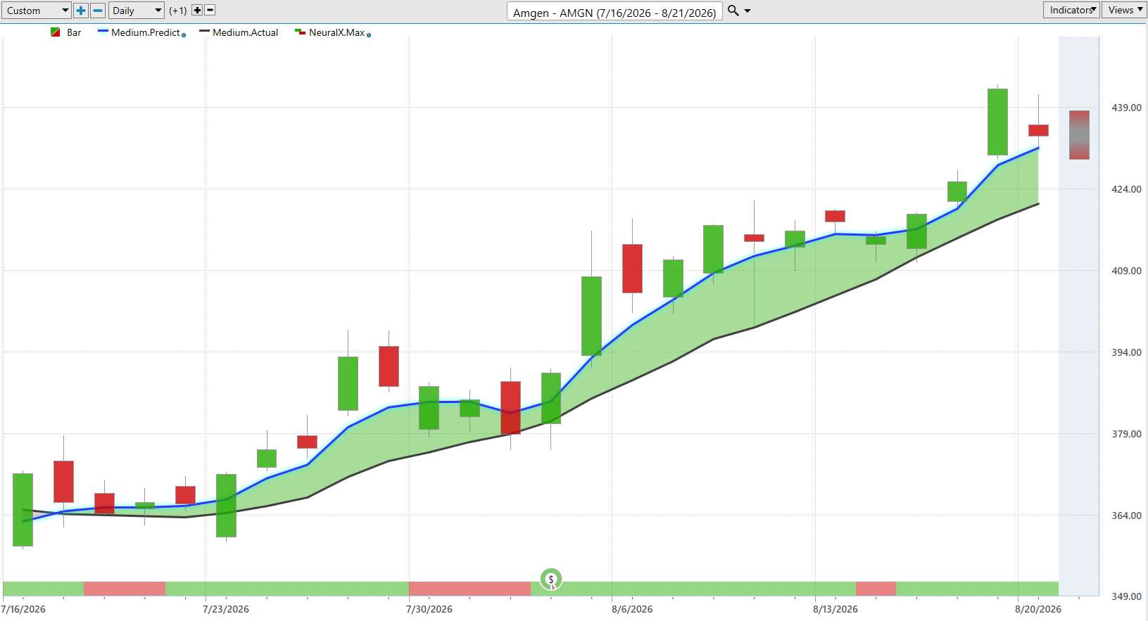

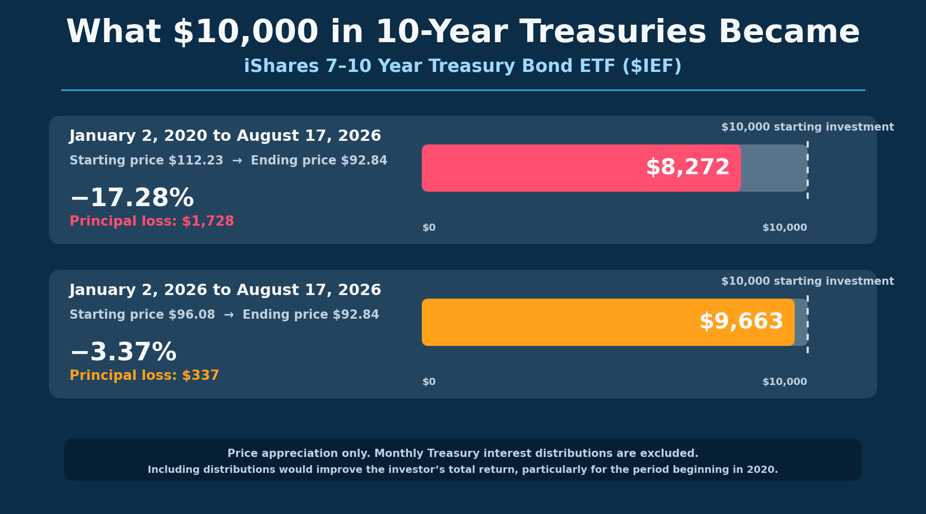
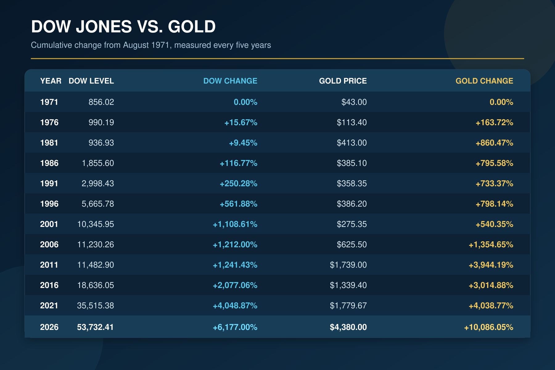
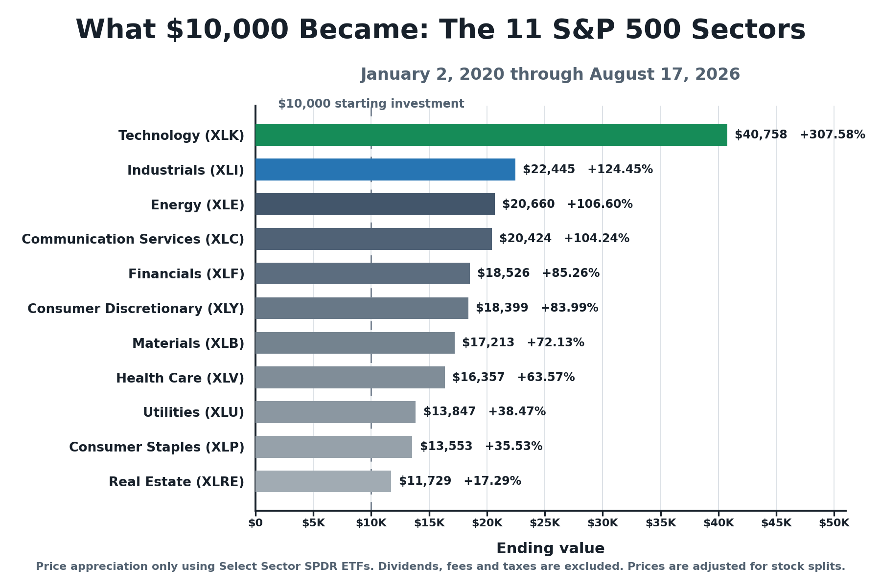
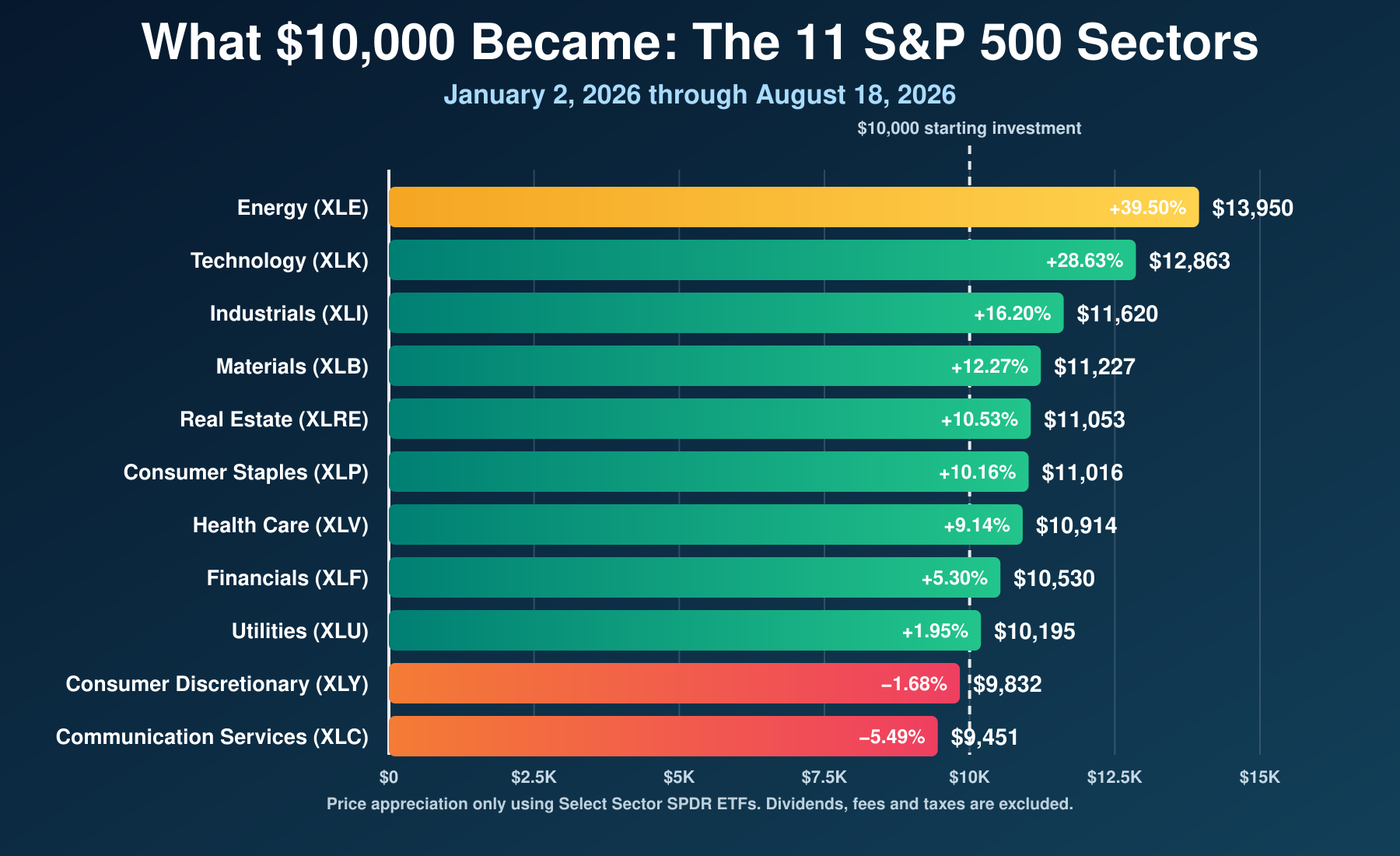
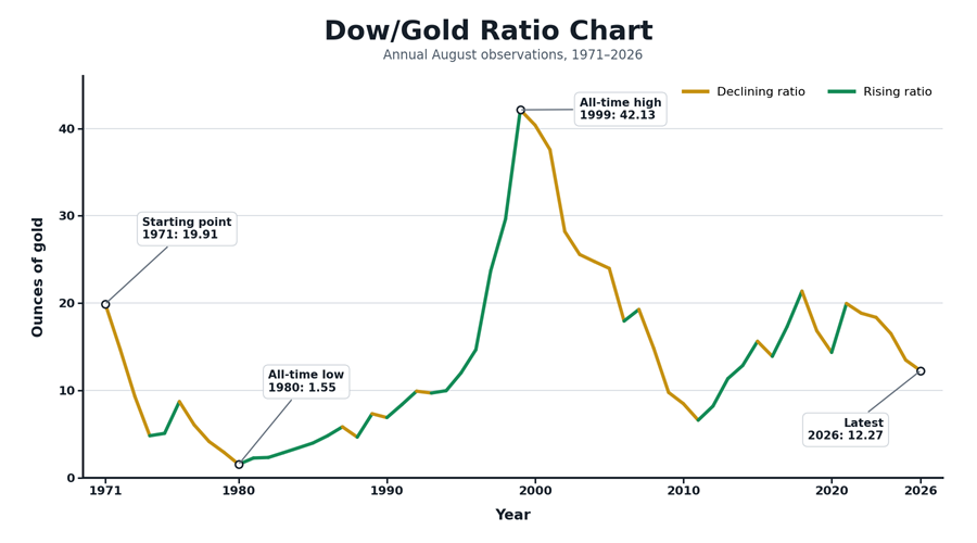

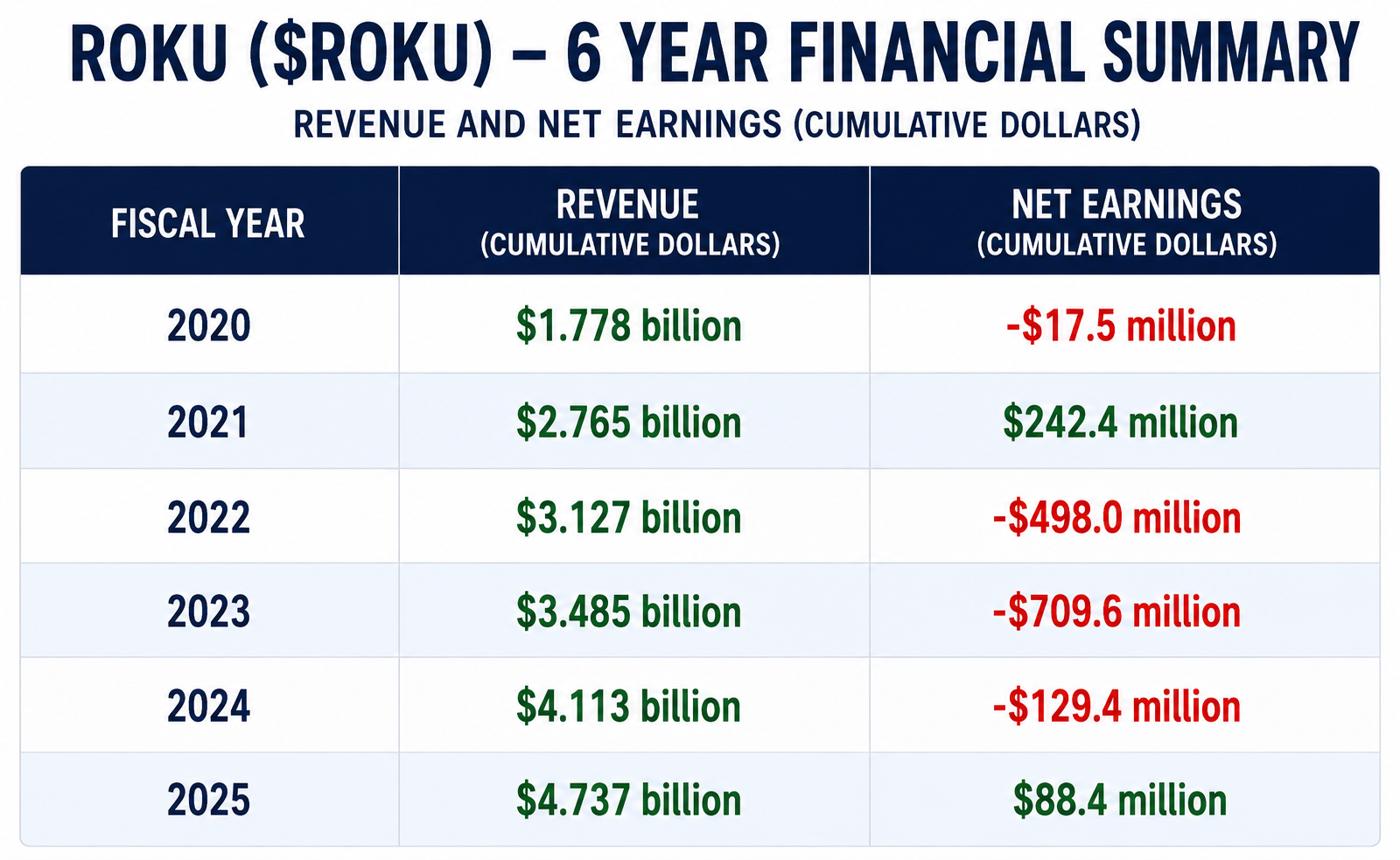 Roku’s numbers tell the story of a company that learned how to grow long before it learned how to make money.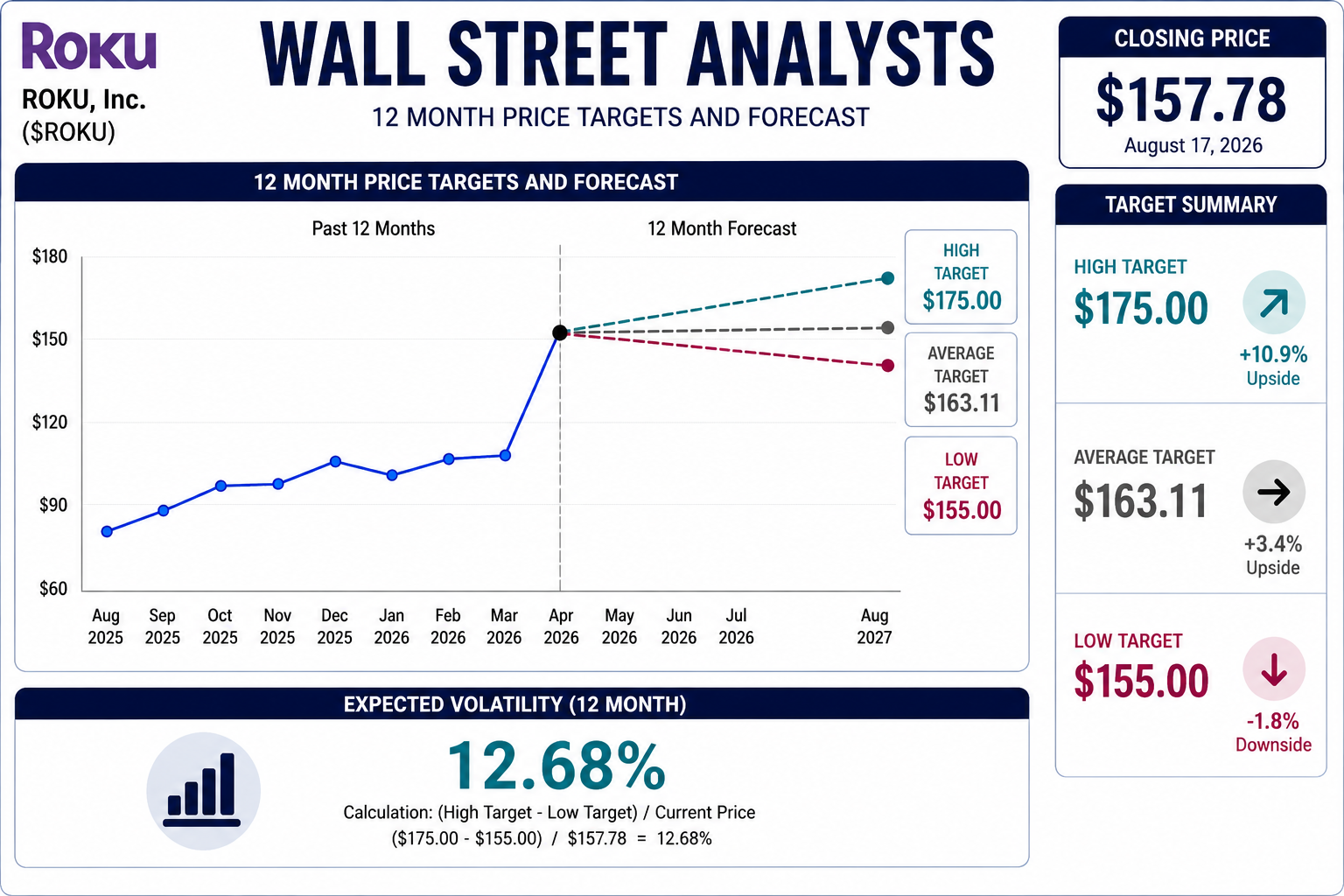
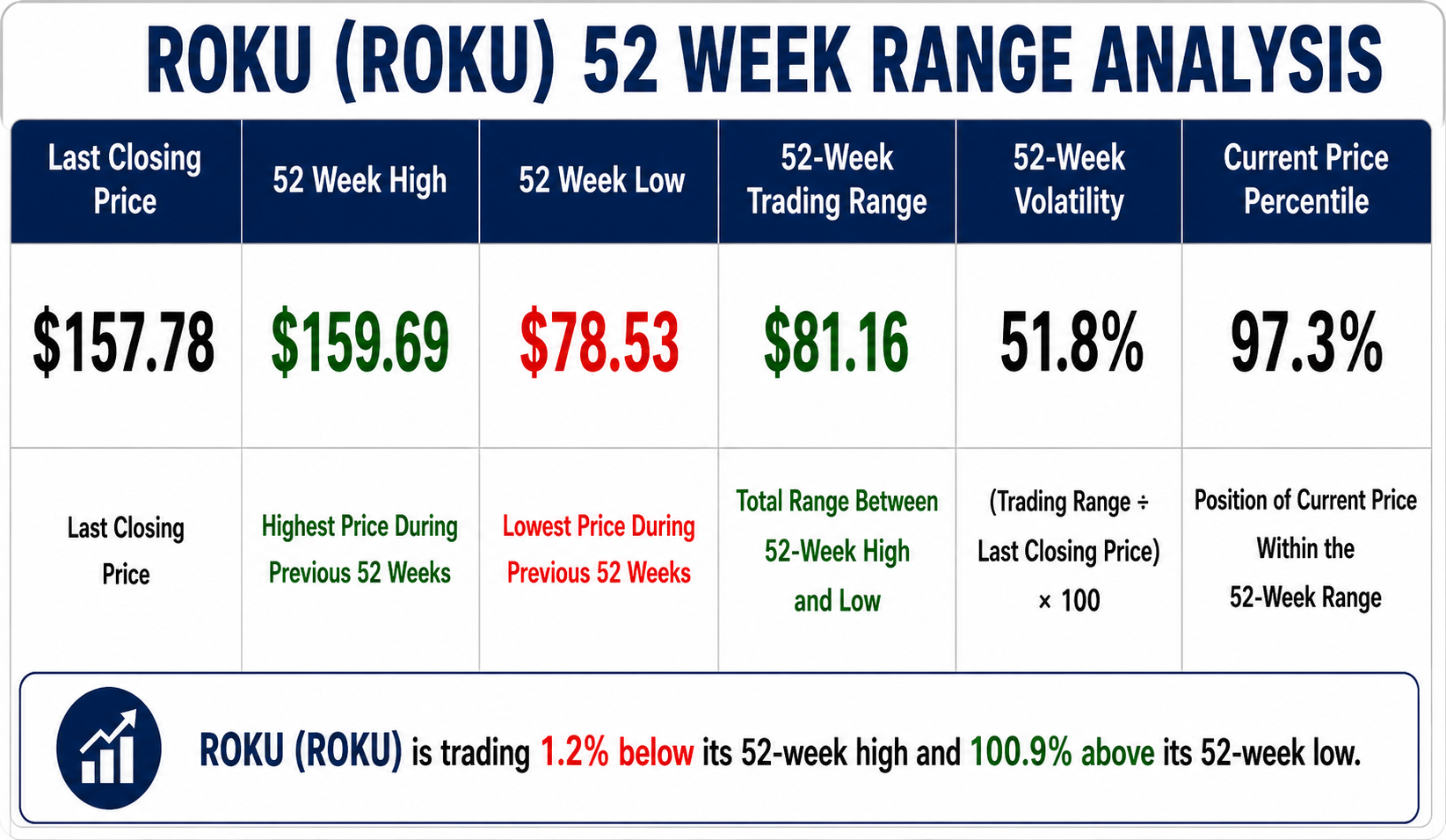 The 52-week chart of Roku tells a story traders should not ignore. The stock has traveled from a 52-week low of $78.53 to a high of $159.69, an enormous range of $81.16. At the $157.78 close shown in the analysis, Roku sits just 1.2% below its 52-week high and roughly 100.9% above its 52-week low.